Michelle G Brown | Mixed Media Art

A Book with a Different Look

~ * ~

This article is written by Kim Kelley

About a year ago I made my very first altered book, I had just found out my uncle Rocky was dying of cancer; was given just a few months to live, and I wanted to make something that might give him and the family a bit of hope. So I started playing around with a book I happened to have had two of and viola… a masterpiece was created…
Altered Book Art by Kim KelleyFirst try at an altered book

After that, I was hooked.  Since I enjoy going to antique stores anyway, going through bins and shelves of; well wonderful pieces of junk, I started searching around for books.  Looking for the heavy, hard cover monstrosities that will make fantastic art!

There are a few ways you can alter a book…altering page by page, making a shadow box of sorts, fanning pages, even cutting shapes out of the pages, but I chose to create a stand up, 2 opening frame display.

For this project I used Jacquard Lumiere paints in …. , harlequin chipboard pieces, some other chipboard pieces, bead texture, flake texture, texture gel, and a digital image from Rebecca Sinz named Wither purchased at www.sweetpeastamps.com. Oh and of course a book!

So to start, I find the middle of the book and pretty much break the spine by bending and wringing the book back and forth. If you could see my hands you would tell what to do. Ha-ha. Then I start to glue the pages together. This takes a little time because even though you are not gluing each and every page you do not want to skip too many, maybe every five pages or so. I used mod podge and made sure I got it right up to the spine of the book as well as right to the edges of the page. If there seems to be too many without glue you can always go back and add more.
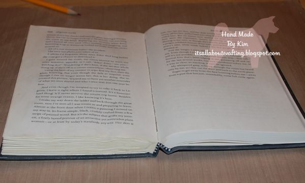
Altered Book Art by Kim KelleyBending of book, start of gluing

Depending on the size of your book is going to depend on the size of your opening that you cut out. I usually go in about an inch from the edges, draw my lines where I want to cut and then cut down about halfway through the pages. You want to leave the showing page to have some writing.

Now bring out your gesso! I like to put at least two coats of gesso on both the cover and the inside, making sure you get all the cracks and crevices.
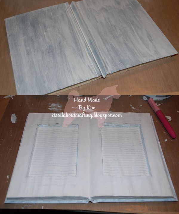
Altered Book Art by Kim Kelley

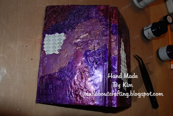
I usually decorate the cover side first. Even if the cover side may not be seen at all times you know someone will pick it up and look at it! I started with my palette knife and several texture mediums; spreading anywhere and everywhere, getting them spread around so that you can see and feel each texture style.
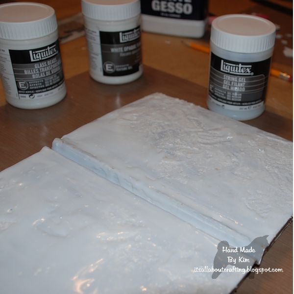
Altered Book Art by Kim KelleyOutside

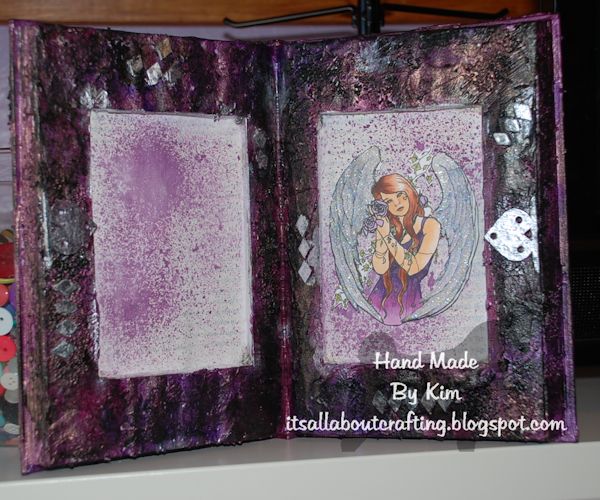
You want to continue doing the same on the inside, trying to keep it away from the cut out portion. If some drips onto the cut out edge, that’s fine, but keeping the bottom pretty clean is good, so that when you add your image and/or saying it will adhere the way it needs to. I initially added drips and splotches of string gel and then had to cut out the bottom page. Live and learn! Ended up just using some mists instead to give some color to the inside page.
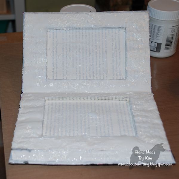
Altered Book Art by Kim KelleyInside

Once you get the texture the way you want it, you can start to add your chip board pieces. I added mine while the texture was still a bit wet, makes for adhering it a lot easier. I used both the outline of the harlequin chipboard and the little pieces that you take out. At this stage I also used my glue gun on the pages, giving both texture and strength to the book.
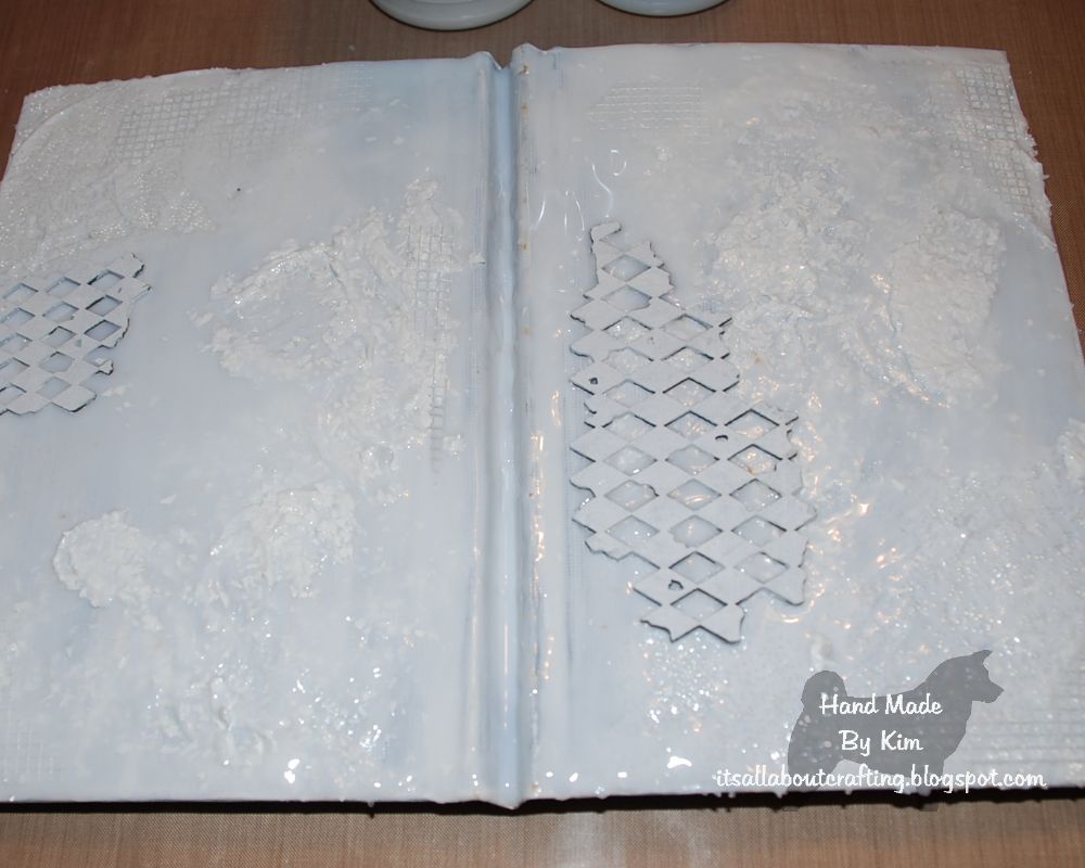
Altered Book Art by Kim KelleyChipboard

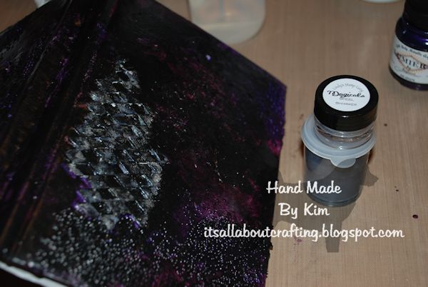
For some reason purple colors jumped off the shelf and onto my craft table, so I figured purples it shall be. I used Burgundy, Grape and Halo Violet Gold; alternating colors and brushes. After the purples dried, I also added black, misting with water and sponging some color off.  The chipboard pieces I colored with black and silver.
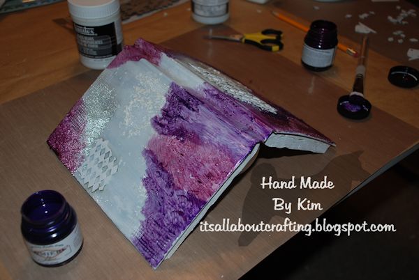
Altered Book Art by Kim KelleyPainting it up

Altered Book Art by Kim KelleyPainting it up 2

Altered Book Art by Kim KelleyPainted chipboard

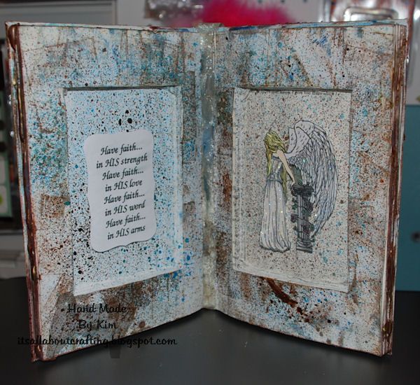
I chose to use an angel for this altered book, I mean who couldn’t use an extra angel around their house. I printed my image twice so that I could make her wings pop out, colored her with Copics and then added glitter to her wings. I will add a scripture or poem once I know who this belongs too, just to make it more personal for them.
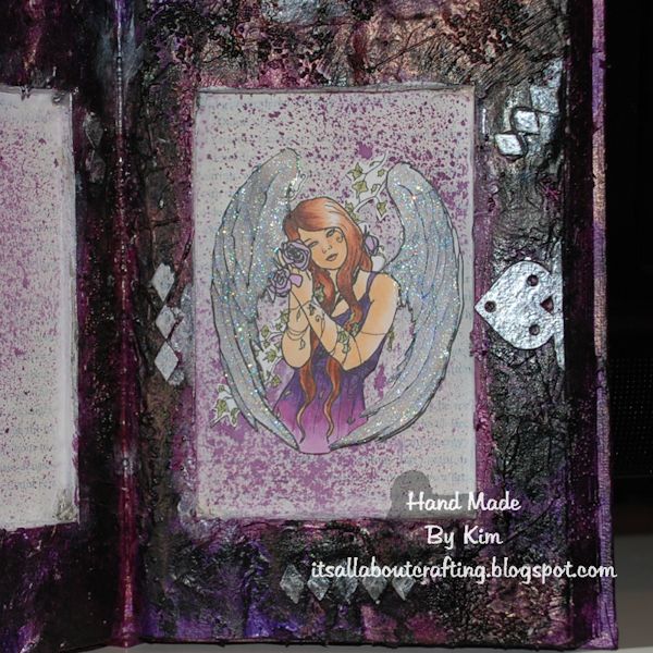
Altered Book Art by Kim Kelley Close up of Angel

Altered Book Art by Kim Kelley Finished Project!

~*~*~*~*~*~*~*~*~*~*~*~*~*~*~*~*~*~*~*~*~*~*~*~*~

Kim Kelley is borderline obsessive about her crafting and her art. She loves mixed media art because you are free to go beyond your comfort zone, using your imagination and exploring an anything goes mind set. Kim loves to learn and explore new techniques and hopes that any art she creates leads someone to find their inner creative artist!

Sites: itsallaboutcrafting.blogspot.com and www.facebook.com/kimscraftyconcepts

~*~*~*~*~*~*~*~*~*~*~*~*~*~*~*~*~*~*~*~*~*~*~*~*~

.

.
Creating your Own Mixed Media Birdhouse

This article is written by Shari Welch

Have you noticed the decorate your own birdhouses at your local craft store? Are you tired of just slapping paint on them? I will show you how you can make a unique, one of a kind birdhouse using mixed media materials.


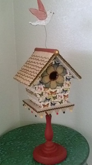
I decided on creating a decorative indoor birdhouse.

Here are the materials I choose to use and how I incorporated them into my project.

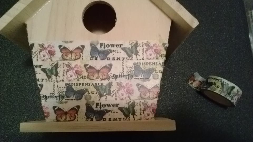
I wanted to try something new with my washi tape.

It worked perfect for the outside.

adding washi tape to the birdhouse

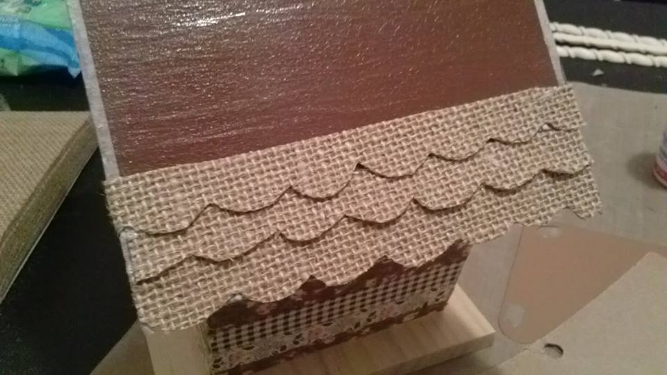
I cut out a series of scalloped shaped strips for the roof, a flower for the opening, and a banner using burlap paper.

adding scalloped burlap strips to roof

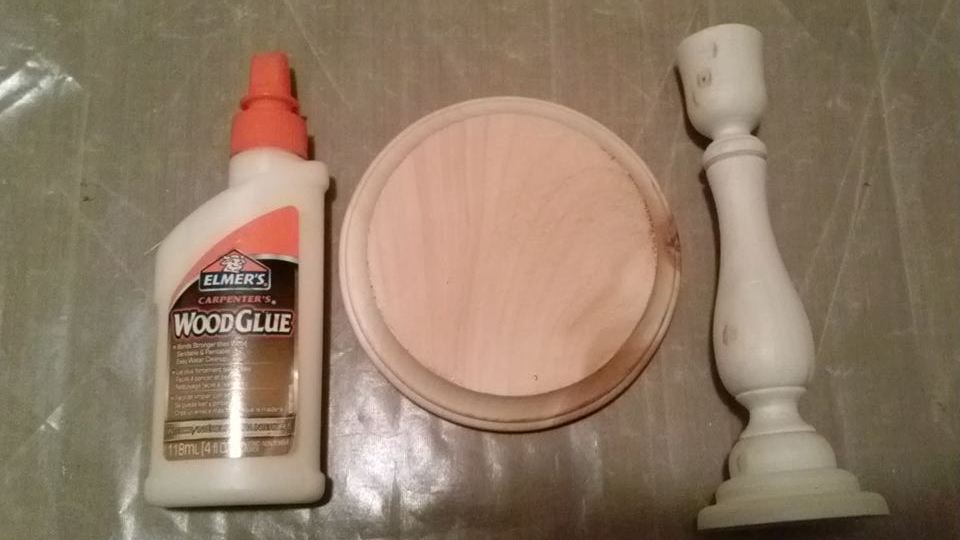
I didn’t want it to just sit on a table. I purchased a wooden candlestick and a round disc of wood. I glued them together and then attached them to the bottom of the house.

gluing candlestick to base and then to birdhouse

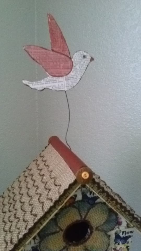
I attached a wire to my roof, and then to a decoupaged wooden bird with E6000 glue.

glue the wire on the bird and birdhouse

To finish, I added 2 types of buttons,small rick rack, shaded the flower and roof-line with Memento Dew Drop Dye Ink Pads and markers.

Now I have a decorative piece for my small table!

Now I have a decorative piece

~*~*~*~*~*~*~*~*~*~*~*~*~*~*~*~*~*~*~*~*~*~*~*~*~

Author bio:

Shari Welch is a mixed media artist living in Denton Texas. She is known for using reuse and recycle materials in her artwork. She volunteers for SCRAP Denton where she is on the education committee, teaches workshops, and performs art demos. She is passionate about mixed media art and loves helping bring creativity into the lives of others.

You can follow Shari and her mixed media art at www.facebook.com/my.altered.life
.

.

There’s a Rainbow in My Paint Box

~ * ~

This article is written by Tamara Dinius

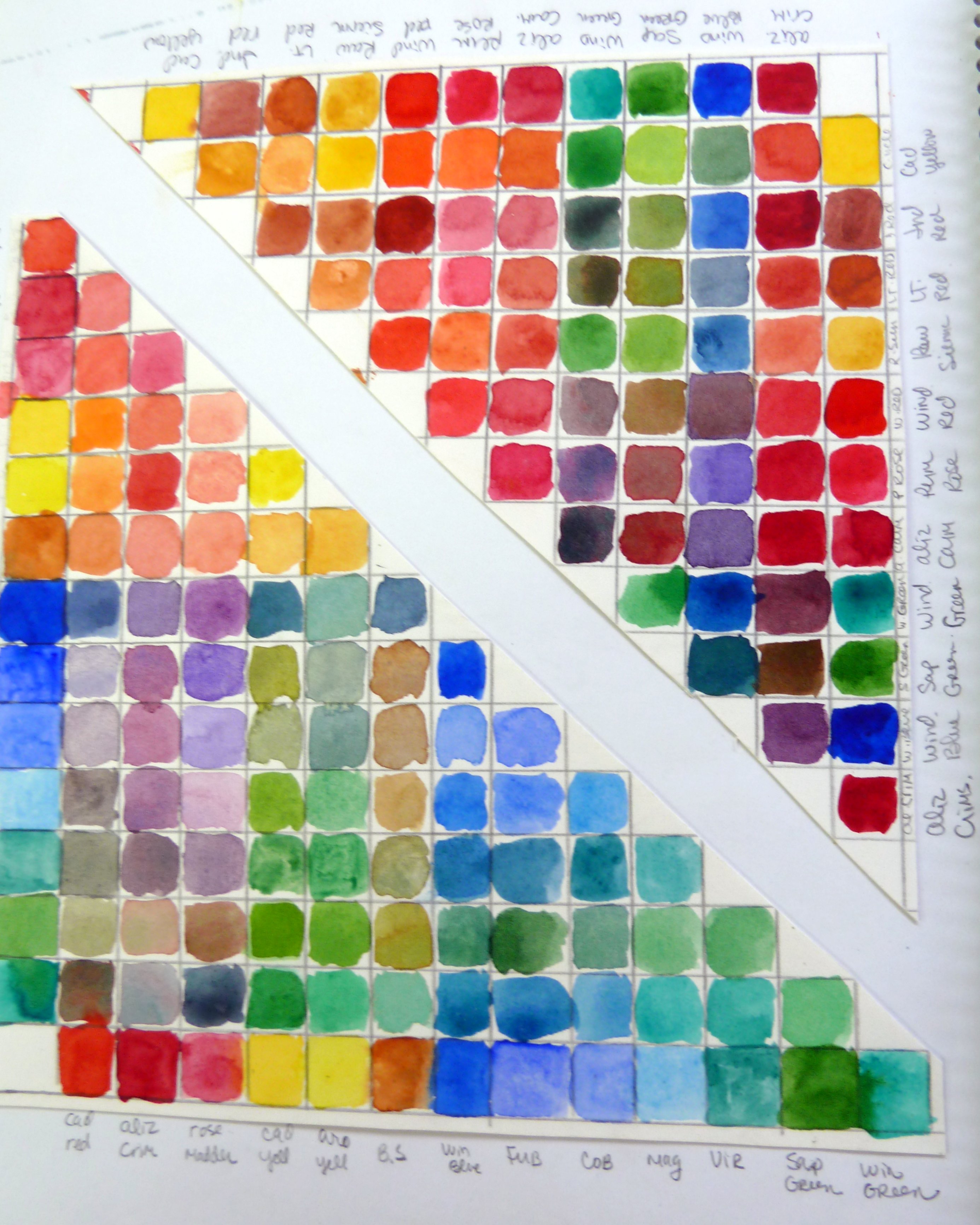
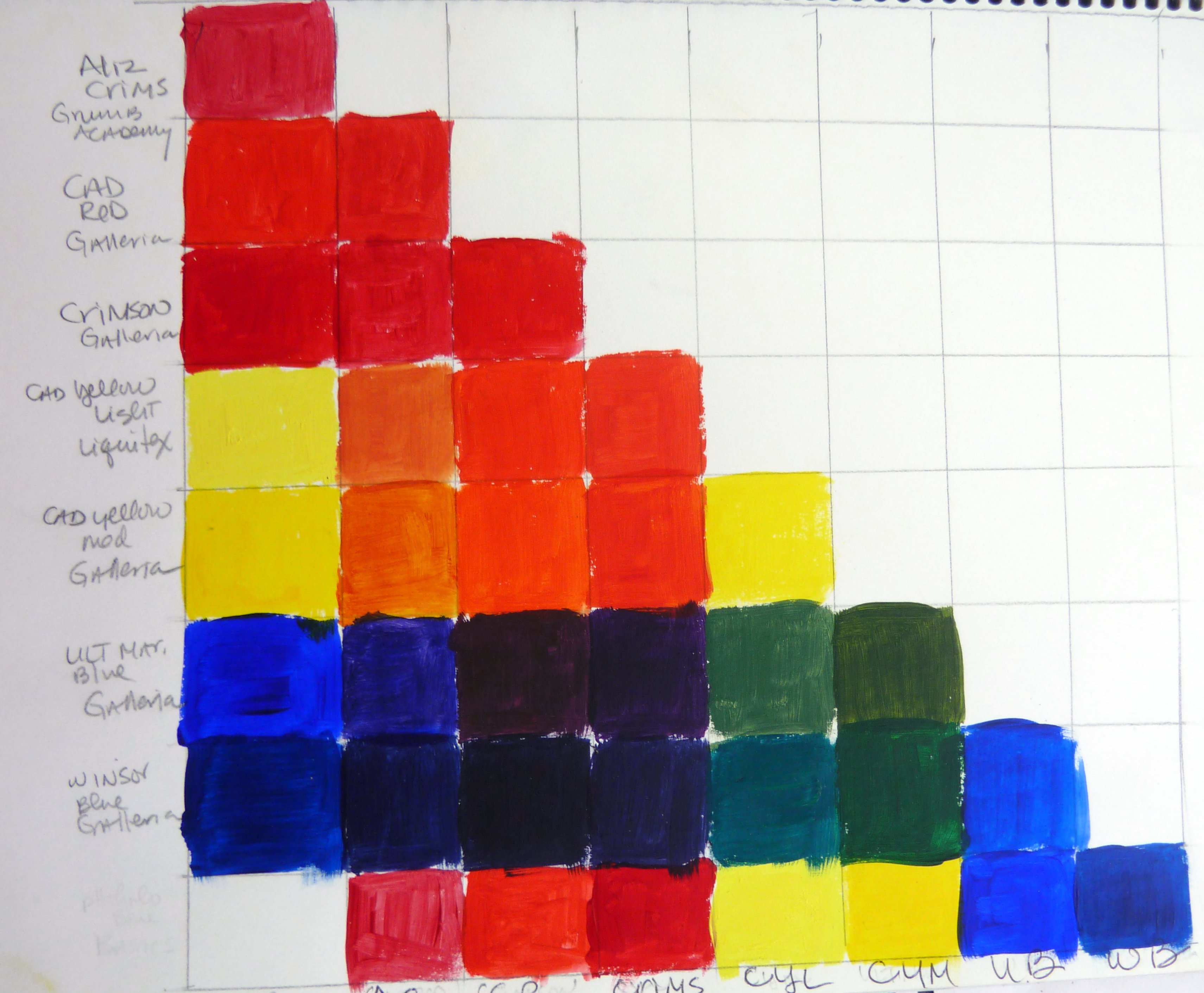
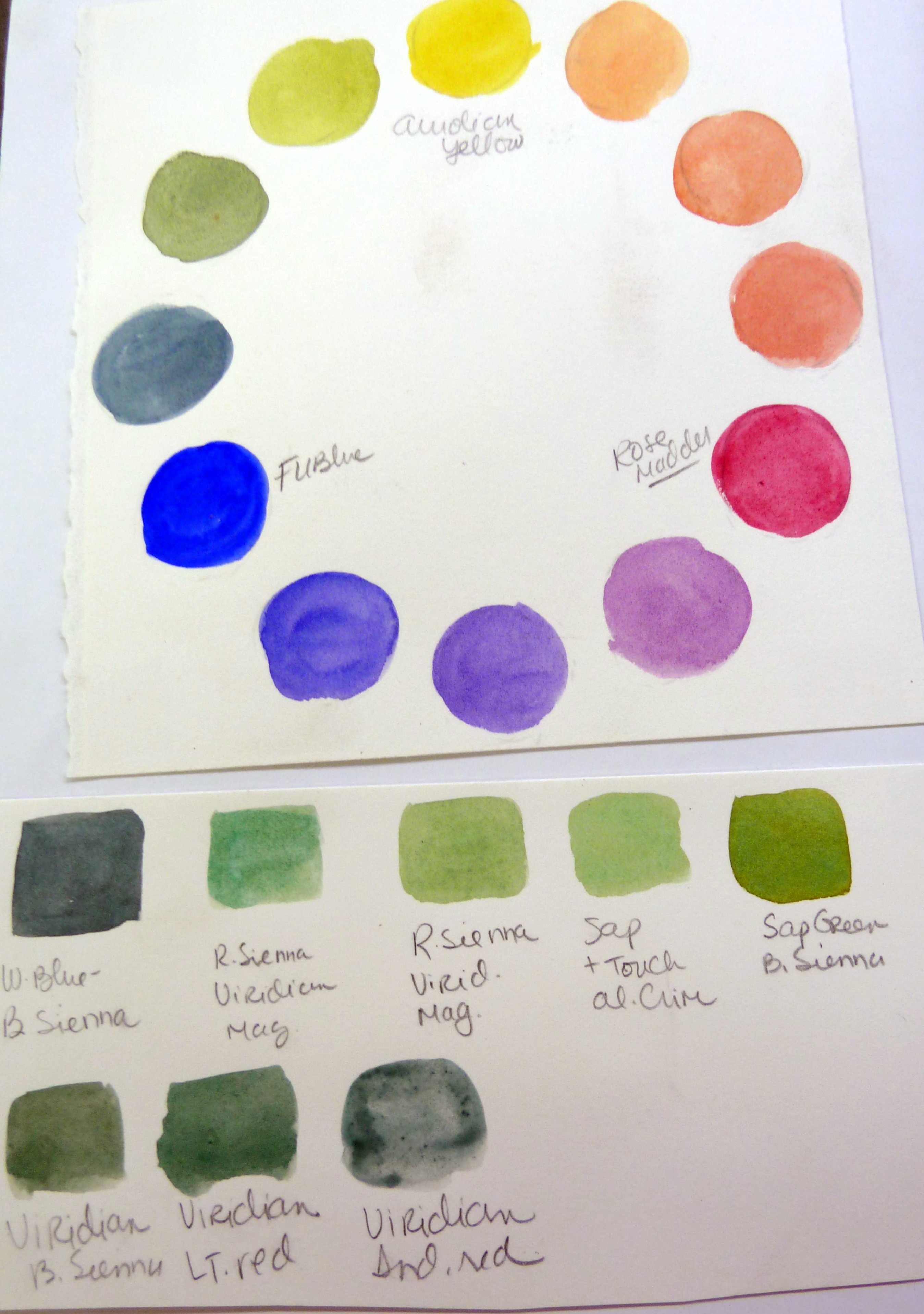
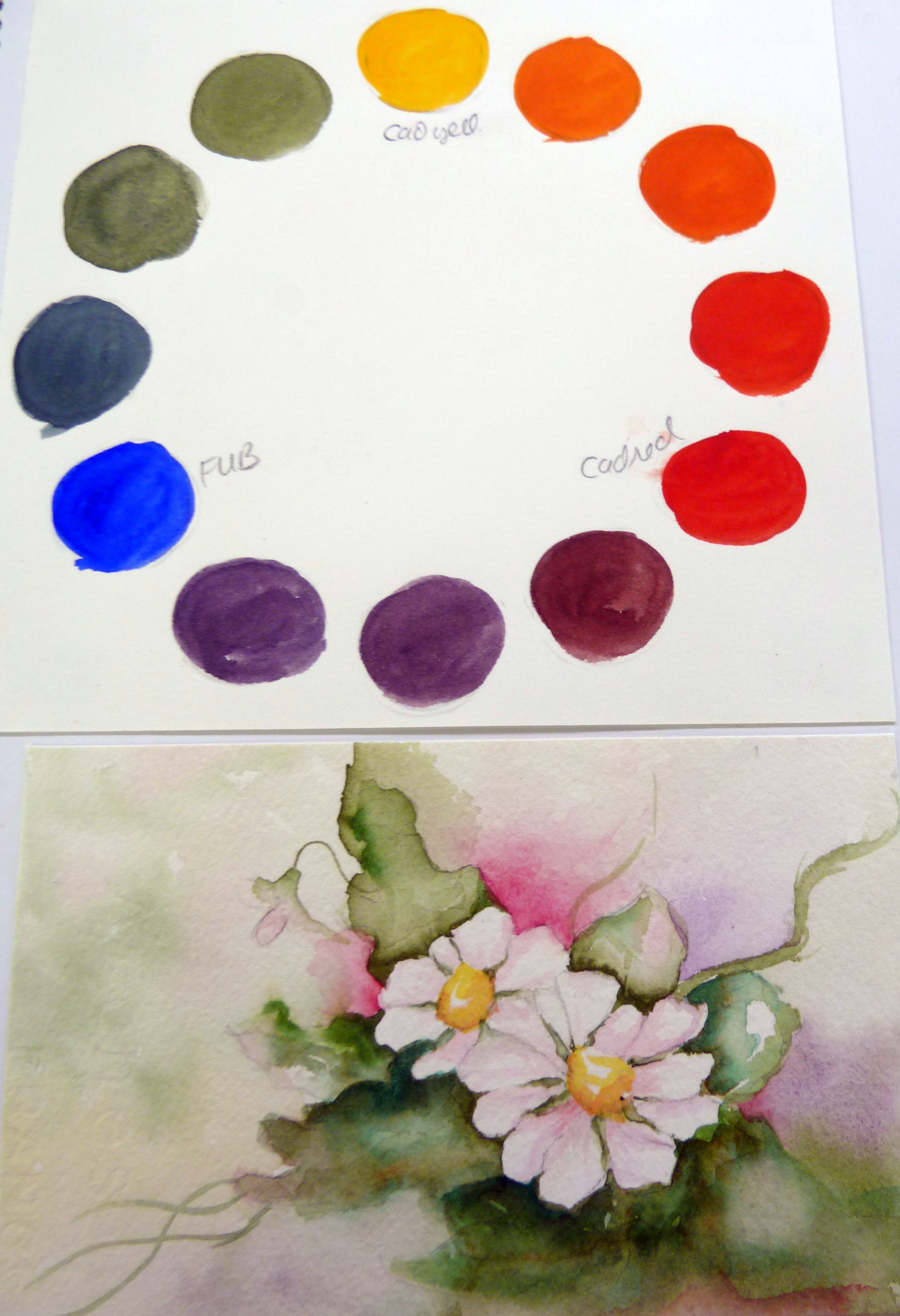
A rainbow lives in our mixed media art supplies and we will be better artists if we learn how to use the colors effectively. Even though there are few guidelines for the mixed media genre of artistic expression , we will have greater success with our art if we become acquainted with our materials.  Over the years I have taken numerous classes in watercolor, acrylics, and oil painting. In each of these classes I have been encouraged to create color wheels and charts to understand how variances in brands of paint can give different results.   I have also found the same to be true with many of the mediums used in my Mixed Media artwork.

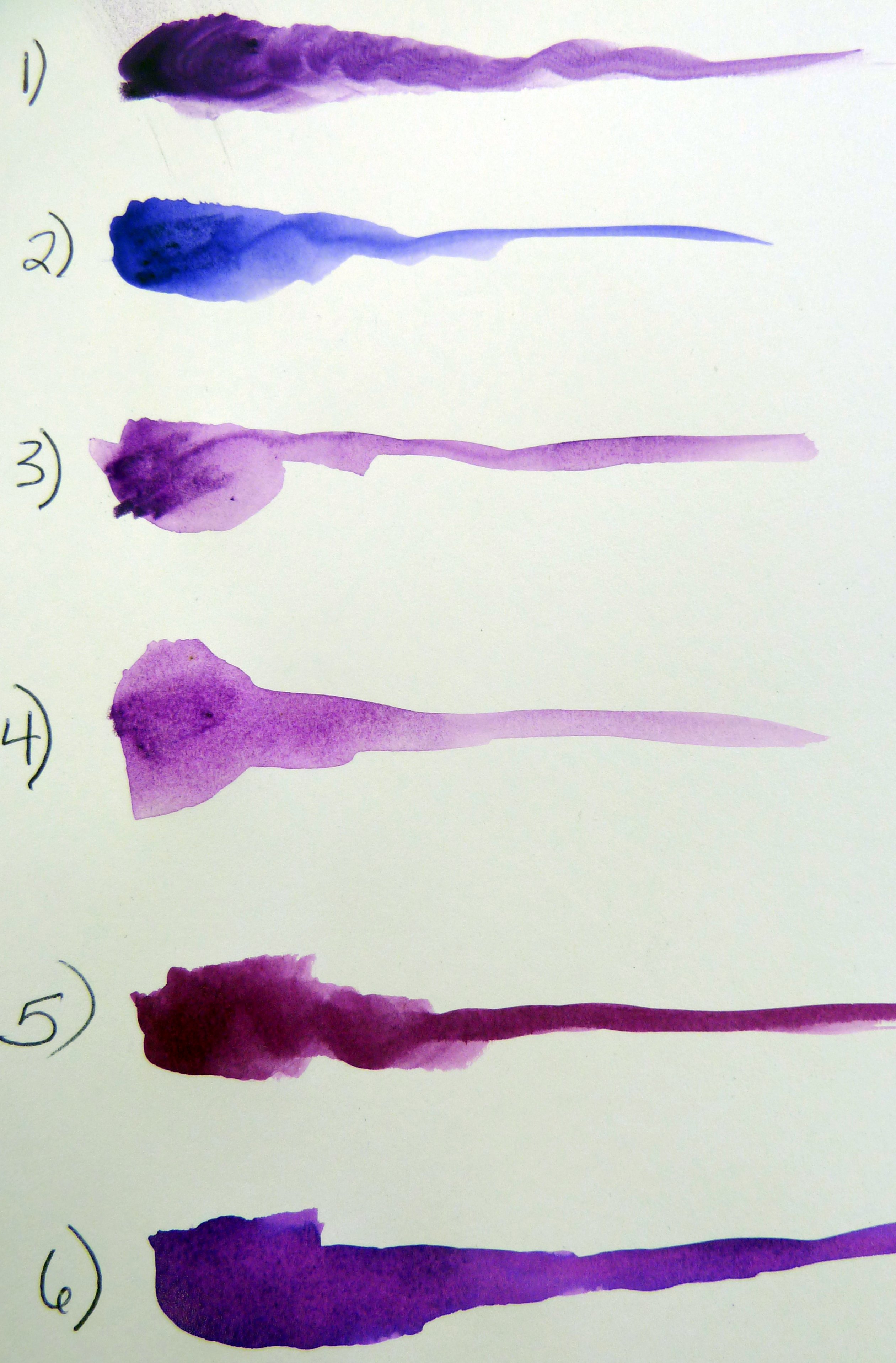
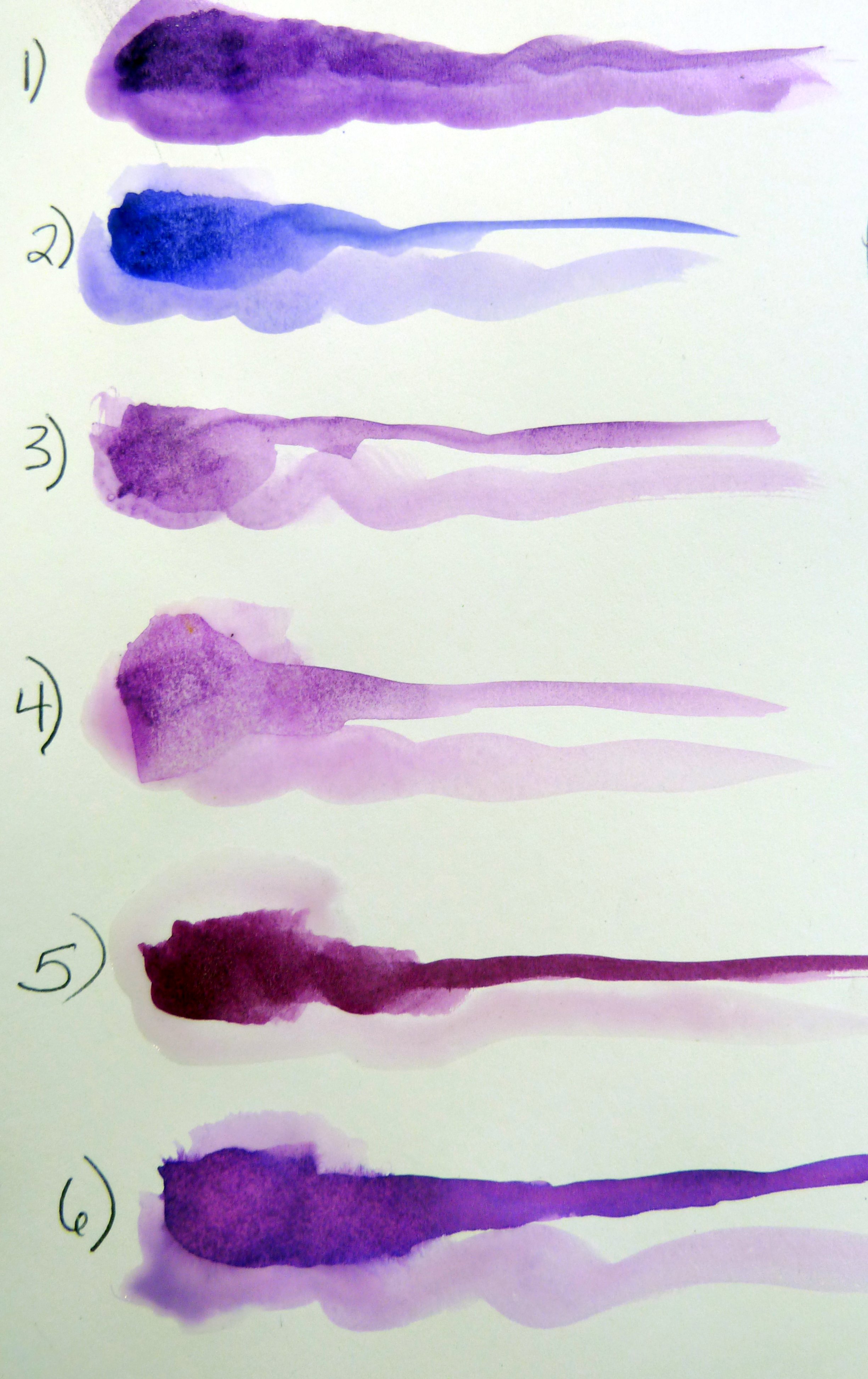
The below photos illustrate the opacity and intensity of the following brands and products.

1) Derwent Inktense Block

2) Derwent Inktense Pencil

3) Derwent Watercolor Pencil

4) Caran d’Ache Neocolor II Aquarelle Artists’ Crayons

5) Liquitex Ink

6) Dylusion Ink Sprays

Tamara Dinius has fun with colour and her Derwent Inktense blocks

First wash of water. The vibrancy of the Derwent Inktense Block is the most intense while the Caran d’Ache does not retain as much of its vibrancy.

Tamara Dinius has fun with colour and her Derwent Inktense pencils

Second wash of water. Again the Derwent Inktense Block retains the greatest intensity. The information received from this will help to determine what product will give the result we are looking for.

Tamara Dinius has fun with colour and her Derwent Inktense blocks and pencils  (your preferred palette of colors)

Tamara Dinius has fun with colour and her Derwent Inktense blocks (Primary colors)

Creating a swatch chart using preferred colors and brands of paint can also assist the mixed media artist. It is far easier to view your swatch chart when looking for a particular green than it is to mix and remix your paint.

Tamara Dinius has fun with colour and her Derwent Inktense blocks

This color wheel has been created using primary colors of designated paint brands.

Tamara Dinius has fun with colour and her range of paints

A floral painting and the associated color wheel.

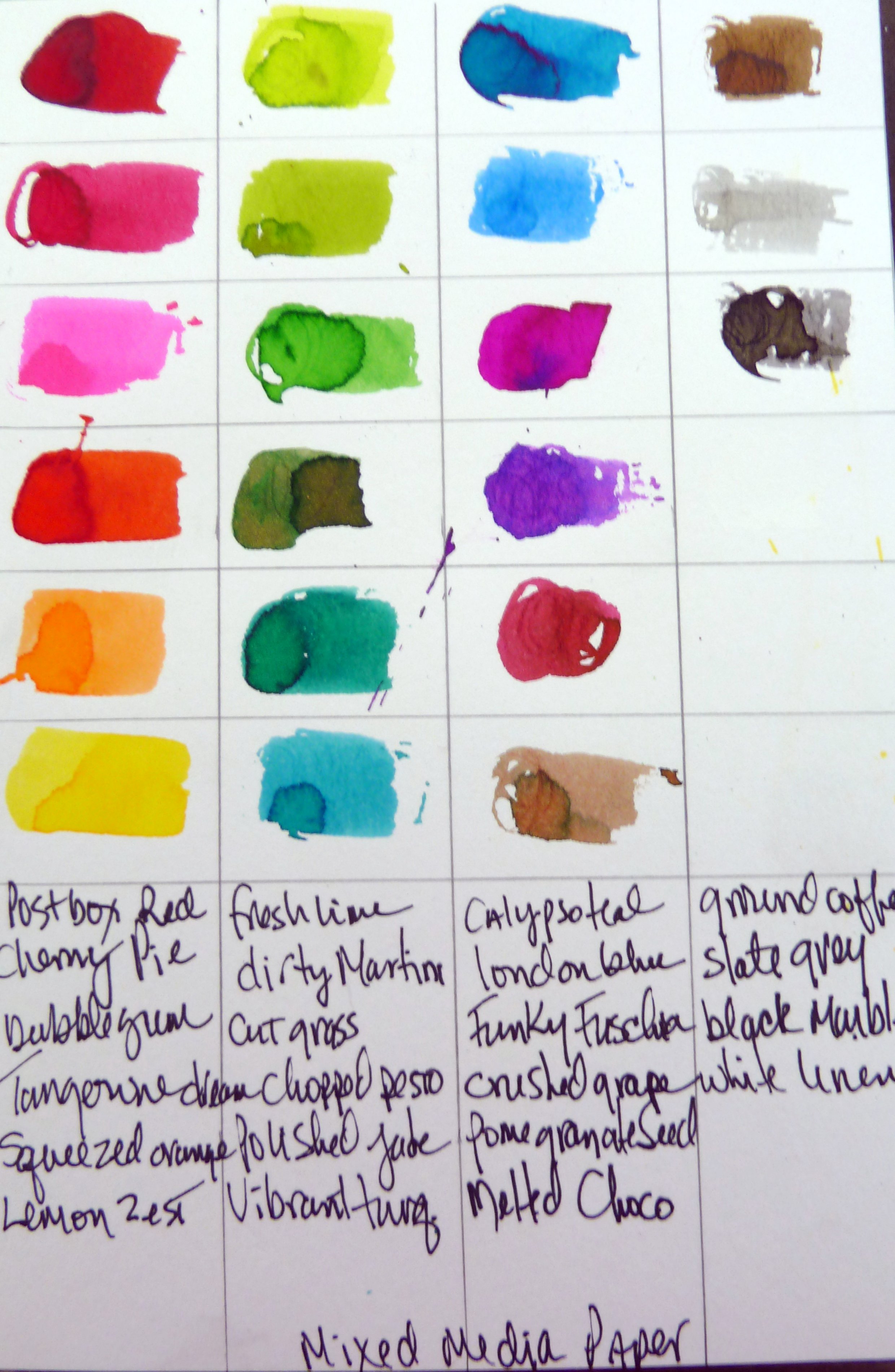
Tamara Dinius has fun with colour and her paints on plain mixed  (Plain Mixed Media Paper)

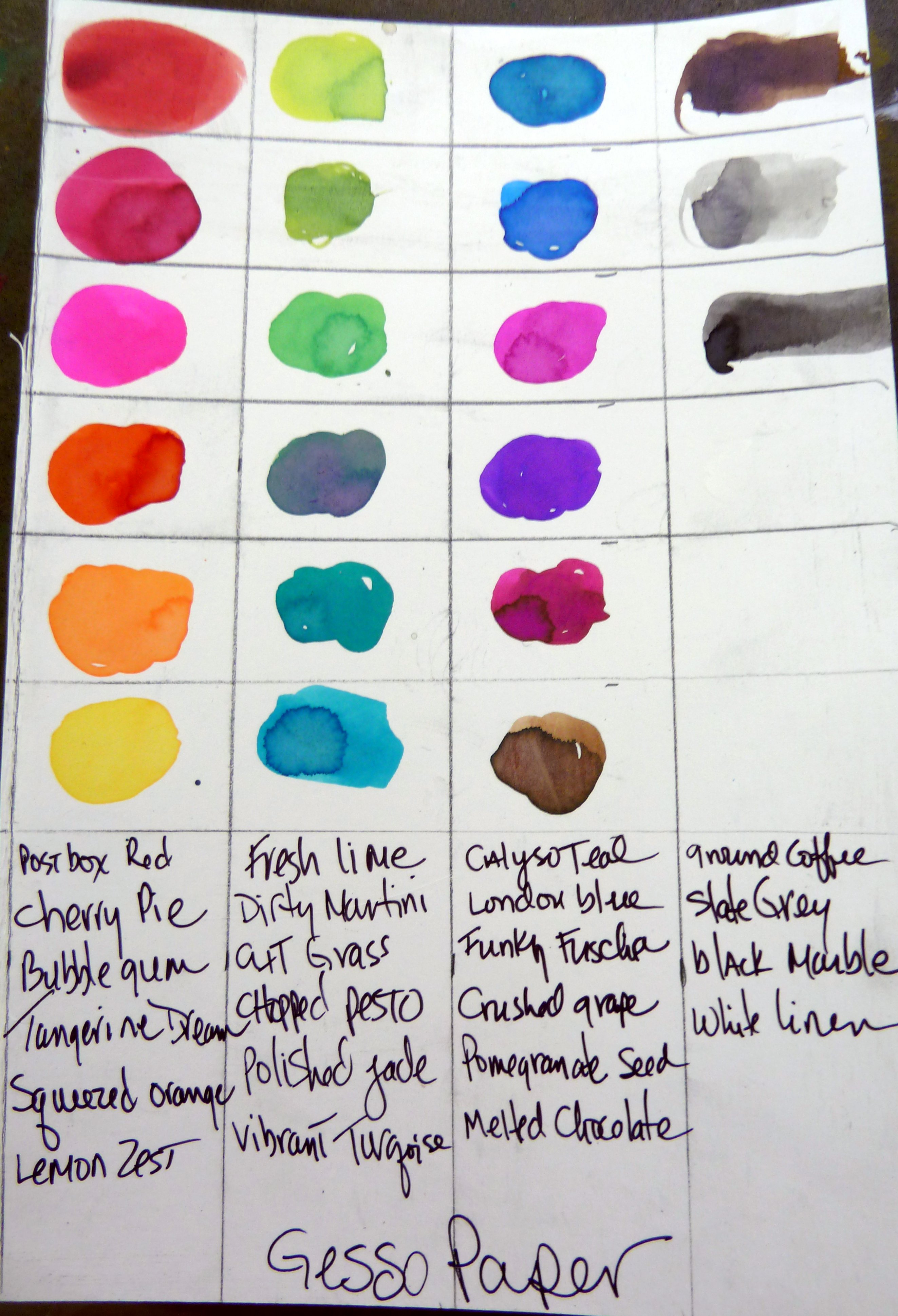
Tamara Dinius has fun with colour and her paints on mixed media paper with gesso (Mixed Media Paper with Gesso)

I recently completed a chart of Dylusion Sprays on plain mixed media paper and another one that was coated with gesso. It was surprising to see the difference in intensity on the two separate pages.  It is quite noticeable with the Lemon Zest and Chopped Pesto.

I encourage mixed media artists to create color wheels and charts of their products. Not only will this assist you when creating your art, but if you take it with you on your shopping trip it may also eliminate duplicate purchases.

~*~*~*~*~*~*~*~*~*~*~*~*~*~*~*~*~*~*~*~*~*~*~*~*~

Tamara Dinius lives in the Pacific Northwest with her husband and chocolate lab. She has two grown daughters who make her life meaningful. They support her, ground her, embrace her, and are amazing people in their own right.

Her love for mixed media has taken over most aspects of her creative journey. She believes mixed media allows for a broad range of styles and anyone can find success in this form of artistic expression.

You can find more of Tamara’s work, and on her website www.countrycraftersusa.com or via her Facebook

~*~*~*~*~*~*~*~*~*~*~*~*~*~*~*~*~*~*~*~*~*~*~*~*~

.

.
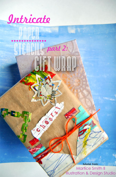
Intricate Paper Stencils, PART 2: Gift Wrap

This article was written by Martice Smith II

Martice Smith II demonstrates how to make your own gift wrap using intricate, paper stencils

Make the stencils, first! PART 1 of this tutorial can be found here.

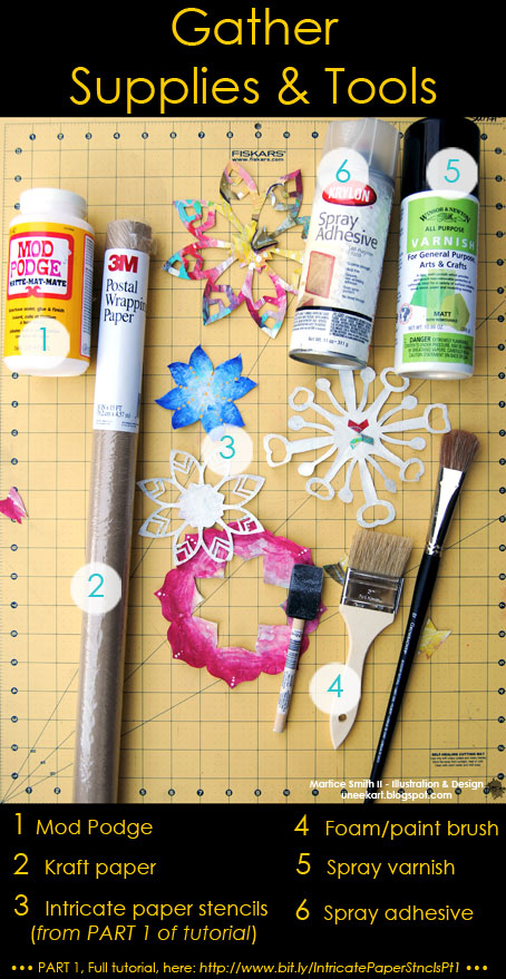
Gather Supplies & Tools

Gather supplies and tools

If you have used watercolors, water-soluble pencil or any other water-based mediums on the stencils you created, go ahead and spray 1-2 light coatings of varnish (matte or gloss; it’s your choice) to seal everything in and to prevent bleeding or mixing of colors on your stencils.

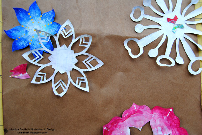
1. Position stencils onto kraft paper 

Position stencils onto kraft paper

Unless your stencils are very large, there’s no need to work on large areas for this step. You will be able to control your work surface much easier if you’re able to work in manageable sections, at a time.

Try a layered look by overlapping the stencils.

Don’t clutter too many of your intricate paper stencils in one area. It’s ok to leave some larger areas of kraft paper!

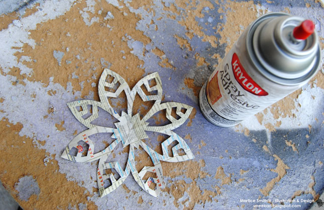
2.  Apply spray adhesive

Apply spray adhesive

Do this step outdoors, as the fumes are very strong and can be harmful or cause irritation to eyes and throat.

On a separate work table, turn over 2 or 3 stencils so that the ‘wrong’ side (the side with no paint) is facing up. Spray each stencil, individually, with an even layer of adhesive. (Sometimes, I allow the spray adhesive to sit on the stencil for about 3 seconds. This will create a stronger bond to the paper.)

Gently place the stencil onto the kraft paper.

Use light pressure from the palm of your hand of fingers to flatten the raised areas of the stencil.

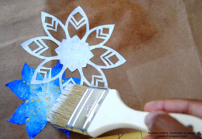
3.  Brush on decoupage medium

09May_MFS_IntricatePaperStencils_PART2_GiftWrap-Pic5

Take your large, bristle brush or a foam brush and generously apply Mod Podge® directly to the stencils.

Depending on the design and delicacy of your paper stencil, spread the Mod Podge®, working from the center, then out to the tips.

4.  Let dry, then trim excess

This step is very important! You need to allow the Mod Podge® to dry completely.

Drying time will vary, depending on how many layers you applied, but a good 15 minutes should be fine.

TIP: If any of your stencils are extending beyond the kraft paper, use scissors to cut off the excess. (Yes, you can use these pieces, too! Go ahead and glue them down.)

5.  Repeat or re-roll

If you like what you see so far, continue adding more of your intricate paper stencils.

When you are done, you can cut off what you need to wrap a package or you can re-roll the kraft paper until you’re ready to start again, later.

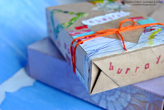
Now go wrap some gifts!!

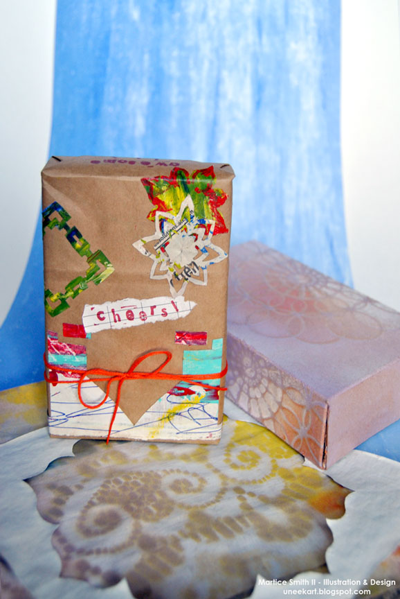
Now you're ready to wrap some gifts!

Now you're ready to wrap some gifts!

Great for mail art packages, too!

Would you like to try 10 more stencil designs? If you’re interested, you can sign up to receive “10 NEW Intricate Paper Stencil Designs”, a free e-book that showcases more of these stunning designs…click here to sign-up to the Uneek Art Letter to get access to download this pdf! (Courtesy of Martice Smith II – Illustration & Design Studio)

~*~*~*~*~*~*~*~*~*~*~*~*~*~*~*~*~*~*~*~*~*~*~*~*~

Author bio:

Mixed-media illustrator and designer Martice Smith II

Martice Smith II is creative director of Martice Smith II – Illustration & Design Studio, based in Kansas City, Missouri and owner of Uneek Art Boutique. She established herself as a freelance Illustrator and graphic designer after receiving her Bachelor of Arts Degree.

Martice also contributes as an article writer for the Creating Mixed Media Art website.

You can see more of her work via her Facebook page or her blog. She invites you to join her monthly newsletter, Uneek Art Letter, for art biz tips, advice and free digital goodies!

~*~*~*~*~*~*~*~*~*~*~*~*~*~*~*~*~*~*~*~*~*~*~*~*~

.

.