Michelle G Brown | Mixed Media Art

Radiant Neon Ink with Delicata Ink

~ * ~

This article was written by Melanie Statnick

Radiant Neon ink pads, created by Imagine Crafts, are bright, bold and juicy. They are also opaque ink and fade resistant and can be embossed.
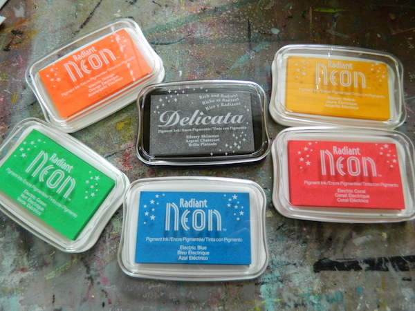
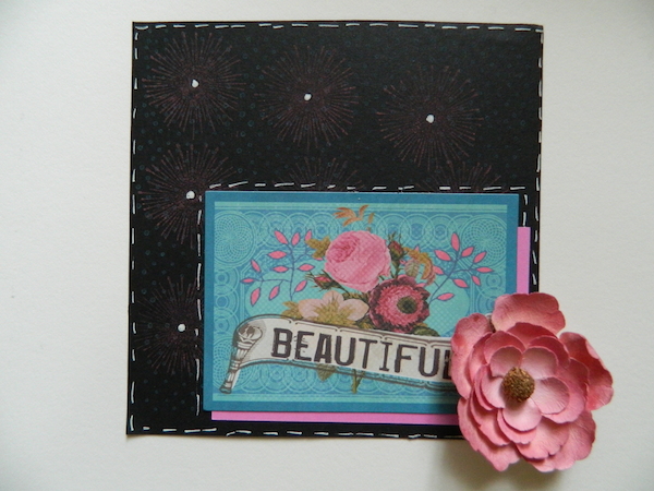
Stamping with Radiant Neon inks

Stamping with Radiant Neon inks

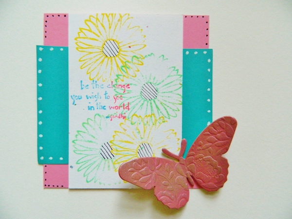
I created a few cards with them on white and black card stock to show how the neon ink affects different backgrounds. Personally I’m a fan of the neon on the white the best.
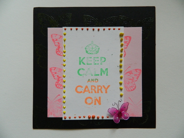
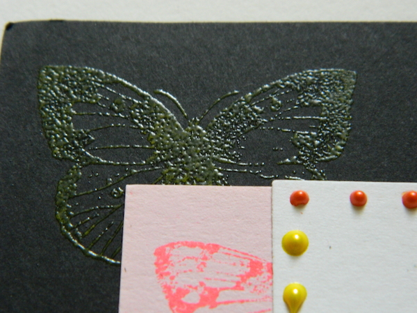
Stamping with Radiant Neon inks

Stamping with Radiant Neon inks

Stamping with Radiant Neon inks

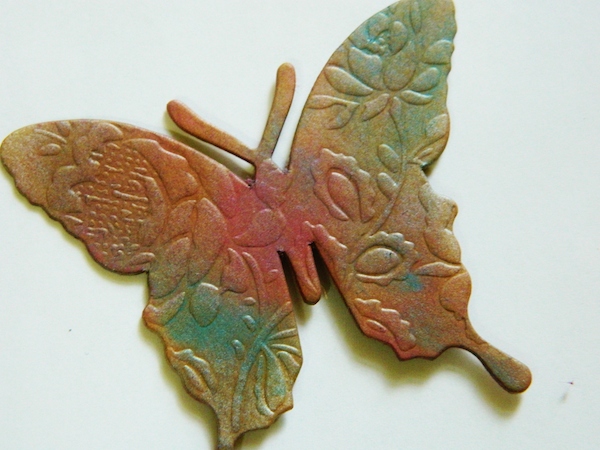
Radiant Neon ink colors can be blended together. I wanted to see how brilliant the silver looks of the Delicata ink pad. I used some chip board pieces and added the radiant neon ink in my favorite colors and then blended the silver ink over top. Do this while they are wet. You can use the delicate ink alone and let this ink air dry for best results.
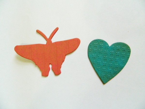
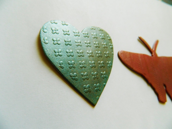
Stamping with Radiant Neon inks

Stamping with Radiant Neon inks

Stamping with Radiant Neon inks

~*~*~*~*~*~*~*~*~*~*~*~*~*~*~*~*~*~*~*~*~*~*~*~*~

Melanie Statnick is a published artist/writer out of North Carolina and you can see more of her work on her website at www.melaniestatnickart.com

~*~*~*~*~*~*~*~*~*~*~*~*~*~*~*~*~*~*~*~*~*~*~*~*~

Disclosure: These products have been provided by Imagine Crafts, for the purpose of review. All opinions are that of the MixedMediaArt team.
.

.
Painting with Dina Wakely Paints

~ * ~

This article is written by Michelle G. Brown 

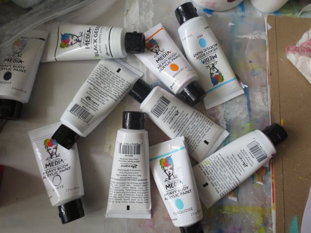
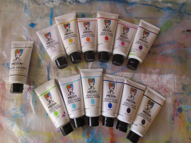
I was SO excited to get my hands on a full set of Ranger’s Dina Wakely paints – all 12 of them, plus her black gesso. I just love seeing all of the colours together! Pretty as a rainbow.

Set of 12 Dina Wakely Paints

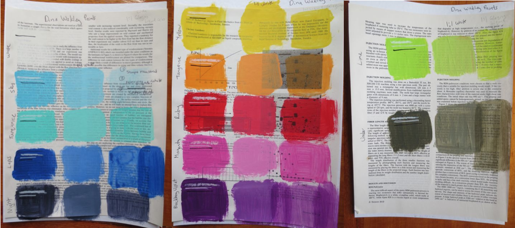
I made sample swatches to see the colour and how opaque the paints are. Then I mixed each colour with the white from the range (about 1:1 ratio) and also with an acrylic glazing medium (also about 1:1 ratio) and added those to the swatch pages.

Set of 12 Dina Wakely Paints on ephemera

The names of the colours are:

Page One: White, Sky, Turquoise, Lapis and Night

Page Two: Yellow, Tangerine, Ruby, Magenta, Blackberry Violet

Page Three: Lime and Umber

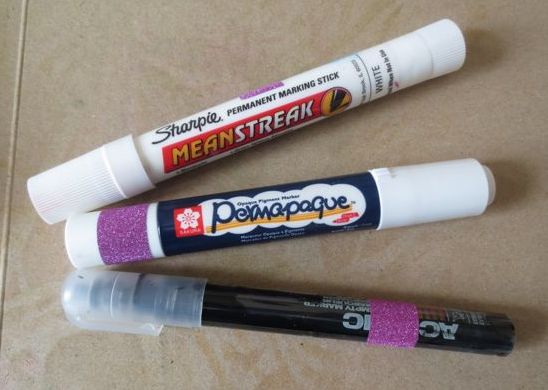
As I knew I would most likely be drawing and writing over the paints (it IS “mixed media”, after all!) I tested three markers on the swatches:

The Sharpie Meanstreak,

– the Sakura Permapaque White and

– my “Julie Prichard” Golden Black pen {Montana Marker with Golden Fluid Acrylic}

Mixed media markers

Most colours are fairly opaque and thick and luscious. When I was watching Dina playing with these paints at CHA 2014, she described them as “creamy” and I would have to agree.

Mixed media artist Dina Wakely

Dina talked about choosing her favourite colours; some bright and some serious. And about the importance for having her paints in tubes to make them easier to apply and close the lids with one hand, as Dina lives in Arizona, where it gets HOT and paints dry out!!

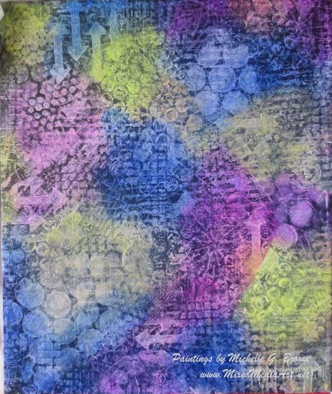
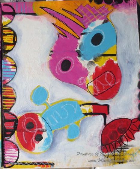
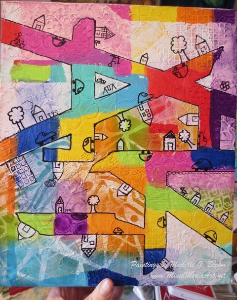
In the wake of my inspiring week at Art Is You Melbourne, I wanted to continue to play my new Dina Wakely paints in the styles of the two artists I had taken classes with; two artist with two very styles styles.  And then I wanted to have a play in my own style. Here are the three canvases to show you the diversity of these paints.

Seth Apter Style

Set of 12 Dina Wakely Paints on ephemera

If you would like to learn more about Seth Apter’s painting, you can find him at The Altered Page.

Kecia Deveney Style

Kecia Deveney mixed media artist

To learn more about Kecia, you’ll find her at Lemoncholoy’s Flight of Fancy.

Michelle’s Style

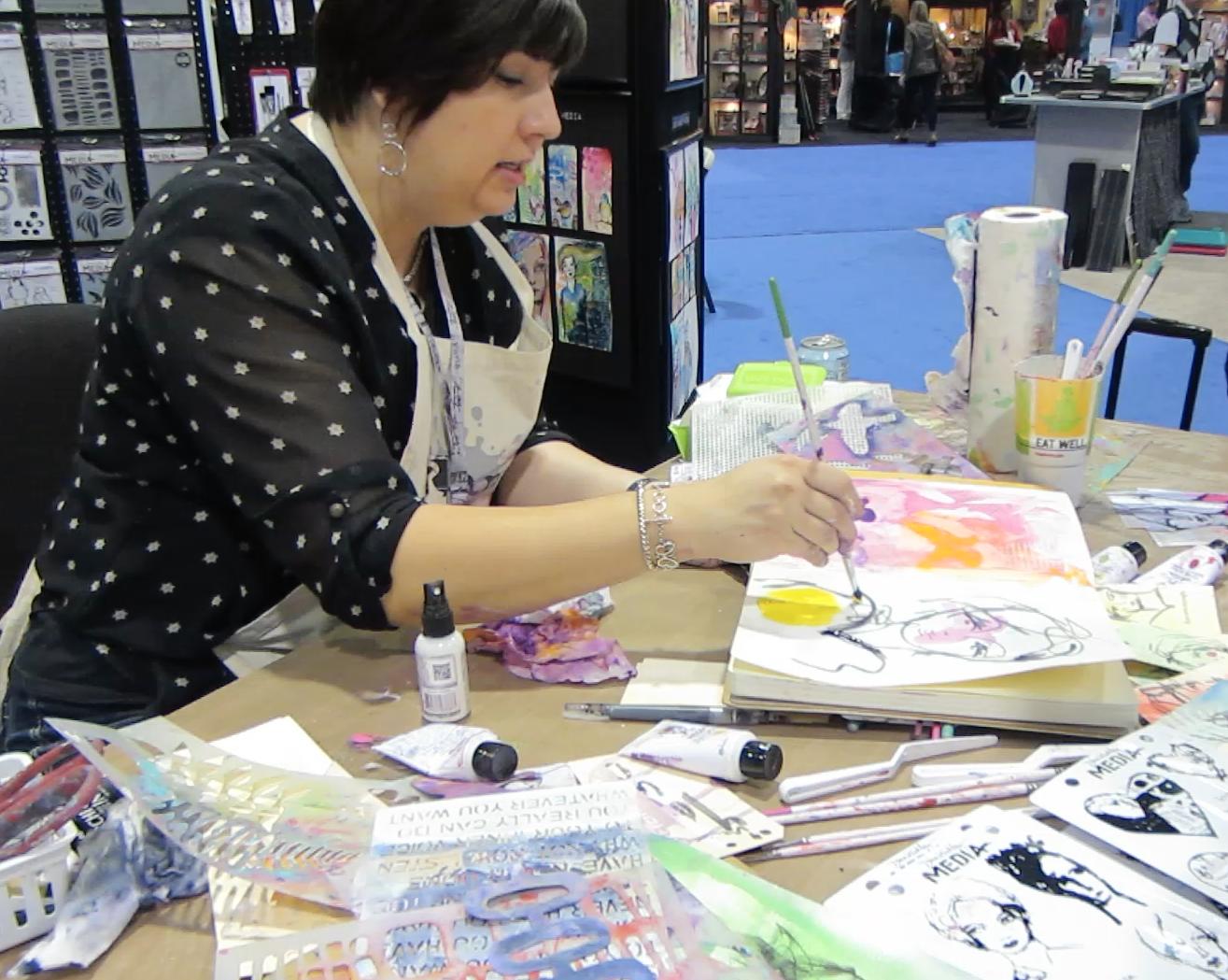
Mixed media artist Michelle G Brown

My full tutorial for this piece will be available soon!

What I like about the Dina Wakely paints:

– love the range of colours

– love their thickness and “open time” (longer drying time to allow blending)

What I don’t like about the Dina Wakely paints:

– my only gripe is not about the paints but the packaging: when these paints lie on the table, the back side of the label don’t show what colour it is. I found it frustrating to have to pick up a few tubes before I found the colour I was looking for. I’m sure this could be fixed by continuing the band of colour on the front of the label onto the back, making it easier to see which colour is which when they are all spread out.

Set of 12 Dina Wakely Paints

– also I’d like a few more colour, especially a medium shade of green; the LIME is divine but I need a darker green too! And maybe a “nice” brown and beige!

Overall conclusion:

*LOVE* these paints and will continue to play with them, and most likely buy some more. I hope there will be more colours out too. They are a great quality paint for a reasonable price – I have bought [italic] them AND used [italic] them, so that’s a great endorsement from me! (Who will often buy expensive materials and then not use them for fear of “wasting” or “ruining” them!)

Happy creating,

Michelle

~*~*~*~*~*~*~*~*~*~*~*~*~*~*~*~*~*~*~*~*~*~*~*~*~

Michelle G. Brown is passionate about mixed media art and enjoys sharing her knowledge and techniques with you to allow you to express your own creativity. Michelle understands that many of us have an inner need to create. By learning a few basic techniques the amazing world of mixed media art is accessible to everyone!

Michelle lives with her husband and two boys in Melbourne, Australia.

~*~*~*~*~*~*~*~*~*~*~*~*~*~*~*~*~*~*~*~*~*~*~*~*~

.

.

Studio Tables Revealed

This article is written by Michelle G. Brown

Seth Apter, Mixed Media Royalty and All-round Nice Guy, is exposing our Studio Tables – you can see tables from around the world here: Studio Table: The Reveal.

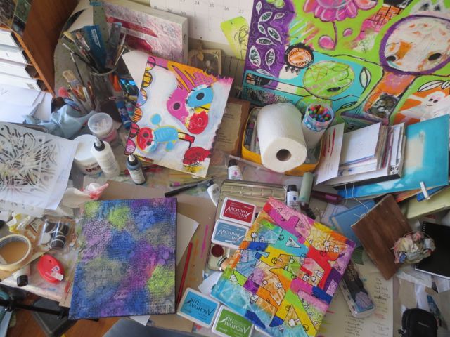
And here’s my table / desk:

Michelle shows off her studio table

I am slightly horrified that I can see (at least) six projects that are currently being worked on. I’m playing with the Ranger Dina Wakely paints and working on three canvases to show three different styles across the range of colours. You can read about my play with the paints here: Painting with Dina Wakely Paints!

I am pleased that it’s colourful! And proof that lots of creating has taken place this week. (And I haven’t left any paint brushes sitting in water overnight!)

Thanks for stopping by! Happy Creating!

~*~*~*~*~*~*~*~*~*~*~*~*~*~*~*~*~*~*~*~*~*~*~*~*~

Michelle G. Brown is passionate about mixed media art and enjoys sharing her knowledge and techniques with you to allow you to express your own creativity. Michelle understands that many of us have an inner need to create. By learning a few basic techniques the amazing world of mixed media art is accessible to everyone!

Michelle lives with her husband and two boys in Melbourne, Australia.

~*~*~*~*~*~*~*~*~*~*~*~*~*~*~*~*~*~*~*~*~*~*~*~*~

Good Design and Composition for Mixed Media Art

~ * ~

This article is written by Marilyn Harris Mills

What is considered good design and good composition?

A greatly debated subject for sure….some consider design to be innovative, cutting edge while others consider good design to evoke emotion with a concentrated colour palette. Who really knows what good design is? Perhaps a subjective matter.

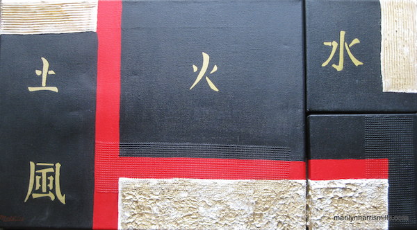
Good Design and Composition for Mixed Media Art

However we judge a good art piece, there are some elements and principles which define a good painting. Whether we design from using our imagination or design from a photograph of our own, some key factors should be considered and applied. You have to teach yourself the basic rules, apply them and then once you’re very knowledgeable then you may go ahead and become creative developing your own style.

The elements of design are the visual elements or tools you use to compose and design. The principles tell you how to use and combine these elements. They help you to organize your composition.

Elements of Good Composition

Let’s first look at the elements of a good composition. These elements should be applied for each painting, whether we are using watercolours, pencils, charcoal or mixed media. Without these elements, our painting is rendered something other than a work of art.

1) Line

Using the correct line within a painting sets the tone of the art. Horizontal, vertical and diagonal, straight, curved, thick or thin can be used. Lines move the viewer into, around and out of your painting. They lead the viewer’s eye and direct it to the center of interest. Using curvy lines will create a more relaxed and casual tone….do we want to stand up and shout or sit and be quiet?! Lines will set the tone. ie think dog fur and the type of breed. A short wiry fur similar to a jack russell fur certainly would look funny on an English sheep dog. In this example the fur compliments the dog breed.

2) Shape

Think small, medium or large for variety. Same sized shapes would be boring. Shapes are organic or geometric. Usually both are included in a painting. Organic shapes are curved, irregular and have a natural feel to them. Geometric shapes are triangles, squares, rectangles and circles. You can paint the shapes either positively, by painting the actual shape or negatively, by painting the space around them. Usually both types of shapes are included into a painting with one being more dominant than the other.

3) Space

Shapes fill spaces. A canvas is a shape itself. You fill this space with shapes to create your painting. The shapes or objects are positive space and the space between and around these shapes or objects is negative space. Both are important. Using shape creates depth in a painting by overlapping them or weaving them together, or laying them side by side. Designing a painting is like putting together a puzzle to create an entire painting.

4) Form

When you draw a circle, once you add form and give it dimension the circle becomes a sphere, a square becomes a cube. So too must you give the objects in your painting, form to achieve dimension. In still life paintings, a direct source of light provides shadows and highlights giving it dimension.

5) Colour

Use a colour wheel if you’re first beginning. Learn about what colours go with each other ie red and green or using a yellow with a purple makes the painting pop. Once you’ve acquired a basic understanding, colour theory courses are a must for the serious artist. The thought by many is that colour is the first design element a viewer will notice and/or remember. Colour speaks first in a painting some say. On the other hand, some may disagree, you’ll need to judge for yourself. If your taste is for pastels, then a bright red incorporated into the canvas will set forth a jungle of nerves for you.

Using colour can make or break a design. If the colours used don’t work together, then forget your whole art piece….another one for the yuck bin. When colours are in competition with each other…they tend to scream at you. When the colours do work together, you’re at peace with the painting.

6) Texture

I love creating texture in a painting and often I find this is the easiest element to achieve. Texture can be actual or perceived. Texture refers to the surface appearance of the objects in the painting. Are we wanting to create a smooth velvety surface such as a piece of satin cloth or a rough aged piece of driftwood or even the skin of an elephant? Texture is fun because it creates excitement, interest in your painting…dynamics is the word I like to use to describe texture. However, don’t use too much texture in a painting, you can over do it!

Stay ARTistically Inspired.

Read Part Two: 6 Principles for Composition in Mixed Media Art

Read Part Three: Composition for Mixed Media Art

~*~*~*~*~*~*~*~*~*~*~*~*~*~*~*~*~*~*~*~*~*~*~*~*~

Marilyn Harris Mills, aka Maer, is a Published Artist, Teacher and Designer, in Ottawa Canada.

You can read about Marilyn at Maer’s Muses. Her art has been published in “Creating Time: Using Creativity to Reinvent the Clock and Reclaim Your Life”

“I work in whatever medium likes me at the moment”-Mark Chagall

~*~*~*~*~*~*~*~*~*~*~*~*~*~*~*~*~*~*~*~*~*~*~*~*~