Radiant Neon Ink with Delicata Ink

~ * ~

This article was written by Melanie Statnick

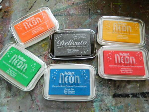
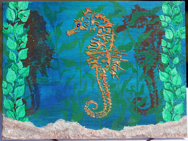
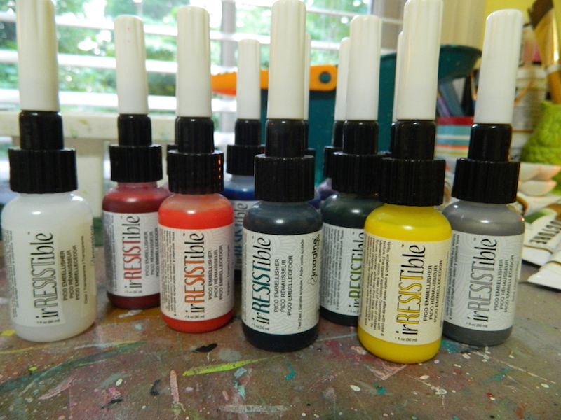
Radiant Neon ink pads, created by Imagine Crafts, are bright, bold and juicy. They are also opaque ink and fade resistant and can be embossed.

Stamping with Radiant Neon inks

Stamping with Radiant Neon inks

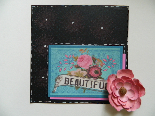
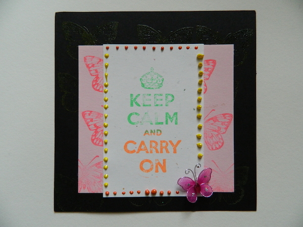
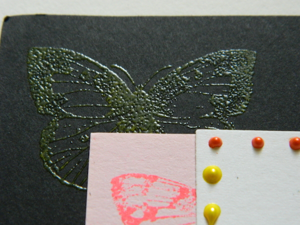
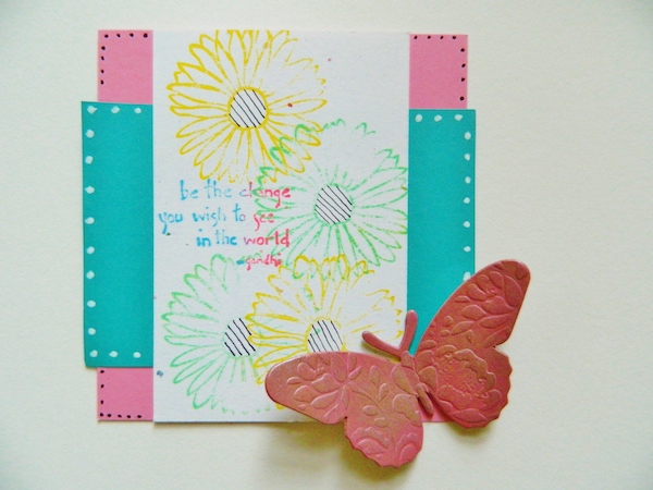
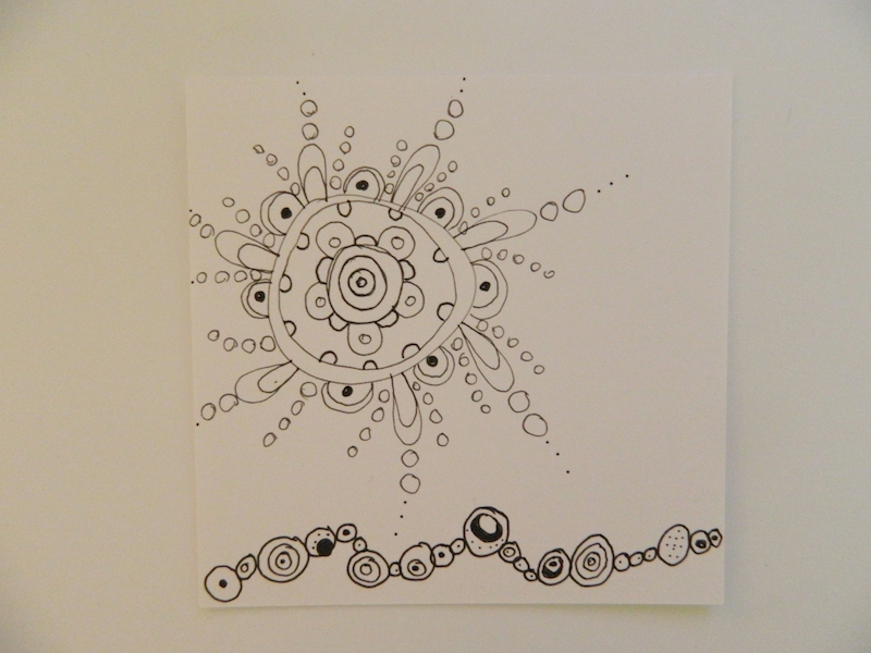
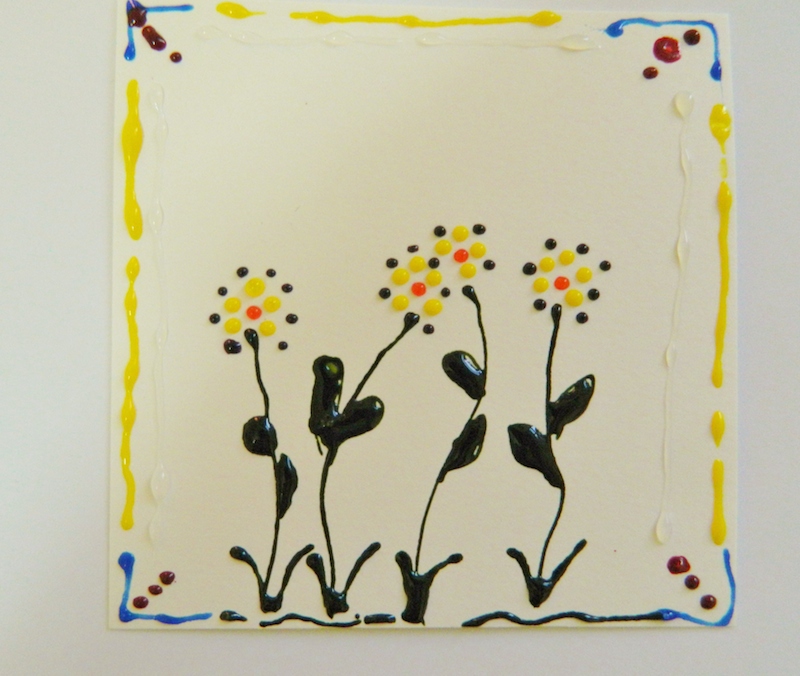
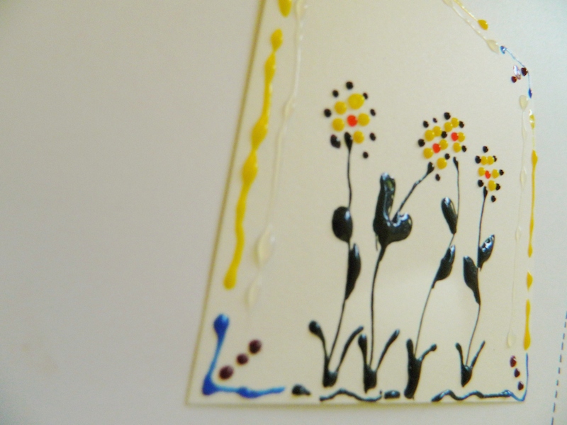
I created a few cards with them on white and black card stock to show how the neon ink affects different backgrounds. Personally I’m a fan of the neon on the white the best.

Stamping with Radiant Neon inks

Stamping with Radiant Neon inks

Stamping with Radiant Neon inks

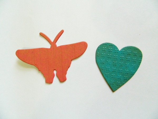
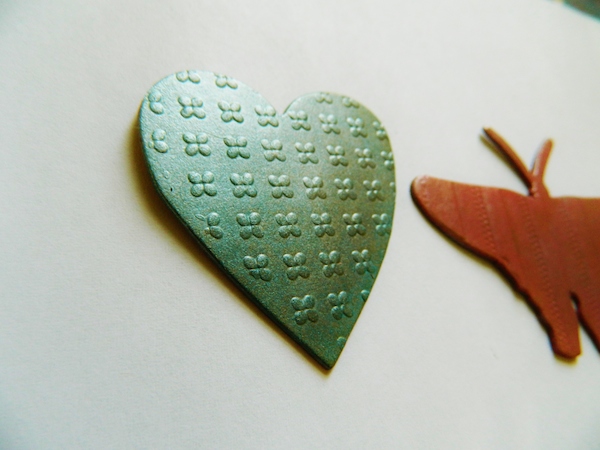
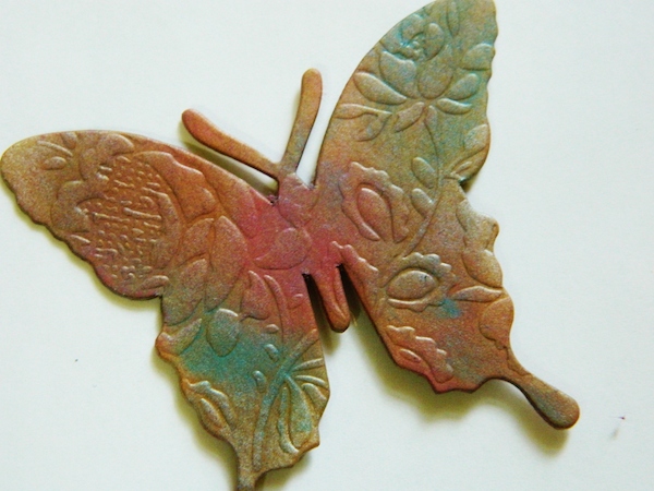
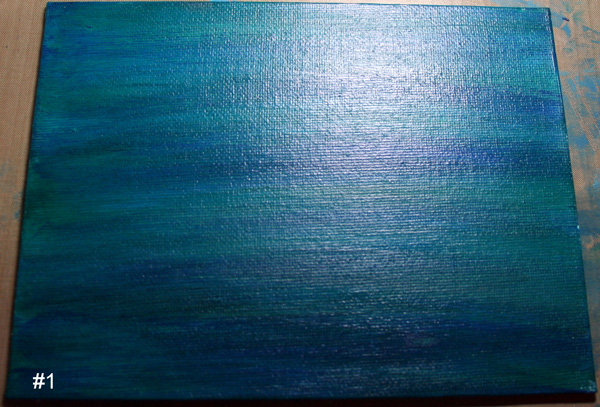
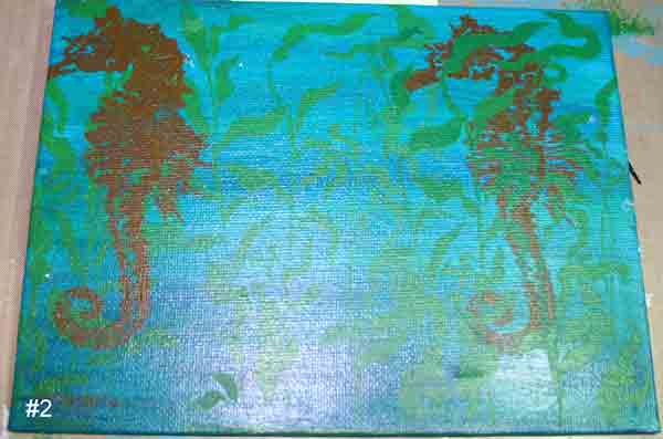
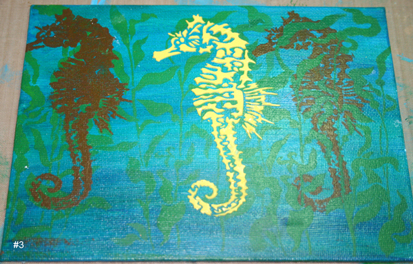
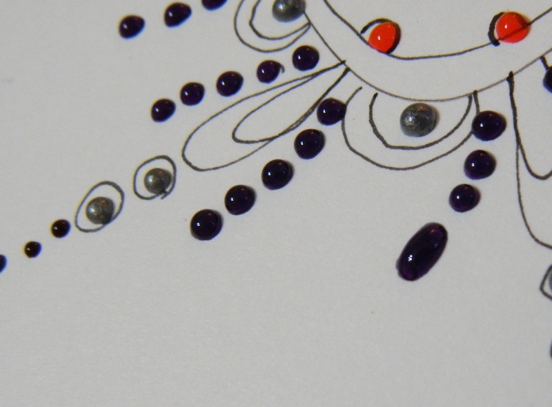
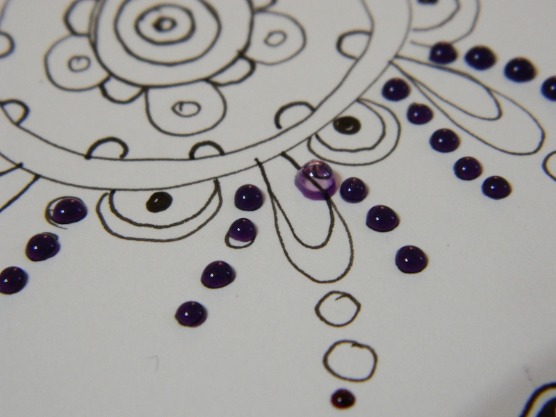
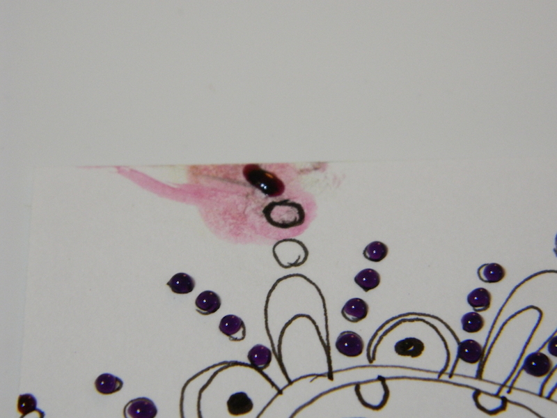
Radiant Neon ink colors can be blended together. I wanted to see how brilliant the silver looks of the Delicata ink pad. I used some chip board pieces and added the radiant neon ink in my favorite colors and then blended the silver ink over top. Do this while they are wet. You can use the delicate ink alone and let this ink air dry for best results.

Stamping with Radiant Neon inks

Stamping with Radiant Neon inks

Stamping with Radiant Neon inks

~*~*~*~*~*~*~*~*~*~*~*~*~*~*~*~*~*~*~*~*~*~*~*~*~

Melanie Statnick is a published artist/writer out of North Carolina and you can see more of her work on her website at www.melaniestatnickart.com

~*~*~*~*~*~*~*~*~*~*~*~*~*~*~*~*~*~*~*~*~*~*~*~*~

Disclosure: These products have been provided by Imagine Crafts, for the purpose of review. All opinions are that of the MixedMediaArt team.
.

.

Painting with Dina Wakely Paints

~ * ~

This article is written by Michelle G. Brown 

I was SO excited to get my hands on a full set of Ranger’s Dina Wakely paints – all 12 of them, plus her black gesso. I just love seeing all of the colours together! Pretty as a rainbow.

Set of 12 Dina Wakely Paints

I made sample swatches to see the colour and how opaque the paints are. Then I mixed each colour with the white from the range (about 1:1 ratio) and also with an acrylic glazing medium (also about 1:1 ratio) and added those to the swatch pages.

Set of 12 Dina Wakely Paints on ephemera

The names of the colours are:

Page One: White, Sky, Turquoise, Lapis and Night

Page Two: Yellow, Tangerine, Ruby, Magenta, Blackberry Violet

Page Three: Lime and Umber

As I knew I would most likely be drawing and writing over the paints (it IS “mixed media”, after all!) I tested three markers on the swatches:

The Sharpie Meanstreak,

– the Sakura Permapaque White and

– my “Julie Prichard” Golden Black pen {Montana Marker with Golden Fluid Acrylic}

Mixed media markers

Most colours are fairly opaque and thick and luscious. When I was watching Dina playing with these paints at CHA 2014, she described them as “creamy” and I would have to agree.

Mixed media artist Dina Wakely

Dina talked about choosing her favourite colours; some bright and some serious. And about the importance for having her paints in tubes to make them easier to apply and close the lids with one hand, as Dina lives in Arizona, where it gets HOT and paints dry out!!

In the wake of my inspiring week at Art Is You Melbourne, I wanted to continue to play my new Dina Wakely paints in the styles of the two artists I had taken classes with; two artist with two very styles styles.  And then I wanted to have a play in my own style. Here are the three canvases to show you the diversity of these paints.

Seth Apter Style

Set of 12 Dina Wakely Paints on ephemera

If you would like to learn more about Seth Apter’s painting, you can find him at The Altered Page.

Kecia Deveney Style

Kecia Deveney mixed media artist

To learn more about Kecia, you’ll find her at Lemoncholoy’s Flight of Fancy.

Michelle’s Style

Mixed media artist Michelle G Brown

My full tutorial for this piece will be available soon!

What I like about the Dina Wakely paints:

– love the range of colours

– love their thickness and “open time” (longer drying time to allow blending)

What I don’t like about the Dina Wakely paints:

– my only gripe is not about the paints but the packaging: when these paints lie on the table, the back side of the label don’t show what colour it is. I found it frustrating to have to pick up a few tubes before I found the colour I was looking for. I’m sure this could be fixed by continuing the band of colour on the front of the label onto the back, making it easier to see which colour is which when they are all spread out.

Set of 12 Dina Wakely Paints

– also I’d like a few more colour, especially a medium shade of green; the LIME is divine but I need a darker green too! And maybe a “nice” brown and beige!

Overall conclusion:

*LOVE* these paints and will continue to play with them, and most likely buy some more. I hope there will be more colours out too. They are a great quality paint for a reasonable price – I have bought [italic] them AND used [italic] them, so that’s a great endorsement from me! (Who will often buy expensive materials and then not use them for fear of “wasting” or “ruining” them!)

Happy creating,

Michelle

~*~*~*~*~*~*~*~*~*~*~*~*~*~*~*~*~*~*~*~*~*~*~*~*~

Michelle G. Brown is passionate about mixed media art and enjoys sharing her knowledge and techniques with you to allow you to express your own creativity. Michelle understands that many of us have an inner need to create. By learning a few basic techniques the amazing world of mixed media art is accessible to everyone!

Michelle lives with her husband and two boys in Melbourne, Australia.

~*~*~*~*~*~*~*~*~*~*~*~*~*~*~*~*~*~*~*~*~*~*~*~*~

.

.

Mixed Media Canvas with DecoArt Media Line

~ * ~

This article is written by Kathi F. Rerek

As part of the DecoArt Blogger team, I was delighted when I recently received a package containing products from DecoArts’ new Media range, which includes new Fluid Acrylic paints (including Interference and Metallic colors), crackle products, Texture products, Antiquing Creams, Misters, and Varnishes.

DecoArt products and The Crafters Workshop stencils

I decided to try them out on a flat canvas, which I knew would hold up to most anything. I started out by applying White Gesso to smooth out a bit of the canvas texture as well as cover up a rejected project. DecoArts’ White Gesso  is thicker than most others I’ve used and covered up the previous project very well.

The next step was to  mix Primary Cyan, Titanium White, and Paynes Grey Media Fluid Acrylics (MFA) on a palette and sponge them onto the canvas. Pthalo Green-Blue MFA were sponged horizontally over the blue to add additional color. This layer was knocked back with a baby wipe.

DecoArt product review

Primary Cyan and Primary Yellow were blended then applied over the Kelp Forest stencil by The Crafter’s Workshop.

Burnt Umber MFA, Primary Yellow MFA, and Diarylide Yellow MFA were combined on a palette, then sponged over the Sea Horse from the Sea Creatures stencil by the Crafters Workshop onto each side of the canvas.

DecoArt product review

White Modeling Paste is supposed to be tintable using Media Fluid Acrylics, so I decided to give that a go. I scooped out a palette-knife bladeful of the paste and blended a few drops of Primary Yellow MFA into it. This was applied over the Seahorse from the Sea Creatures stencil.

DecoArt product review

It was time to try out DecoArts’ new White Crackle Paint, which like the Modeling Paste, is supposed to be tintable. Using a palette knife, I scooped out some White Crackle Paint onto a palette and mixed in a few drops of Pthalo Green-Yellow MFA and Primary Yellow MFA. The mixture was sponged over a Leaf Flourish stencil by Dylusions/Ranger onto the right side of the canvas. The stencil was cleaned and when I came back, I was thrilled to discover that the leaves had already crackled! The same mixture was sponged over the stencil onto the left side of the canvas. Sadly, it seeped under the stencil, so I had to wipe it off, which left some spotty patches on the canvas. I went ahead and reapplied the Crackle Paint mixture through the stencil with better results.

DecoArt product review

By this time, the center Modeling Paste on the Sea Horse had dried sufficiently for me to add additional colors to it. First Quinacridone Gold MFA was painted and allowed to dry. Interference Gold MFA was then painted over the previous layers.

DecoArt product review

Like the other DecoArt Media Texture products, Textured Sand Paste is supposed to be tintable. It is a greyish color when in the jar and I wanted the sea floor to be a different color, so I scooped some of the paste onto a palette and added Burnt Ochre MFA and Transparent Yellow Oxide MFA to it, then used a palette knife to apply it to the base of the canvas.

While this was drying, I went back and touched up the leaves since I wasn’t pleased with the color I had mixed. Pthalo Green-Yellow MFA and Interference Green MFA were combined and spritzed with water to thin it to a wash-like consistency. This was brushed over the leaves on both sides of the canvas. I was delighted to note that the crackle texture remained even when painted over with a wash of paint.

The painted Textured Sand Paste was mostly dry, but I wasn’t thrilled with the color, so I mixed Transparent Yellow Oxide MFA, Burnt Sienna MFA, Titanium White MFA, and Burnt Umber MFA and lightly brushed the paint over the sand. Much better!

DecoArt product review

The last step was to combine Cobalt Turquoise MFA and Cobalt Blue MFA with some water to create a wash, which was brushed over the entire canvas. A purple jewel added to the seahorse’s eye finished the canvas.

DecoArt products and The Crafters Workshop stencils

Whereas I’m not totally happy with my canvas, I am very pleased with the performance of the products from DecoArt’s Media line and can’t wait to explore them further.

Reference Websites:

DecoArt

The Crafters Workshop

Susana’s Custom Art and Card Design — SCACD carries most of the products mentioned in this article. Additionally, she carries rubber stamps that coordinate with several of the latest stencils from The Crafters Workshop.

~*~*~*~*~*~*~*~*~*~*~*~*~*~*~*~*~*~*~*~*~*~*~*~*~

Kathi F. Rerek is a mixed media artist who lives in New Jersey with her husband, daughter, and two cats. She’s been crafting for almost fourteen years and has been lucky to have served on several design teams.

Her blog, Kat’s Tales of Stamping and Scrapping can be found at kathstales.blogspot.com

~*~*~*~*~*~*~*~*~*~*~*~*~*~*~*~*~*~*~*~*~*~*~*~*~

Disclosure: These products have been provided by DecoArts for the purpose of review. All opinions are that of the MixedMediaArt team.
.

.

Playing with the Irresistible Pico Embellisher

~ * ~

This article was written by Melanie Statnick

using Pico embellisher in mixed media art and on cards

I really enjoy working with a new product. When I saw the Imagine Craft irresistible Pico embellisher I wasn’t sure what to expect with its precise tip applicator and the needle that inserts into it. It was foreign and I wanted to try it.

using Pico embellisher in mixed media art and on cards

As a visual artist I could see numerous ways to add this texture into art pieces. I love to add details into my art and the Pico embellisher tip is perfect for this. On a piece of Bristol paper I drew up a doodle and gave it a go.

using Pico embellisher in mixed media art and on cards

using Pico embellisher in mixed media art and on cards

There is allowance for control with the tip the embellisher has, making lines and dots thick or thin depending on the pressure of how you squeeze. I did notice that the embellisher will suck some air creating bubbles on the next release.

using Pico embellisher in mixed media art and on cards

using Pico embellisher in mixed media art and on cards

I dabbed the bubble with a napkin and it broke leaving a ring. Another time I wiped it away and it left a mess. Please take care cleaning up any bubbles that may happen. This could have been something that happens with a first time user. I also wanted to try the embellisher freehand. I think it gives the drawing a needle point look.

using Pico embellisher in mixed media art and on cards

using Pico embellisher in mixed media art and on cards

Overall I think the irresistible Pico embellisher by imagine craft is an excellent tool for texture and more. With the verity of colors who know what your imagination will create.

~*~*~*~*~*~*~*~*~*~*~*~*~*~*~*~*~*~*~*~*~*~*~*~*~

Author bio: Melanie Statnick is a published artist/writer out of North Carolina. Melanie creates art daily from her private studio. Her style is happy and whimsy. Statnick’s artwork can be found in art galleries and shops extensively in NC with international private collections. Learn more about Melanie view her website at: www.melaniestatnickart.com

~*~*~*~*~*~*~*~*~*~*~*~*~*~*~*~*~*~*~*~*~*~*~*~*~

Disclosure: These products have been provided by Imagine Crafts  for the purpose of review. All opinions are that of the MixedMediaArt team.
.

.