Michelle G Brown | Mixed Media Art

The Beauty of Zentangles

~ * ~

This Book Review was written by Anne Maslin

“The Beauty of Zentangle” is published by Design Originals.

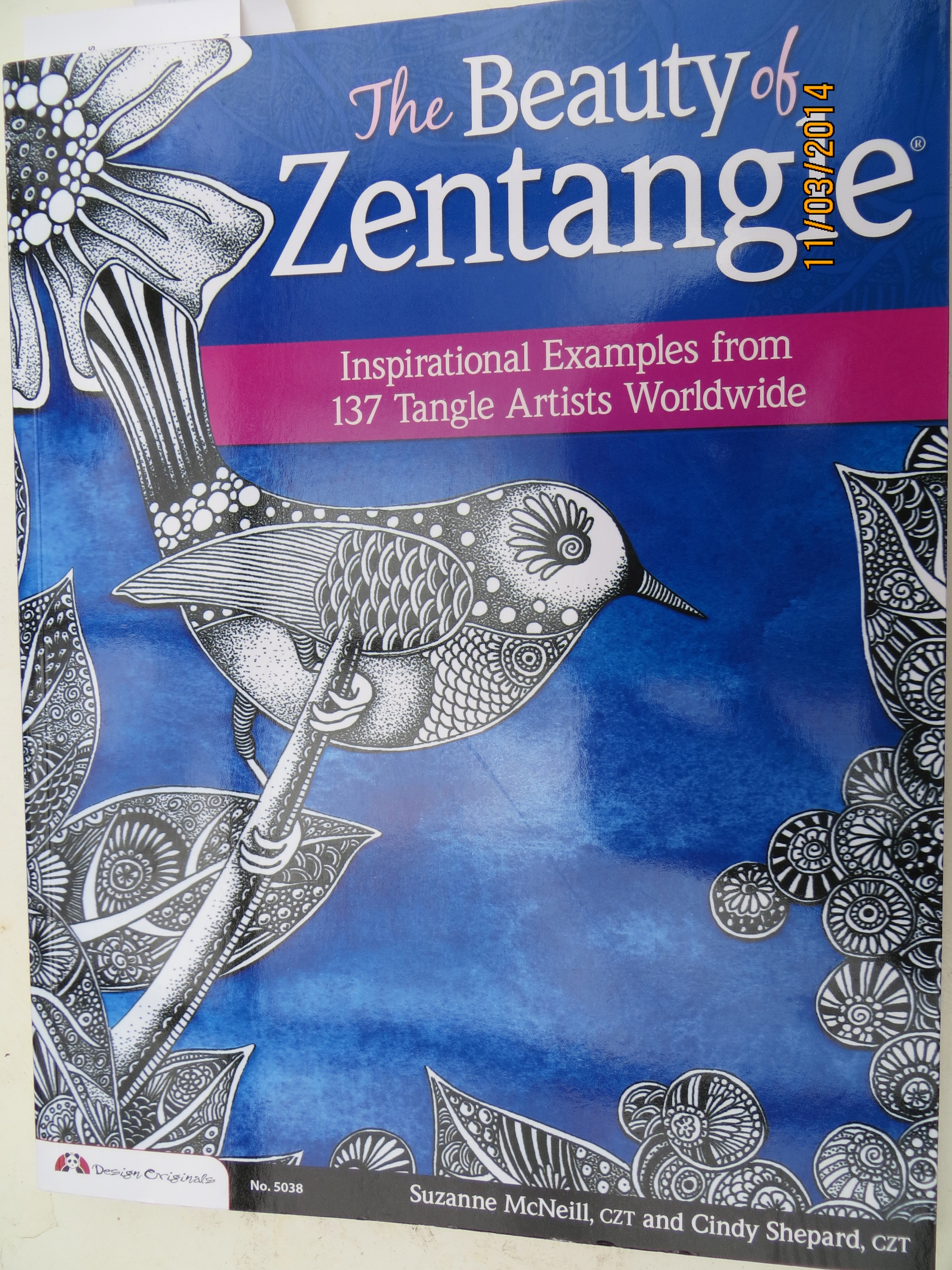
Oh what freedom! Oh what joy! Just doodle with a pen. No rules, no focal point, no reason or meaning. Just do it. Make mistakes, no one will know. Copy the patterns given in the book or develop your own using the given ideas. Put the Zen into Zentangles, it’s an experience that is liberating, relaxing and therapeutic. ‘The Beauty of Zentangles’ shows you how.
Book review of the Beauty of Zentangles

Take this book on any level you want. Inspiration, instruction, a jumping-off board. Overcome those blank page blues, just doodle. The two authors of  ‘The Beauty of Zentangles’, Suzanne Mc Neill and Cindy Shepard provide a comprehensive overview of possibilities. Suzanne has applied her extensive experience in art and design to taking the commonplace doodle to an art form in its own right. She has received a ‘Designer of the Year award and CHA gave her a ‘Lifetime Achievement Award’, not earned lightly. Cindy loves experimenting with mixed media, showing that Zentangles can be applied to any surface – ceramics, wood, quilting, birdhouses, even boots.  She has developed her own rubber stamps using her zentangle designs. Both authors are CZT (Certified Zentangle Teachers) but anyone can do a zentangle, especially after reading their book.
Book review of the Beauty of Zentangles

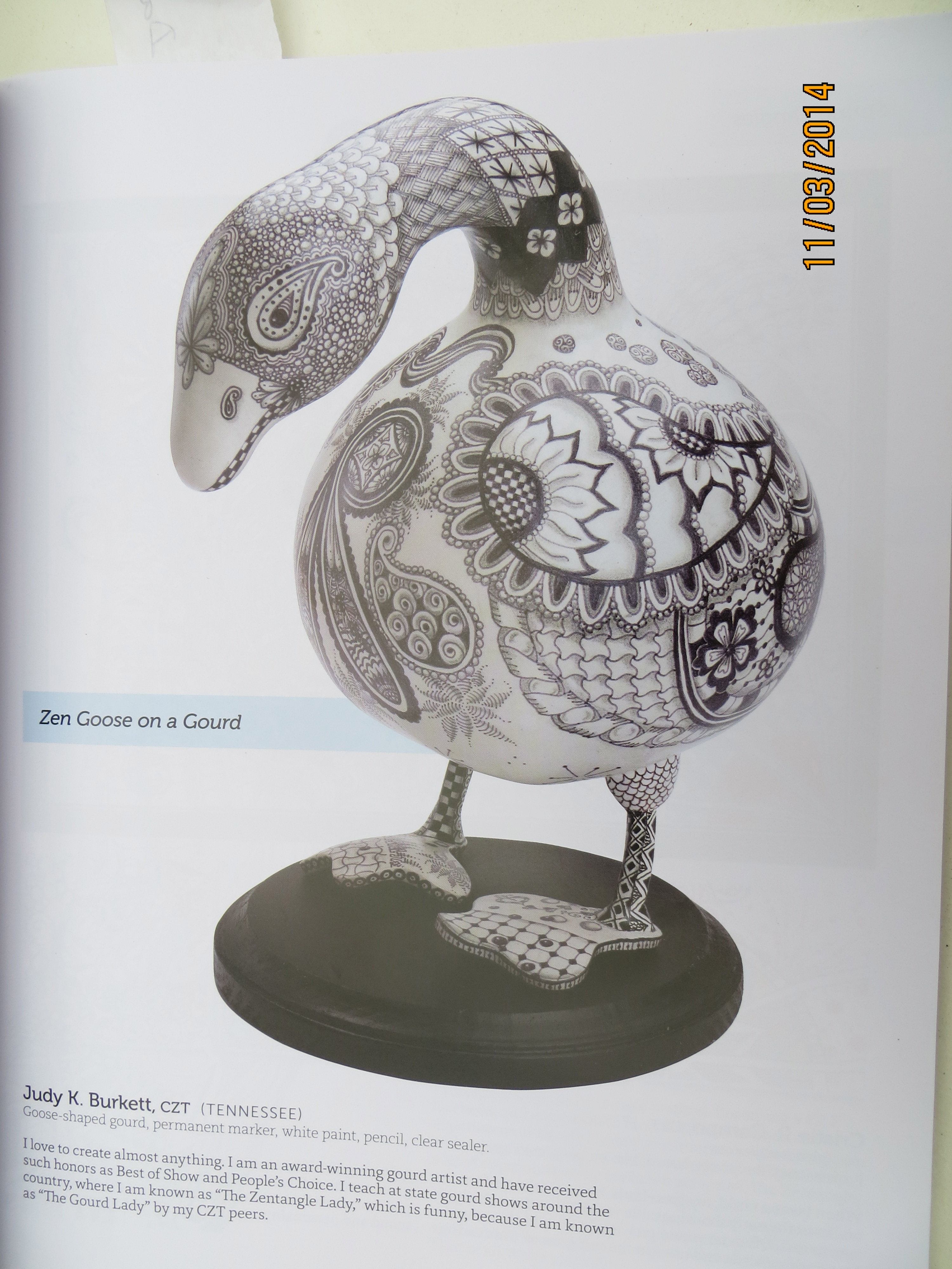
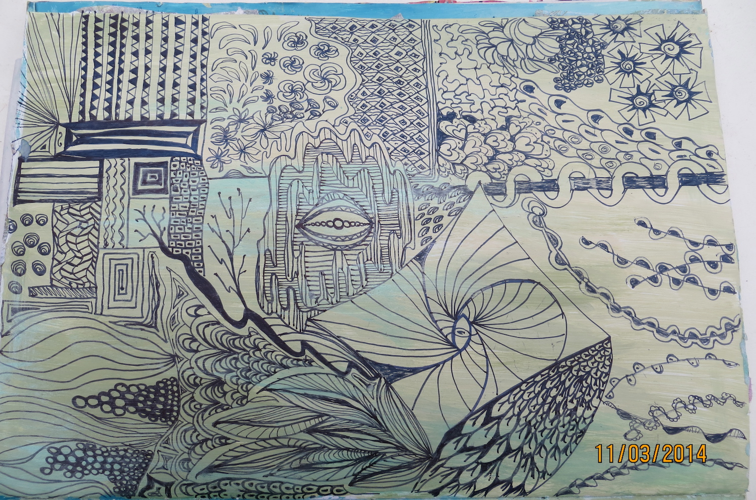
Decorate anything. The book gives some gorgeous examples of applying zentangle designs to any surface. The authors use and acknowledge the work of many artists and include illustrations, some in colour, to showcase how zentangles can be incorporated into the design on paper and 3D objects.  The illustrations are accompanied by a little note from the artist, explaining their picture. The ‘Goose on a Gourd’ by Judy Burkett is attention-grabbing and would take its place in any art gallery.
Book review of the Beauty of Zentangles

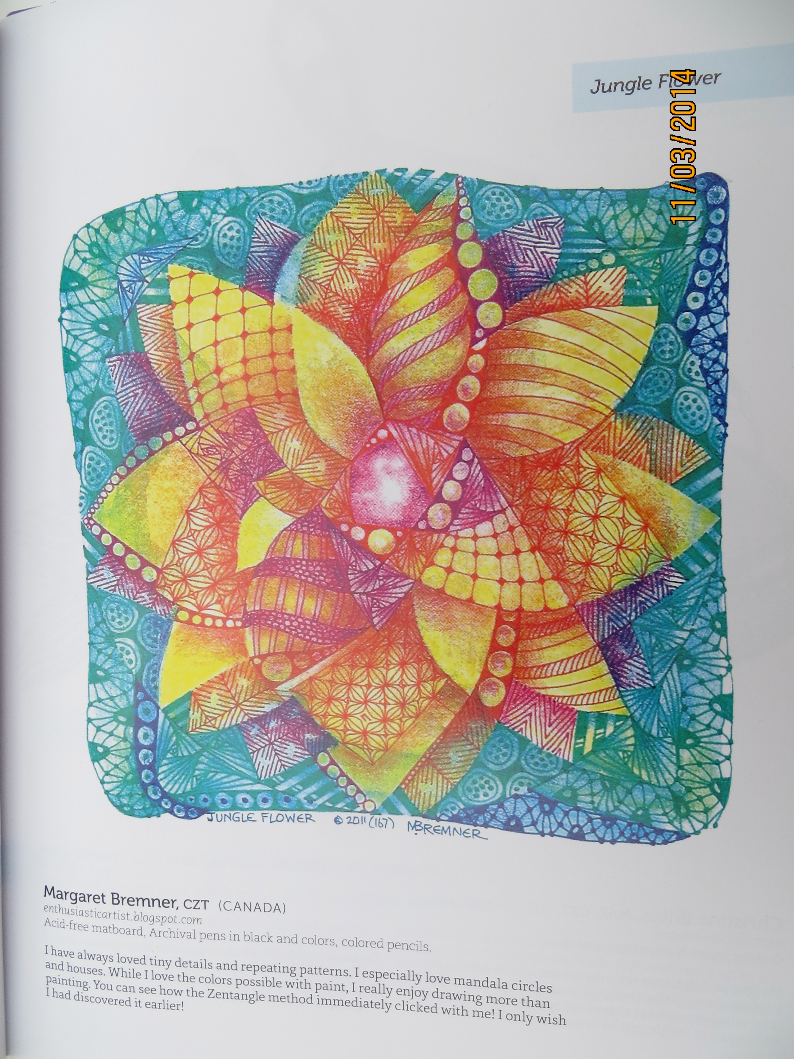
Colour it.  The zentangle lends itself to the simplicity and the elegant impact  of black and white.  But some love to colour a space; the zentangle is so inviting  and takes the doodle to another level. Any medium: pens, paints, crayons, markers can be used. The authors selected the work of many artists who coloured their zentangles. For example the ‘Jungle Flower’ by Canadian artist Margaret Bremner. Margaret describes how she loved to draw but not paint. The zentangle style allowed her to add colour and she wished she had discovered it earlier.

Need instructions? The authors have included the specific designs of some artists, who demonstrate how they developed the design. Some of these instructions are easy to follow, some need a bit of working out. But hey, by making mistakes, new tangles emerge. So never run out of ideas again!
Book review of the Beauty of Zentangles

I have not read this book from front cover to back. I concentrated on a few pages and studied them closely.  But that leaves more delights to come. It was a lot of fun tracking the development of designs. This book is very comprehensive and is highly recommended as a resource, especially when faced with a daunting blank page.

You can read more about Zentangles on their website: Zentangle Blog

~*~*~*~*~*~*~*~*~*~*~*~*~*~*~*~*~*~*~*~*~*~*~*~*~

Anne Maslin lives in Melbourne Australia

~*~*~*~*~*~*~*~*~*~*~*~*~*~*~*~*~*~*~*~*~*~*~*~*~

.

.
DIY Business Cards

This article was written by Jean Mullins

Supplies required

Computer and printer

Laminator (optional)

Coloured Card stock A4 size. This will give you approx. 10 cards depending   on the size.

Water colour paper or thin card A4 size or larger, not printer paper as this is too thin.

Glue, acrylic paint or inks, stencils, stamps etc.

Creating back of cards

Step 1.

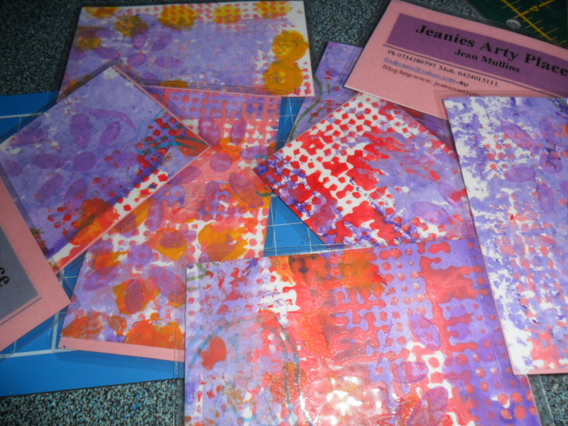
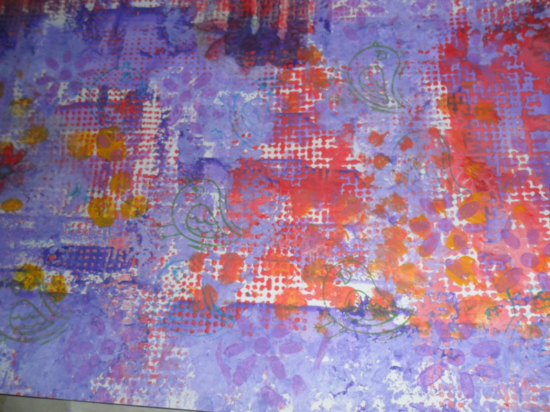
Paint, stencil, and stamp the paper or thin cardboard.  I used Jo Sonjas paints, simply because I have a lot, I love Cad red light, Norwegian orange, French blue, white, touch of yellow, and violet, I used stencils, then stamps.

I made 2 separate backing papers so some cards have the orangey back and some the violet shades.

Create unique business cards

TIP>If your painted paper is lumpy and bumpy, for example if you use texture paste, buttons or similar, it will be harder to laminate, creates wrinkles, air pockets etc.

Step 2.

While your painted paper is drying, create your business card.

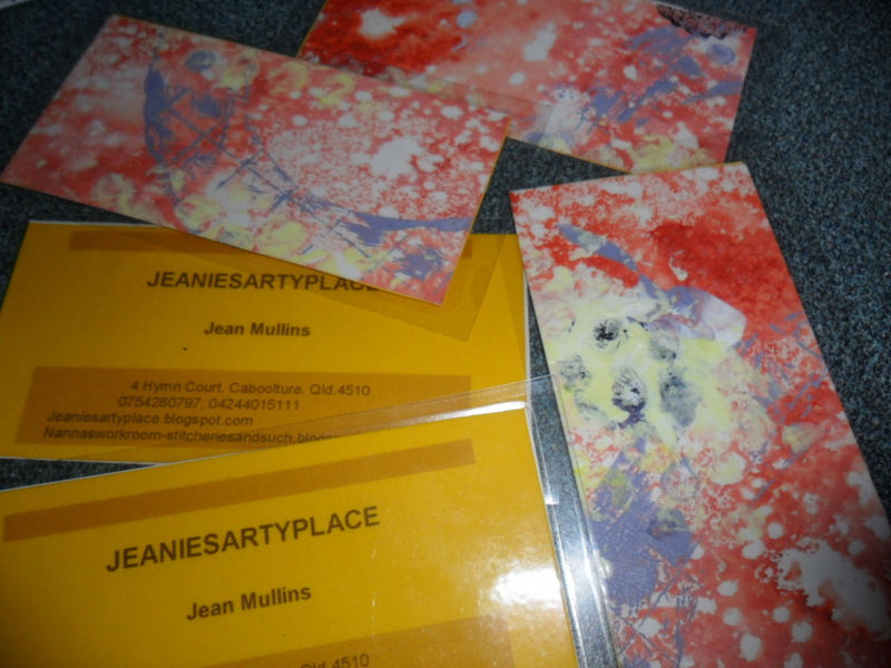
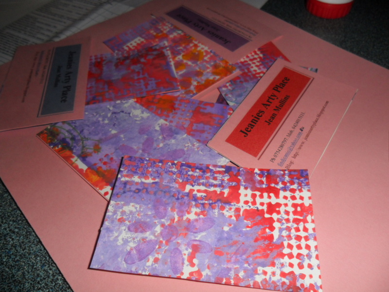
I used an Avery template, 10 cards to the page.Type the wording you want on your cards, name address, webpage, what you do etc.Save,and then print them out on the card stock, use a colour that will blend with the paper you have just painted. Cut each card out.

Step 3.

When the painted paper is dry, use a cut out card as a template on the back of the paper draw around it, this will give you the right size to cut for each card. Cut them out.

Create unique business cards

Step 4.

Now you require one of each, using a glue stick, dab a bit of glue on each card as you stick the front to the back take care to have them back to back. Trim if required.

TIP. Use just a dab of glue and press the 2 pieces together firmly.

Step 5.

The fun bit Laminating.

Get your laminator ready, turn it on to warm up.

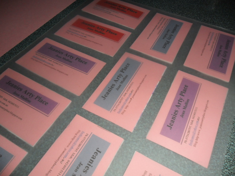
Lay a laminating pouch on a flat surface, open it, then dab the glue stick on each card as you position it on the laminating sheet. Leave a little space between so that they each seal. (Approx. 10/11 per sheet). When the laminator is ready carefully lift and feed through.

Now cut and separate each of your beautiful, unique business cards and say wow. Trim excess laminate off each card.

For those of you who don’t have access to a laminator, office supplies or similar place will laminate them for you.

Alternatively after glueing the 2 pieces together, use a brad in opposite corners or eyelet in one corner then tie with string cord etc.

~*~*~*~*~*~*~*~*~*~*~*~*~*~*~*~*~*~*~*~*~*~*~*~*~

Jean Mullins (Stevenson) lives at Caboolture Queensland with 2 little dogs.

Mother and grandmother, Jean is passionate about teaching and passing her knowledge on to everyone she can. Author, pattern designer, magazine contributor for many years, Jean loves to create and play with paint, as well as tutor at U3A.

You can see more of my work at:

www.nannasworkroom-stitcheriesandsuch.blogspot.com

www.jeaniesartyplace.blogspot.com

~*~*~*~*~*~*~*~*~*~*~*~*~*~*~*~*~*~*~*~*~*~*~*~*~

.

.
Seaside Inspired Shelf

~ * ~

This article is written by Victoria Warren-Mears

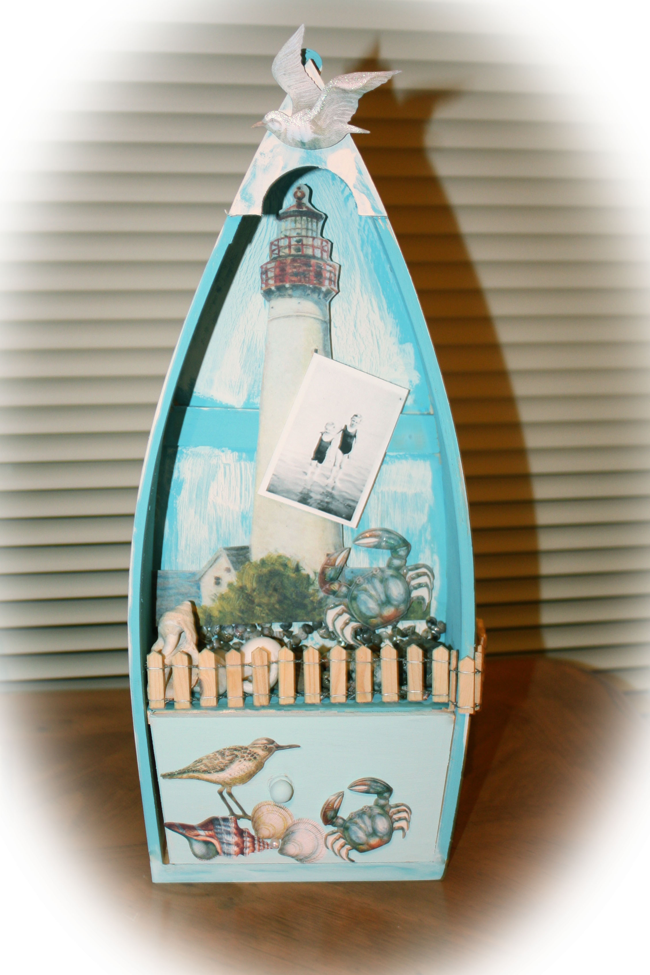
Finding inspiration for mixed media projects sometimes comes easily and other times can be difficult.  The inspiration for this Seashore shelf came from the photograph that you see, taken in about 1934 in England of my dad and his older brother.  My dad immigrated from England to the United States at the end of World War II.  Unfortunately, his older brother passed in World War II, as a member of the English Home Guard of Tuberculosis.  When my family immigrated, they chose clothing and household items over paper and photographs, because they were flying and had a weight limit imposed, much the same as today’s luggage weight limits.  The few photographs I have of my dad’s family are very special to me.

My immediate thought for this photo was something representing the seashore and the color turquois, or in this case Indian Blue acrylic paint from Delta.

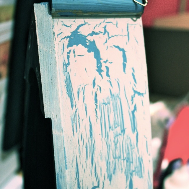
I found this row boat shelf on-line about a year ago and though it to be the perfect base for my project.  I used a faux crackle paint technique for the outside and inside “flooring” of the boat.  Initially the outside of the boat shelf was painted Indian Blue and allowed to dry thoroughly.  I wanted large crackles, so the piece would look very aged and worn, so I added a thick layer of liquid adhesive (I used Elmers Glue) and allowed it to dry until it was just tacky.  Then I layered an Ivory acrylic paint from Delta over the liquid adhesive, using a light touch and allowed to dry.

altered boat shelf inspired by old family photos

The inside was done in the same manner using a lighter layer of liquid adhesive, which produced fine crackles.

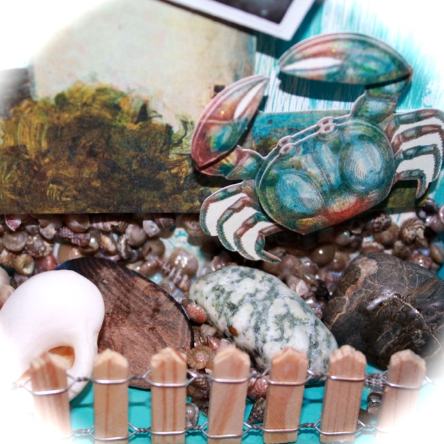
For shelf embellishment, I knew that the photo was going to be my focal image.  I used a lighthouse image cut from K and Company paper by hand.  The image was adhered to the shelf using dimensional mounting tape.  I then added found drift wood, rocks and large shells from beach vacations that my family and I have been on.  These items were adhered with liquid adhesive and definitely are a good use of found memorabilia.  The tiny shells are from Mudd Puddles, which is a product that has tiny shells in an adhesive, which is spread like frosting.  I allowed all of the dimensional natural elements to dry overnight.  I adhered my special photograph, which is actually a copy of the original photo, which was scanned and printed. I also added the crab and seagull images from K and Company. Throughout, I chose to stick with a theme of blues, ivories and light brown. The last step was to use liquid adhesive to adhere the fencing (Darice brand).  I again allowed everything to dry overnight.

altered boat shelf inspired by old family photos

The shelf’s drawer was painted a lighter shade of blue attained by mixing the Ivory and Indian Blue acrylic colors.  I decorated this portion with additional paper elements from K and company to further the seaside theme.

I am considering making additional canvases and decorations to include not only vintage images, but found objects.  I think it is a fabulous way to incorporate memorabilia from one family and one’s history into meaningful art for the home.  Care to join me?

altered boat shelf inspired by old family photos

~*~*~*~*~*~*~*~*~*~*~*~*~*~*~*~*~*~*~*~*~*~*~*~*~

Victoria Warren-Mears is full time scientist and part time artist working in paper and mixed media.  She can be found at work in her home studio, along with her husband, son and rescue dog.  You can see more of her work online at Victoria’s Mellifluous Musings.

 ~*~*~*~*~*~*~*~*~*~*~*~*~*~*~*~*~*~*~*~*~*~*~*~*~

.

.
Don’t Be Afraid To Texture

~ * ~

This article was written by Kim Kelley

In this age of technology we have sites, blogs, tweets and Pinterest making all sorts of suggestions to use their brand of paste or gel; even sites on how to make your own paste. There are so many choices that it can be overwhelming. 

Kim Kelley tried three different types of texture paste

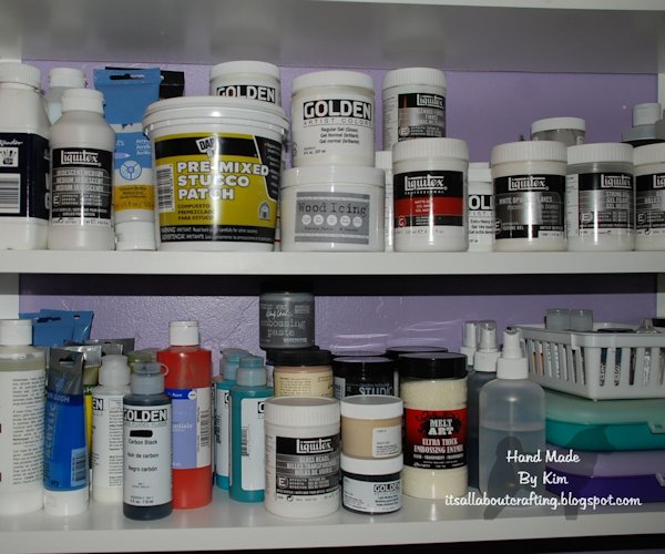
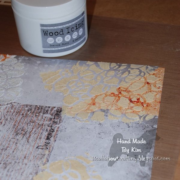
In this project I decided to use 3 name brand products; Wood Icing by Stencil Girl, Stucco Patch (from local hardware store), and Gloss Gel by Golden. The Wood Icing cost me $12.99 but had $12.00 shipping, whereas the Stucco Patch cost $5.99 and we were going to the store anyway! The Gloss Gel I purchased a few months back at Michael’s and used a coupon, so it probably cost me just under $5.00 but it is about half the size of the Wood Icing and ¼ the size of the stucco.

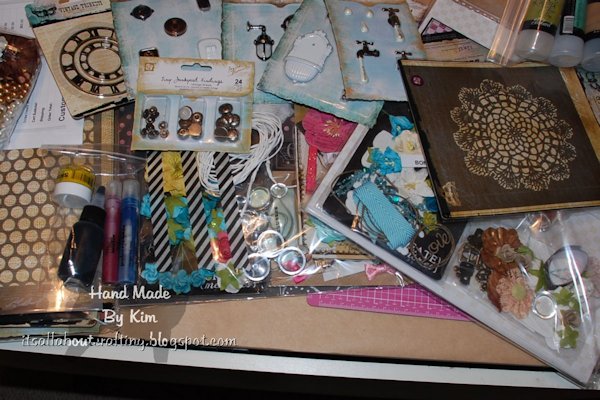
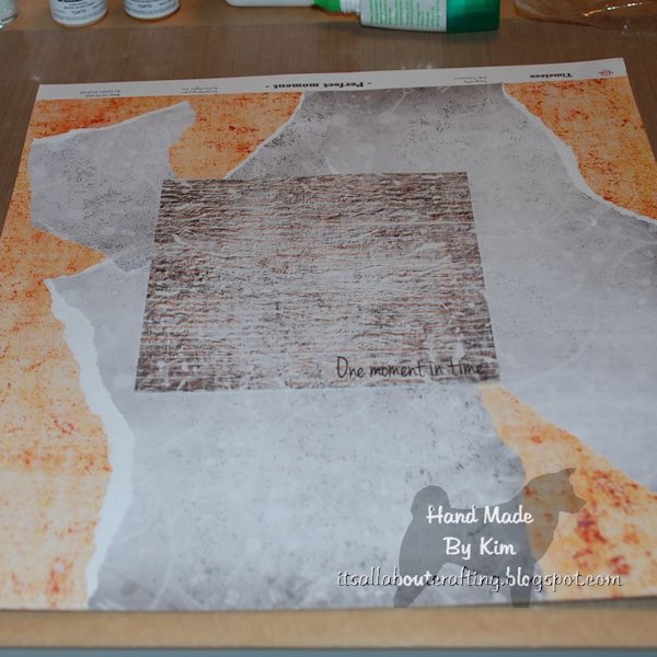
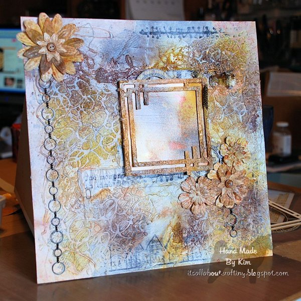
I am going to make a layout that can be used as a scrapbook page, framed art, or just wall decor. This is a kit that I purchased from Scrapbook Diaries consisting of papers, frames, flowers, sprays and even micro beads.  This is the first creation I actually made on paper, rather than canvas or wood.  So we will all be surprised at the result. 

Kim Kelley tried three different types of texture paste

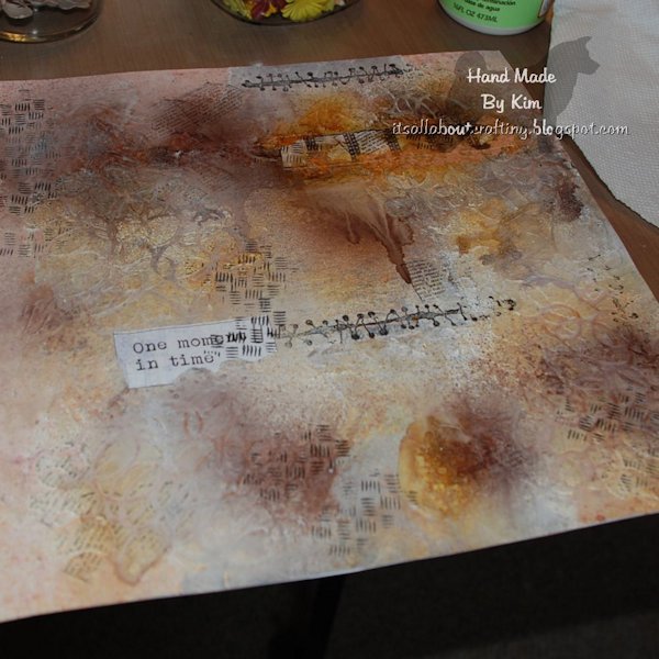
 After getting my papers layered and glued where I want them, it is time for texture. I decided to use my “circles” stencil and started with the stucco. First thing I noticed was the texture! No pun intended. It is rougher, having almost a concrete feel. I used it in both top corners of my project.

Kim Kelley tried three different types of texture paste
The lower two corners I used the Wood Icing. My only problem with this is it has a brown tint to it. The way to get past the color issue is to add gesso over it before adding any paint, spray or color technique. The feel and thickness you achieve is perfect, so for me it is worth it to use.

Kim Kelley tried three different types of texture paste
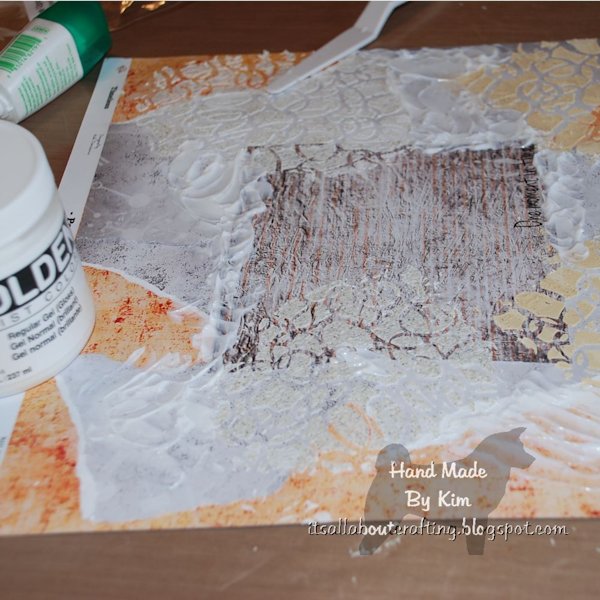
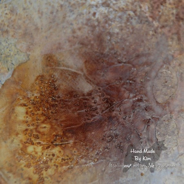
Next I added the regular gloss gel, really just dabbing it anywhere on the page with my palette knife. Then added micro beads to give it some texture, since it dries clear and the beads are clear it really shines. You can buy the medium with the beads already mixed in, but you are stuck with the color and consistency. If you add your own beads you can change the color of them and add as many as you want. You can even change the size of the beads that way.

Kim Kelley tried three different types of texture paste
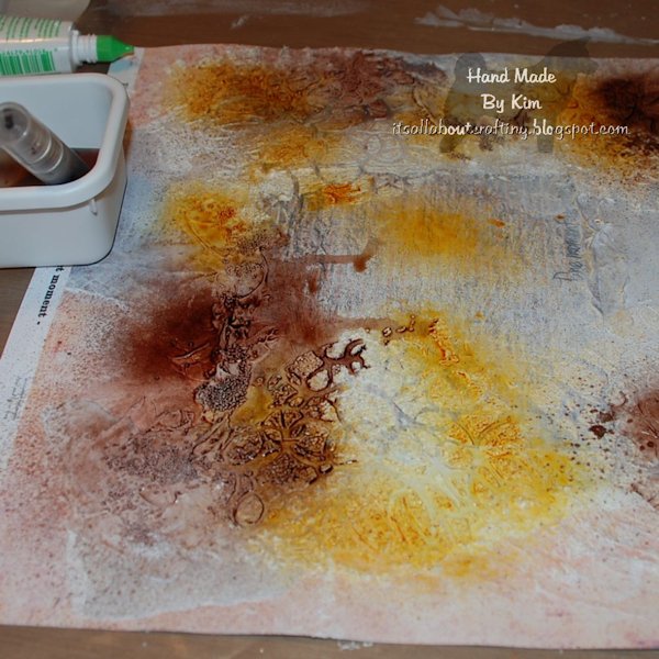
Now for some color. The kit comes with Amber and Dark Brown Chalk spray. The colors are very pretty but I really wanted and added pop…so I used some sprays from Lindy’s Stamp Gang. These gave it the sparkle and shine that was needed.

Kim Kelley tried three different types of texture paste
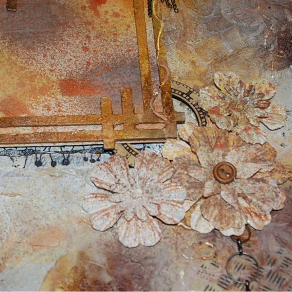
Once I was happy with the colors, I started on some embellishments I wanted to add. I colored a chipboard frame with sprays, paints and crackle gel. I attached this to a piece of paper that was also colored the same…this way someone can slip a picture right behind the frame. I had to add some flowers, chain, stickers and some chipboard. Then I used a few Tim Holtz stamps to add not only color but some dimension.

Kim Kelley tried three different types of texture paste
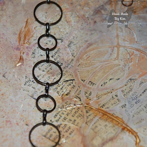
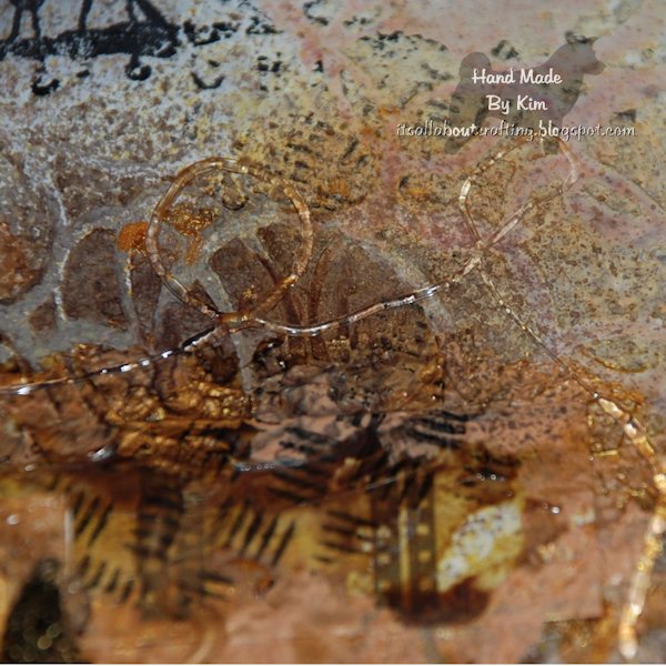
Now for the fun part and something I had never tried before…glue gun goop…yes that is a technical term! (ok- ok one I made up but still technical) For this you take your glue gun and make swirls, circles, loop de loops; whatever you want to create and let it dry right on your project. You can paint or spray over it for added color or leave it clear and shiny. I did both.

Kim Kelley tried three different types of texture paste
The final step is putting it all together. Whatever you feel looks right, is right. That is the best part about Mixed Media Art, there is no wrong or right way to end a project. Here is the end result.

Kim Kelley tried three different types of texture paste
I did add some gloss Mod Podge over the top; it seals it as well as gives it that glorious shine!

~*~*~*~*~*~*~*~*~*~*~*~*~*~*~*~*~*~*~*~*~*~*~*~*~

Kim Kelley is borderline obsessive about her crafting and her art. She loves mixed media art because you are free to go beyond your comfort zone, using your imagination and exploring an anything goes mind set. Kim loves to learn and explore new techniques and hopes that any art she creates leads someone to find their inner creative artist!

Sites: itsallaboutcrafting.blogspot.com and www.facebook.com/kimscraftyconcepts

~*~*~*~*~*~*~*~*~*~*~*~*~*~*~*~*~*~*~*~*~*~*~*~*~

.

.