Michelle G Brown | Mixed Media Art

Mixed Media Art Journal Class by Laura Thykeson


Are you longing for an art journaling class that nurtures and helps you develop your own unique style instead of everyone ending up making the same style art? Laura Thykeson, who has featured on Mixed Media Art with her “Reading between the lines with Altered books” article is conducting classes on her “Art from your Heart” ning group.
mixed media art journal

The first class, which is free for all to participate, is based on L.K. Ludwig’s True Vision – Authentic Art Journalling. “I think it will make for an enjoyable class and I also think you may find that my approach is a bit different than some of the other classes you may have seen”, says Laura. While this class started 15 March 2012, there is still time to sign in and play along.
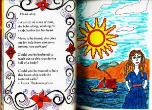
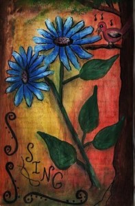
mixed media art journal by Laura Thykeson

The second class is called “ Letting Your Heart Sing”and it is actually a good class for any level artist that wants to nurture, celebrate and develop their own unique style of art journaling and creating altered  books. The cost for this class is $20.00 per person,  and will teach you how to discover your inner poet and writer, and add that special “something” to your art journals and other artwork! Original poetry and prose can add so much to a piece of art-you just need to learn to “Let Your Heart Sing”! The class will start on 1 April 2012.

You can join up by going to the “Art from your Heart” ning site, signing up to the community (which includes is a whole community of mixed media artists, not just lessons). Then you can sign up for either the free class or the $20.00 class. Or both.
Laura Thykeson

There is a “Donate” tab at the top of the page where you can go to pay the $20.00 if you want the paid class, and when Paypal lets Laura know you have paid, she will admit you to the class. Then you will get access to the class and start creating.

The classes will be at least 6 weeks, maybe even longer if anyone wants to continue on a week or two. But at least 6 weeks for sure, one new lesson per week, plus lots of emails and chat from Laure as she is on the computer a lot. There is a material list up in the free class you can already access. It is just normal favorite journaling materials (Laura made a list of several things suggested) and a journal or loose heavy paper to work on.

For further information, please contact Laura at LThykeson@yahoo.com or visit Art from the Heart.
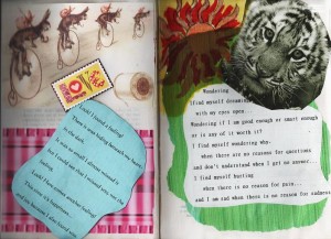
laura Thykeson

~*~*~*~*~*~*~*~*~*~*~*~*~*~*~*~*~*~*~*~*~*~*~*~*~*~*~*~*~*~*~
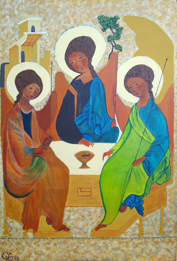
The Holy Trinity

This article is written by Gloria Malouf-Marsh

Original Painting by Andrei Rublev (1370-1430)

This painting I took from an Icon called “The Holy Trinity”.  Andrei Rublev painted it around the 14th century. He is a famous medieval artist of Orthodox icons. This icon is a masterpiece of Russian traditional iconography. There are many depictions of this Icon, portraying different colorings.  It represents the Trinity in the form of three angels.  The icon describes three angels who visited Abraham at the Oak of Mamre. The angels are a representation of Father, Son and Holy Spirit. The Father and the Holy Spirit are both inclined toward the Son, which is the central figure. The faces’ gaze is circular.  The symbolism portrayed is that the Father leads us to the Son, who leads us to the Holy Spirit; in turn the Holy Spirit leads us back to Christ and Christ leads us back to the Father. There are three figures sitting around a table. The finger pointing is very important in iconography – pointing to the chalice, the eyes gazing to God the Father, which is the first figure. God the Son is the central figure and the figure on the right is the Holy Spirit.   Its purpose is to transport us into a transfigured world. Meditating on and symbolism of the icon is a very important factor during the painting.

The house above the first figure (God the Father) is that of Abraham and Sarah from the Old Testament. The subject of the icon is based on the story of Abraham, who is camping by the Oak of Mamre when he received three visitors.  As he converses with the three angels and serves them a meal, it is revealed he is actually talking directly to God. The Mamre oak tree above the middle figure (God the son) may represent the Cross, and the mountain above the third figure represents places where people often encountered God -places where heaven and earth seem to touch. Another name for this icon is called “The Hospitality of Abraham” icon.

mixed media painting

To appreciate the subject, I thought to elaborate on the background of the Icon first. I started painting the canvas with gesso. I sketched 3 figures and 3 haloes and wings in the center of the canvas. I worked around, above and below the 3 figures. Firstly, I used burnt umber (dark brown) above and below the figures.  I then used the deer brush to dab the rich gold, over the burnt umber and left spaces between. I then applied yellow oxide on top of that with the deer brush, and finally used Naples yellow hue, one at a time to build the texture and effect. This gave a three-dimensional effect to the picture. This is an effective tip to pass on. I loved the color scheme that I chose.  The painting was very detailed; drawing the figures had to be reasonably in proportion. I then sketched the wings and the painting  was taking form. A clergy told me that I depicted the feminine side in the three figures of this picture. I thought that was significant, as one would imagine that the male dominant force was strong in the medieval times. This was significant for me because I learned that we all have a feminine and masculine side to us. One goes on a very personal journey with the artist and the subject. Creating and painting folds of material sweeping and draping of the arm garments and the knee positions all assisted with the overall effect. I chose to create my personal style in this composition and it meant a lot to me. This took me over three months to finish.  I was also caring for our very sick dog named Cassie, during this time.  So my time was divided, and I was feeling very sad at the time.

I thoroughly enjoyed the time I gave this painting.

I do encourage all artists to try all mediums and a diversity of choices when being creative.  Create with abandon; nothing is right or wrong with using the brush.  Acrylic Medium is very forgiving. So be daring with swirls and freeing up of the hand, the brush and the mind, and you’d be surprised where creativity takes you. This does unleash the artist within.

I also encourage regular practice with the brush. Mix with likeminded people.  We all teach each other so much and most of all have lots of fun and enjoyment! This keeps us connected to our creative spirit.

~*~*~*~*~*~*~*~*~*~*~*~*~*~*~*~*~*~*~*~*~*~*~*~*~
My name is Gloria Malouf-Marsh. I live in Brisbane, Australia, in a very leafy suburb called Indooroopilly. I live with my husband Greg and my daughter Salwa.

Emails are welcome to gloria@radiantpathways.com.au

~*~*~*~*~*~*~*~*~*~*~*~*~*~*~*~*~*~*~*~*~*~*~*~*~
.

.

Create Your Own Pearlized Flourishes

This article is written by Dawn Stegall of FaithfullyYours.net

From crystals, to pearls to rhinestones and beyond, bling is hot in scrapbooking and mixed media art! However, bling can be expensive. In this tutorial, you will learn how to make your own pearlized flourishes for much less. Not only are these less expensive, but quick and easy to create as well as easily customizable.

Supply list:
• Bling flourish (you want to copy)
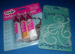
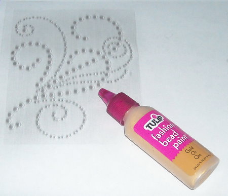
• Pearl paint (Ranger’s liquid pearls, Tulips pearl fabric paint)
Transparency
• Scanner/copier

Tulip fashion fabric bead paint


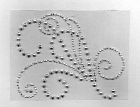
Step 1: Scan/Copy Original Flourish

This step may require some experimenting on your part to get the desired result. I started out scanning with flourish still attached to original backing. Finally, I ended up copying and printing in one step.

dawn stegall

Step 2: Place transparency on top of copied image.

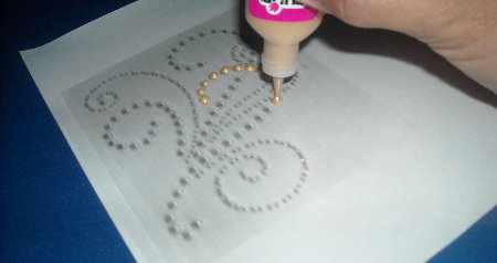
Step 3: Begin Painting

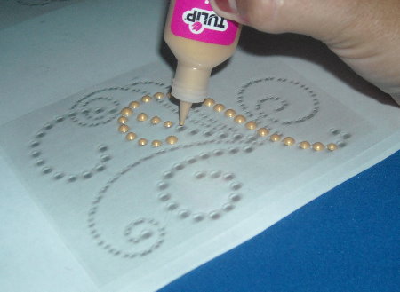
Add dots of paint following copy as your guide. Keep paint bottle straight up for better “beads” of paint.

Continue adding paint.

This copy has multiple flourishes. You can copy “as is” or only use the ones you want.

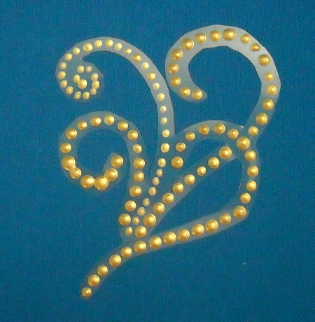
Once you have finished making all your beads, let dry.

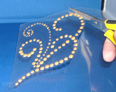
Step 4: Trim Around Flourish

The clear transparency will be barely visible on your finished project.

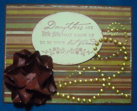
Finished card using handmade pearl flourish.


The flourish didn’t quite fit my card placement, so I cut it apart and placed around the sentiment how I wanted.


A few ideas:
• You can use any type of flourish or pattern. Just follow along lines, making dots of paint.
• Stamps-I have also seen rubber stamps of “dotted” flourishes.  Stamp with watermark ink or a light ink and cover each stamped dot with a dot of paint.
• Find a digital image online you can print out and use for your pattern.

Think outside the box!  You can use any shape, pattern or design you want. Simply follow along the design placing spaced dots of paint. Good luck and fun!

~*~*~*~*~*~*~*~*~*~*~*~*~*~*~*~*~*~*~*~*~*~*~*~*~
Dawn Stegall strives to be a good steward while remembering God in her scrapbooks.

For a free guide and weekly inspiration visit FaithfullyYours.

~*~*~*~*~*~*~*~*~*~*~*~*~*~*~*~*~*~*~*~*~*~*~*~*~
Homemade Stamps

This article is written by Francesca Albini

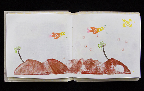
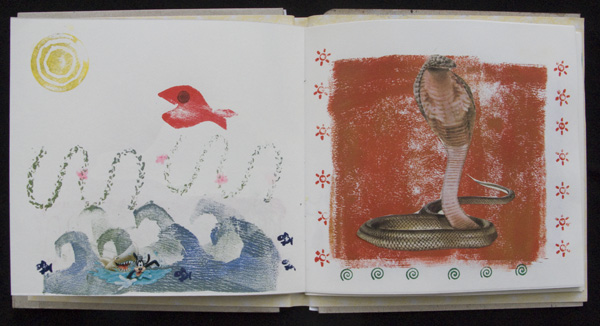
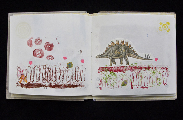
I wanted to do a little booklet of imaginary landscapes and thought it would be fun to use only stamps and stickers. I have a large collection of stickers that I find in children’s books and magazines, or that I buy when I travel. Most of the stamps I used in my booklet are homemade. All you need is some lino carving knives, scissors, a brayer, some kind of plastic sheet to spread acrylic paint onto and… a trip to the pound (or dollar) store. There you will find lots of things that can be used to make stamps – flip-flops, erasers, foam sheets, gardening mats, etc. You can find novelty erasers in the shape of fish, frogs, triangles, that can be quite cute. Also don’t forget the small erasers at the back of pencils, they make lovely dots. After a while you’ll develop an eye for what items make interesting patterns.

Francescas amazing handmade stamps

Normal white erasers are ideal for carving simple designs, like my palm trees, the bird and the sun. I draw the (mirror) image with a marker on the eraser and then carve out very carefully all the bits that I don’t want printed. I ink the stamp and do a print, if it needs tweaking I carve some more and test it again. I use both sides of the eraser, so I get two stamps out of one eraser. Tips, sides and corners of erasers can also be used to print lines and rectangles.

Francesca Albinis handmade stamps

I cut the fish and the waves from a foam sheet that came from a children’s card making kit. I cut the foam gardening mat into blocks, and with a double sided sticky tape I attached a thick windy string on one, some paper clips on another and buttons on a third.

Albini's use of stickers and handmade stamps

To ink my stamps, I use ink pads, stamping brush markers and acrylic paint. When using acrylic you have to wash your stamps straight away, before the paint dries. Sometimes it helps to put a foam sheet under the page where you want to stamp, so that you get a better print (with the buttons stamp, for instance.)

I like the idea of a theme, like landscapes. I guess one could also make portraits out of stamps, compositing hair, eyes, hats. The possibilities are endless.

Happy stamping!

~*~*~*~*~*~*~*~*~*~*~*~*~*~*~*~*~*~*~*~*~*~*~*~*~
Francesca is a visual artist using pretty much everything she finds around her to record and relive feelings and memories of places and emotions. She collages, paints, draws, photographs. Francesca loves mixing modern technology, such as mobile phone apps, with the simplest of tools such as glitter glue, crayons and other children’s art supplies. Read her blog at Frans Journal Blogspot.

~*~*~*~*~*~*~*~*~*~*~*~*~*~*~*~*~*~*~*~*~*~*~*~*~