Michelle G Brown | Mixed Media Art

Create Your Own Rub-ons

This article is written by Debbie Davis

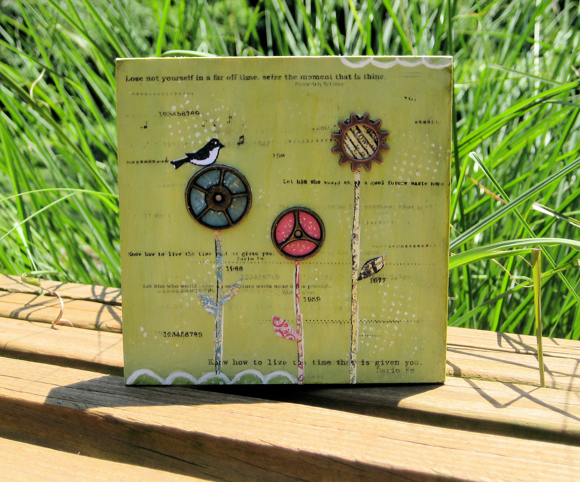
I’ve been reading Marney Makridakis’ new book called Creating Time. I was intrigued by the name of this book because I always find myself saying things like, time goes by so fast, I don’t have enough time, etc.  I am hoping it will help me to at least feel like I have more time.  I am working on the first “Artsignment” in the book, which is creating a time box.

I wanted to add some quotes on time to the box and needed a quick, simple way to do it.  I had recently made my own text rub-ons for another project and thought that would be a great way to add text and dates to the box.
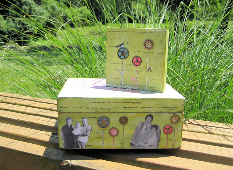
Creating text rub-ons

I found the quotes on-line by googling “time quotes” and then copied and pasted them into a word document.  I changed the font to a size and style that would fit on my project.  Using overhead transparency film, I placed the film into my inkjet printer so that the text would print onto the smooth side.

When creating rub-ons this way, you need to make sure to print text in a mirror image, otherwise it will be backwards when you rub it on your project.  Also, be careful not to touch the ink after printing or it will smear.  Lay the film, smooth side down, onto your project and, using your fingernail or a wooden craft stick, rub over the text/image you want transferred.  You can rub as light or as heavy as you want, depending on how clear you want the text/image to be.  I like to print off a string of symbols such as ########## and just randomly rub them on.
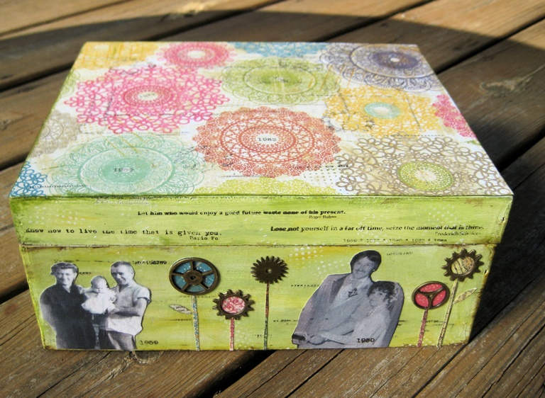
How to rub a text or image

After rubbing the quotes, etc, onto my time box, I decided to see if I could re-use any ink that might be left on the film.  I was so surprised to find that I could get another print out of most of what was on the transparency.  It was very light, but that just added to the look I was going for.

I added some additional text using the rub-ons so that it was darker in some areas.
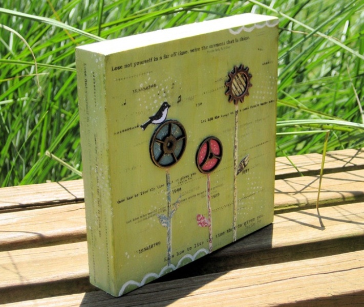
Adding texts on the rub-ons    Rub the quotes on the time box

Please note that the rub-ons will not be permanent and will smear if you brush over them with anything wet such as paint or glue.  To set the ink, I took my project outside and lightly sprayed it with a little matt coating before doing any additional “wet” work on it.

Think of the possibilities with creating your own rub-ons!  Here’s an image that I printed onto the film and then rubbed on some scrapbook paper.  I found that you don’t need to set the ink when transferring the image to paper, unless the paper has been previously painted on or coated with any type of acrylic medium.
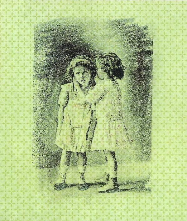
rubbing on a scrapbook paper

This is a fast and fun way to add text, numbers and even images to your art.


~*~*~*~*~*~*~*~*~*~*~*~*~*~*~*~*~*~*~*~*~*~*~*~*~

My name is Debbie and I live in Morton, Illinois (USA). I’m happily married and have a wonderful family that includes a daughter, son, son-in-law and 2 of the sweetest grandchildren ever!

What I love most about mixed media art is that you don’t have to be an expert at anything to create beautiful art. It is a great way to recycle found objects. Art is such a wonderful stress reliever. I just wish I had more time to play!

I have a shop on Etsy called Artful Explorations where I place some of the art I have created for sale.

~*~*~*~*~*~*~*~*~*~*~*~*~*~*~*~*~*~*~*~*~*~*~*~*~

.

.
Inverting Colors in Mixed Media Art

This article is written by Jon Webb

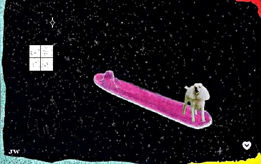
This artwork features my dog Wally who passed away several years ago. I call this artwork, “Celestial Surfer“.

Jon Webb’s Artwork

I created this by using:

  • black marker to make star-like dots on
  • water color paper
  • glue
  • photo cutout of my dog
  • cardstock
  • water color crayon

This is how I created it:

  • draw the surfboard and painted it with a water color crayon.
  • After the paint dried, I glued to the surfboard.
  • Then it was all scanned into the computer – I used the inverse colors feature from the jpeg menu to create the night sky effect (I actually had to use a photo of the dog with the colors inversed when I glued it onto the surfboard). When I inversed the colors in the computer, the photo of the dog also changed back to normal.
  • I created the window from the jpeg menu and, once again, inversed the colors to make it opposite of the surrounding background. The trim around the edges was created from cardstock and from the jpeg menu.

I usually experiment on different things to discover new ideas. Creativity as well assists me in all my artworks. Don’t be afraid to explore new things. Art is fun and you can always use art to express your feelings, thoughts and who you are.

I started a blog last month which features the rest of my artwork. Here is the link to it: jonfwebb.blogspot.com. You are welcome to visit it anytime. I hope you’ll like my artworks. I hope you get a good laugh out of it if anything else. Thank you, once again.


~*~*~*~*~*~*~*~*~*~*~*~*~*~*~*~*~*~*~*~*~*~*~*~*~

Hi! my name is Jon Webb. I am a mild-mannered grocery store employee, who lives in a world of weird, ridiculous, and sometimes serious art which is represented here. Although my artwork is warped and twisted much of the time, it is G-rated and not meant to insult anybody, though I do reserve the privilege to poke fun at myself. I now live in the Dallas/Fort Worth Metroplex after spending most of my life in the western U.S. I am also a jack-of-a-few trades who mastered none of them. My greatest joy in life was the 25 years that I spent with my dear wife, Renee, who passed away in 2010.

I now invite you to visit my bizarre and sometimes serious world, and I hope you enjoy the experience. Come back as many times as you wish. To get the picture of what I am doing here, I recommend that you start at the beginning and work up to the current date. Remember, art saves!

~*~*~*~*~*~*~*~*~*~*~*~*~*~*~*~*~*~*~*~*~*~*~*~*~

.


.
The “FEAR“

This article is written by Cheryl Crane

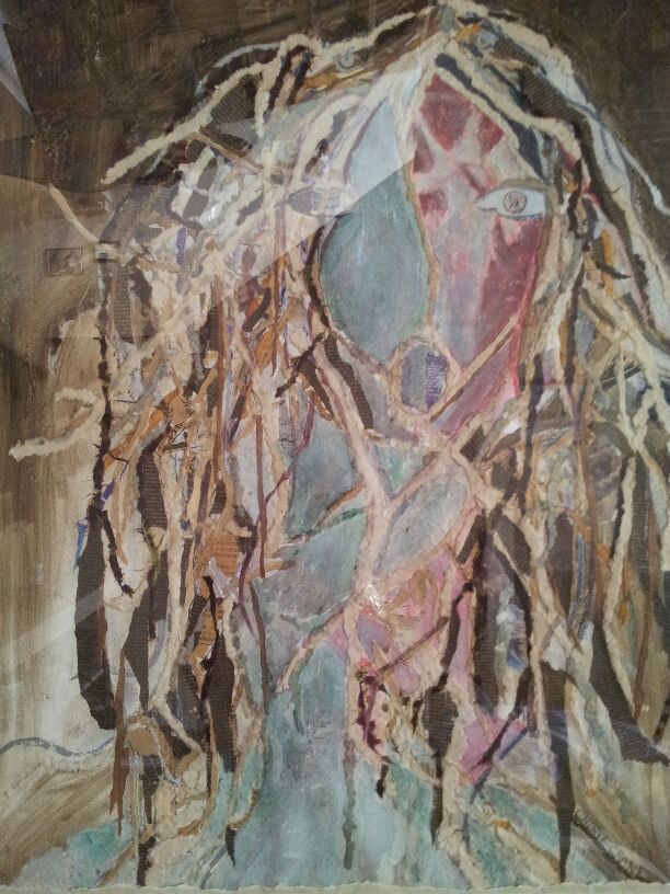
There are many layers in this artwork, layers of thoughts, tears, imagery, and art materials. This artwork was inspired by the 911 attacks on the world Trade Center. There are 2 thoughts intertwined in this piece.  One, Fear of death and dying; hopeful for a better life as we journey with the angels to a greater life without fear.

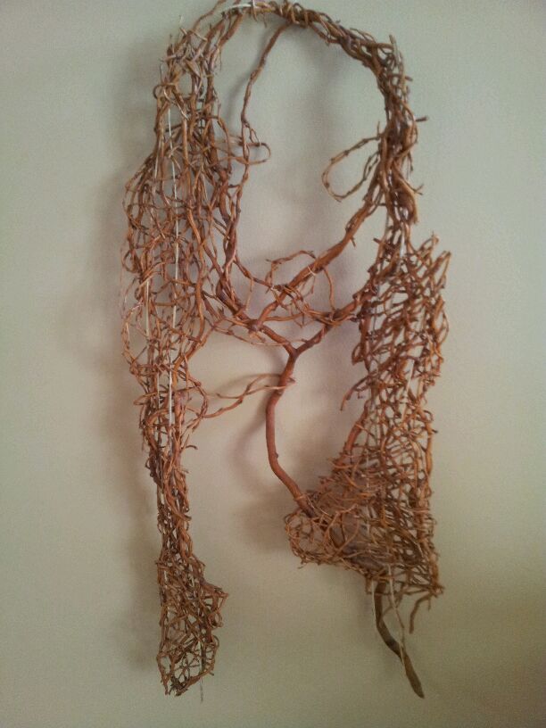
Below is a weaving of wisteria that inspired the imagery for Fear.  Fear was created after 911 as a reminder of evil that lurks.

Image preparation and materials

It’s a mixed media artwork that combines:

  • Stamps
  • torn newspaper with names of victims from the attacks on the world trade center
  • imagery representing death and dying.

The Angels on the face are digital imagery created from a painting. Green oil paint is used to complement the red and cause strong contrast.

The angels represent hope. Each piece of mixed media is painted on with gel medium.

Cheryl Crane

This piece began as a large Reeves watercolor, paper and a lot of newspapers, stamps, and textured papers.

I first planned my imagery levels of fear…fear of death and dying.  This imagery is collaged figures that are placed within the hair.  Different textures/papers are torn and ripped then glued using gel medium. The 2 stamps represent the United States and the beginning of Fear when the atom was split and the atomic bomb fell on Japan.

There is also ripped paper from an old Japanese newspaper.

Also in the hair of Fear is a ripped black paper.  If you look closely you will see the names of the victims who died in the attack. These names were posted in the Free lance Star.

On one half of the face is a cropped altered image of the Angels of Death.

This painting of Angels is an oil painting that hangs in Fredericksburg Baptist church in Fredericksburg, Virginia.

I took a photo of this painting and altered it using photoshop.  I then glued it onto the watercolor paper using gel medium.

The overall color scheme was planned as a monochromatic scheme.  However, I decided to add the greens and red (compliments to show conflict).  I used water and oil paint in the background.

That is how I created my artwork – The FEAR. I hope you like it!


~*~*~*~*~*~*~*~*~*~*~*~*~*~*~*~*~*~*~*~*~*~*~*~*~

Cheryl has been an art educator for 25 years in Stanford County Schools. She also teaches private lessons and sells art in her company Paint with Me. She is known as the Angel painter.

~*~*~*~*~*~*~*~*~*~*~*~*~*~*~*~*~*~*~*~*~*~*~*~*~

.

.
Liturgical Representation: A Series of Mixed Media Pieces

This article is written by Julie Anna Johnson

I’m a grandma who can’t knit, can’t measure, and can’t draw a straight line with a pencil between two rulers. I heard early and often that I was uncoordinated and untalented in the arts and was kicked out of band in third grade because I was “..’or-e-bley.”

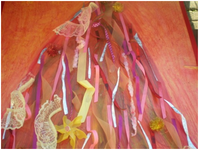
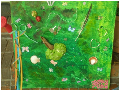
After years of wanting to be an artist I came to understand that we are all called to be artists and found freedom in mixed media work. It is in the genre that I learned rules can be set aside and I can play in glue, paint, glitter, mod podge, clay, chalk, ribbon, stuff from the backyard, and magazines and get as dirty as I want.

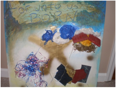
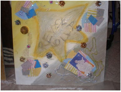
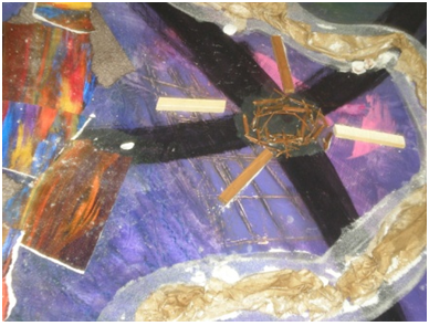
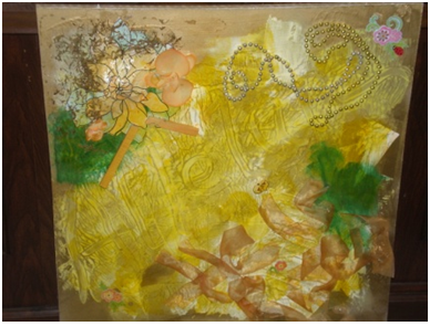
Many of my pieces combine my love of art with my love of my perfect parent. The liturgical series is my representation of the liturgical year in the Episcopal tradition.

This series has allowed me to live each church season in a new and child like way after getting my hands dirty with it. It has impacted my preaching and teaching and my ongoing identity as both an artist and a priest.

Materials:

  • 2X2 MDF
  • Acrylic paints
  • Pastels
  • Embellishments
  • Gesso
  • Mod podge
  • Acrylic inks
  • Chalk

Process:

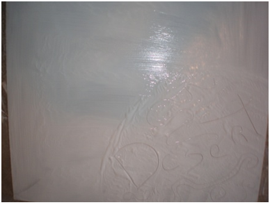
  • MDF was prepared with gesso. On some pieces words were embedded in the gesso.

Using Gesso

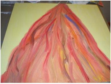
  • Once completely dry each piece was painted in one or more colors symbolizing the season.

Designing the piece   Julie Anna Johnson

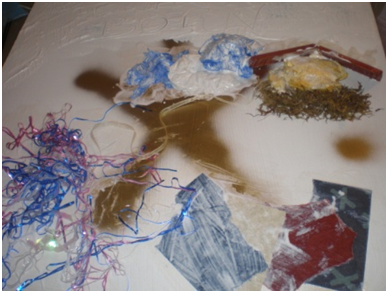
  • Various embellishments were added symbolizing the season.
Adding embellishments
Finishing touches of color added to each piece with inks, pastels, or chalks.

Design for Christmas season  Design for Epiphany

Design for Lent   Design for Easter

Design for Pentecost Design for Season after Pentecost

~*~*~*~*~*~*~*~*~*~*~*~*~*~*~*~*~*~*~*~*~*~*~*~*~
The Rev. Julie Anna Johnson attended seminary at The University of the South School of Theology and received her Master of Divinity in May 2008. While in seminary, she also completed course work in pastoral care, community outreach, and leadership development. She also spent two years reading Greek and was selected to attend the Excellence in Preaching Conference. Mother Julie attained her undergraduate degree in Liberal Arts with a concentration in Child Development at Humboldt State University in Northern California. She worked with the developmentally disabled for over twenty years before serving in parishes as a youth pastor in California and Indiana. She is currently the rector of a small church in a small town in Tennessee.

Mother Julie is married to Thomas, a conservation worker for the State of Tennessee Parks Department. They have three children and one grandchild and enjoy spending time camping, four wheeling, fishing, and kayaking. Mother Julie spends her free time gardening, reading, creating art, and gourmet cooking.

Her passion for ministry can be summed up in this prayer by St. Teresa of Avila:
“Christ has no body now but yours,
no hands but yours,
no feet but yours.
Yours are the eyes through which
Christ’s compassion must look out on the world.
Yours are the feet with which
He is to go about doing good.
Yours are the hands with which
He is to bless us now.”
~*~*~*~*~*~*~*~*~*~*~*~*~*~*~*~*~*~*~*~*~*~*~*~*~

.

.