Michelle G Brown | Mixed Media Art

The Return of the Prodigal Son

This article is written by Gloria Malouf-Marsh

For this painting, I would like to introduce you to two artists, though years apart, have found, that this painting has made an indelible impression on them both.

The Return of the Prodigal Son is an oil painting by Rembrandt Harmenszoon van Rijn (1606-1669). It is among one of the Dutch master’s final works.  The highlight of this story describes the impact the moment the Prodigal Son returns to his father and the consequences that unfold. The story is about two sons of a rich man. The youngest one asks his father for his inheritance. He leaves home and squanders all his money and returns home penniless and asks for his father’s forgiveness. His father welcomes him home with open arms.
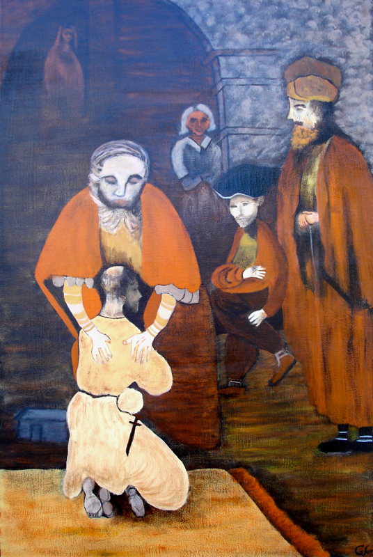
canvas mixed media textures

This painting evokes mood, human compassion and shades of light and dark were used often in his style of painting. The symbolism used here is of a homecoming and this ignites the compassionate heart to offer those who have experienced brokenness and darkness in their lives to be  loved and accepted.

Henri Jozef Machiel Nouwen (1932 –1996) was a Dutch-born Catholic priest and writer who authored 40 books about spirituality. Among his subjects he studied were theology, and psychology. He discovered the connection were related and this took him on a personal journey. This lead to his becoming a lecturer in pastoral theology, and an academic. During these times they were fruitful for him. He had a strong relationship with his mother.

The above two artists drew parallels and similarities of their personal lives and brought it to life in painting and writing about the story. The most poignant point I  see is that the father is forgiving, loving and welcoming his son with open arms and  compassionate love.  Looking at the picture one notices the father’s large hands embracing his long lost son – this symbolises the maternal instinct. The father’s hands were welcoming the son. The left hand was larger that the right one

The first impression I get when I see this artwork evokes a sense of darkness, complexity and symbolism.  But this didn’t deter me from attempting one of Rembrandt’s most cherished art pieces.

I used gesso to seal the canvas followed by a coat of burned umber. I sketched the top arch and faintly sketched the outlines of the figures. The father’s cloak and the cloak of the older son where painted with a mix of cadmium orange and ultramarine blue. It was difficult to paint the two figures faintly. I didn’t want them to stand out but still wanted their outlines seen. There were shades of gold, yellow, orange and brown scumbling and I used the deer brush to daub the mottled brown/opal/grey, giving the motley effect around the top right side of the canvas.

The Prodigal son was difficult to paint with a mournful side face and kneeling facing his father.

The painting was a mammoth challenge and took me on a personal journey of a deeper understanding of the characters in “The Return of the Prodigal Son”. The characters being the father, the older brother, the Prodigal son, the mother figure, and the maid servant in the distant background, (these two characters are thought to be) and the tax Collector (The Pharisee) sitting down garbed in his rich garments. I only knew of an overview of the story, but until I tackled this painting did I discover the true meaning of this painting.  In writing this book, Nouwen reflected what homecoming, and reconciliation was all about in his life.  There was a similarity of parallels used with both Rembrandt and Nouwen in painting and writing the story, using their life experiences of loneliness, dejection, jealousy and anger which assisted to complete the real story. The book is thought provoking and if you want to go on a deeper search and personal journey in your own life – Rembrandt and Nouwen make it easier to understand the parable of ‘The Return of the Prodigal Son”.

This work has been a challenge for me in drawing the characters and some barely visible. I agonized over the finished work, whether I could do more and better. This painting took me over 6 months to finish.

Keep creating; you never know what your capabilities present.

Thanks to Michelle from Mixed Media Art for giving me the opportunity for sharing my creation of artwork.

Keep Creating! Enjoy!

Emails are welcome

~ * ~ * ~ * ~ * ~ * ~ * ~ * ~ * ~ * ~ * ~ * ~ *  ~

My name is Gloria Malouf-Marsh. I live in Brisbane, Australia, with my husband Greg and my daughter Salwa .  I rise early and go for brisk walks, do my yoga practice and I’m inspired to face the day with inspiration and confidence. I get creative ideas for painting when I’m in nature. I love listening to nature’s sounds and watching and hearing the birds.

I am developing discipline in creating and making time for myself to daily paint. I seem curious to want to further my techniques.  I’m working with the building texture  mediums.  A sense of confidence and enjoyment has developed with me regarding honing my skills and techniques in the art medium, and I do enjoy this website so much.  Hearing peoples’ ideas and seeing their talents, just simply amaze me.  It is a special global family.   If I can create, so can you! Enjoy!

Emails are welcome at Gloria@radiantpathways.com.au

.

.
Little Fat Books

.

Joy Bathie continues to share her passion for handmade books, with these stunning Little Fat Books (LFB).

~*~*~*~*~*~*~*~*~*~*~*~*~*~*~*~*~*~*~*~*~*~*~*~*~

I have always loved books and my interest was expanded after attending a workshop at the State Library of NSW in Sydney some years ago, where I learned how to construct a basic hard cover codex book.  Since then I have experimented further and my repertoire now covers “handmade artist’s books” of various types and sizes, filled with colour and texture.  I’m now creating smaller books and enjoy making ‘LFB’s” (Little Fat Books) which are generally 10.5cm x 10.5cm (4” x 4”) square; I love this size, which sits so nicely in the hand.

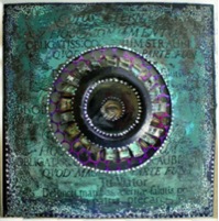
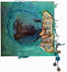
LFB in greens

This page from an LFB looks through the central circular  cut-out to the following page

Little Fat Books in greens

Here is a the page beneath

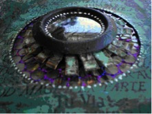
LFB in greens with found objects featured

and the close-up view.

Altogether there are five layers of colour and texture, plus clear and printed acrylic windows. Amongst other recycled materials these pages incorporate painted curtain rings and other circular metallic pieces, soft drink bottle caps cut, rusted, and patinaed, and also pulcinella (sequin waste).

This lovely Little Fat Book has a textured cover with nature elements

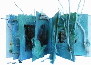
Here is another LFB, called “Twigs”, with two of its pages.  Again, each page in this book has a central cut-out section to view adjacent pages. 

This lovely Little Fat Book has a textured cover with nature elements

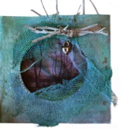
This lovely Little Fat Book in greens and blues

~*~*~*~*~*~*~*~*~*~*~*~*~*~*~*~*~*~*~*~*~*~*~*~*~

 Joy Bathie lives in Port Stephens, NSW, Australia. You can see what Joy is up to over on her Facebook page.

 ~*~*~*~*~*~*~*~*~*~*~*~*~*~*~*~*~*~*~*~*~*~*~*~*~

Listen To Your Inner Voice and Enjoy The Process

This article is written by Jenny Grant

When I let my intuition lead me through the painting process and I find my flow – Magic Happens! When I think too much about the result my inner critic is taking over and I am not enjoying the painting as much. When I am brave enough to follow my inner voice and I am not being afraid of adding another layer – that is when the magic happens!! When a painting is ready I can feel it physically in my body. It is strong and it fills me with both energy and peace.

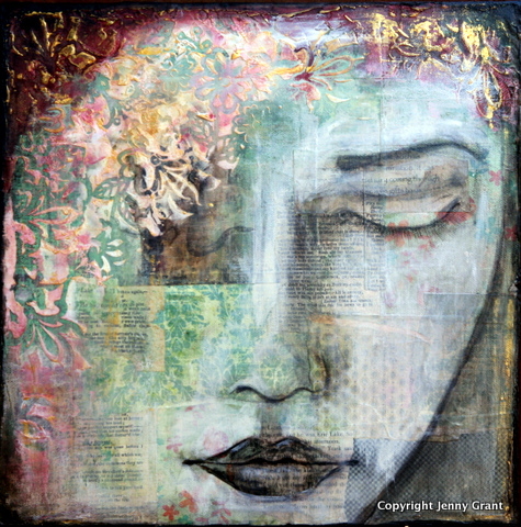
mixed media collage by Jenny Grant

I believe that many of us have lost the connection with our spiritual self. Many of us search for answers. We want to expand and explore love, creativity and our spirituality. But we fail. We seem to go in circles and not find the answers. I believe that we should stop searching and start listening. Listen to our inner voice, our inner guide. If we do we will achieve more and peace will develop within ourselves.

Did you know that recent research indicates that being creative and making things by hand improves mental health and makes us happy? We experience pleasure, pride and meaning through the creative process much more so than simply buying what we need. But the research shows that it is not the result that gives the joy it is the process! Too much focus on the result feeds frustration and unhappiness; we should experience and take pleasure from the journey.

When I find my flow while painting, I become totally absorbed in the moment. When I take a step back from the painting I often realize important things that leads me to insights about life and myself. My latest solo exhibition was about intuition and what I learnt through the process of painting the exhibited paintings. You can read more about that on my web site: The Voice Within.

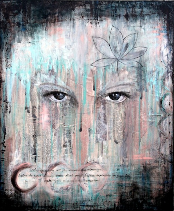
Mixed Media Collage by Jenny Grant

My goal for 2013 is to find Inner Harmony. I will let my intuition lead me and I will enjoy the journey. The first couple of paintings this year led me to the concept of Stillness. Stillness is not the lack of energy but energy in harmony! I realized that stillness will be important to understand and practice to reach Inner Harmony. I will explore this further and if you are interested you can follow my insights on my blog through the year.

I hope that I with this short article can feed your curiosity to explore further, to be brave and creative and to listen to your inner voice! Intuition, instinct, inner voice, inner guide or gut feeling – many names for the same thing. Whatever you call it, respect it and act on it! Intuition is our most reliable compass on our life journey and everyone has access to it. Be Brave! Let Go of your Inner Critic! And last but not least Enjoy the Journey!!!

With my art and my blog I am exploring creativity, spirituality and life in general. 

To find out more visit my blog Flow by Jenny or follow me on Facebook. You can also OWN some of my work from
Etsy – Jenny Grant Art or Society 6 – Jenny Grant

Jenny Grant's Someday Mixed Media Canvas

Artist Statement: Through my art I explore myself and I practice to let go. I create based on an intuitive process. Most of my paintings evolve as I paint. It is my inner guide that guides me. When I find my flow magic happens and it fills me with energy! I work with mixed media – acrylic paint, ink, color pencils, fabrics, paper, photos… anything that comes my way. My work is very rich with many layers that add depth and texture. My work is exhibited and for sale both in Sweden and New Zealand as well as on-line.

Mixed Media Artist: Tara Pasher

~*~

Our Mixed Media Art community is a diverse bunch; from all around the world, with different interests and reasons why we create and a wide range of skills. We love to bring a variety of artwork, techniques and mixed media artists to you, especially some you may not have come across yet… you just never know where inspiration will come from!

This week Tara Pasher shares her passion for mixed media painting and a sample of her gorgeous work.

~*~*~*~*~*~*~*~*~*~*~*~*~*~*~*~*~*~*~*~*~*~*~*~*~

Tara Pasher and her untitled painting

Tara Pasher is a self-taught professional artist from Stoney Creek Ontario who discovered her passion for art at a very young age. Her works incorporate bold colours and heavy amounts of texture. She works with a wide range of mediums including birch bark, sand and even glass. Tara has been painting on canvas just over 3 years. With much success with all her endeavors within the art world, she hopes to become a full time artist.

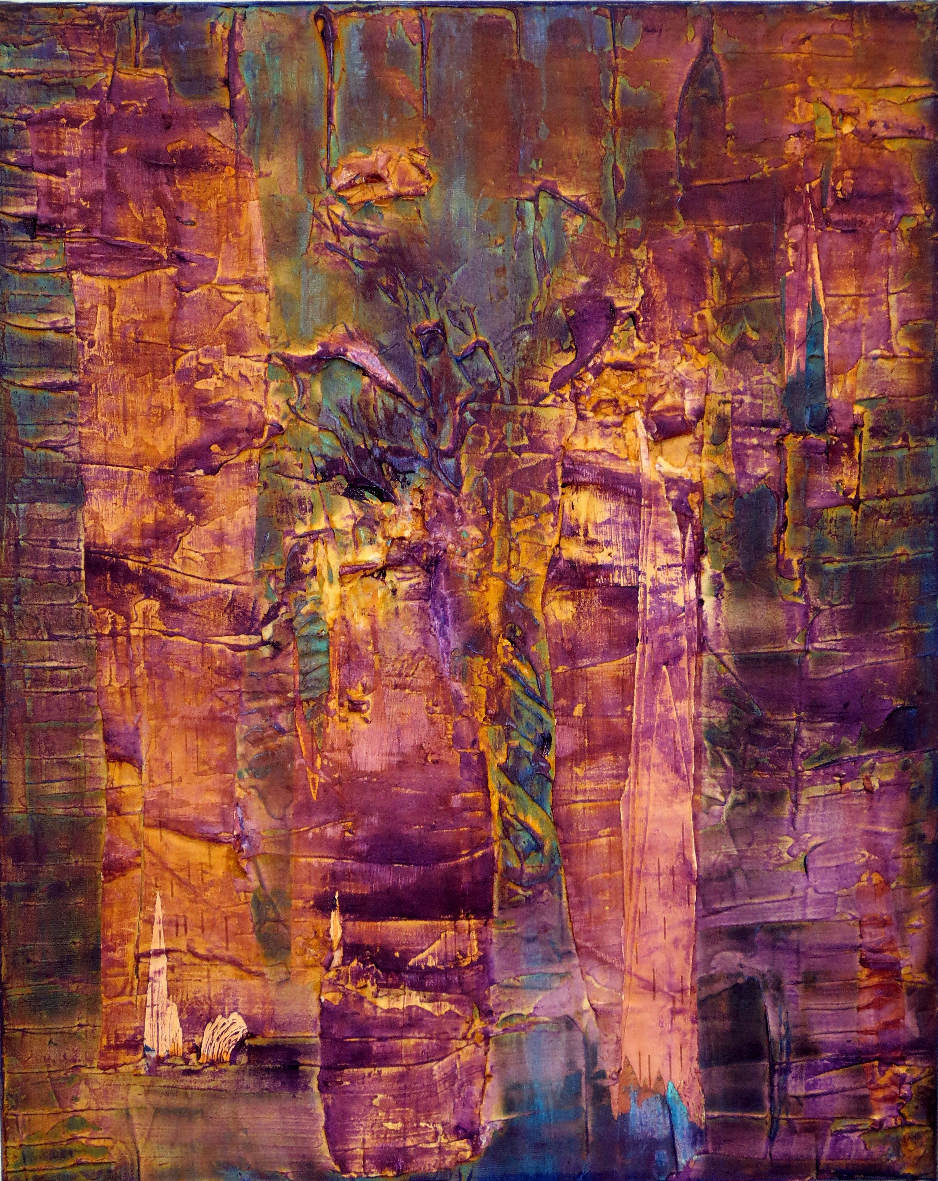
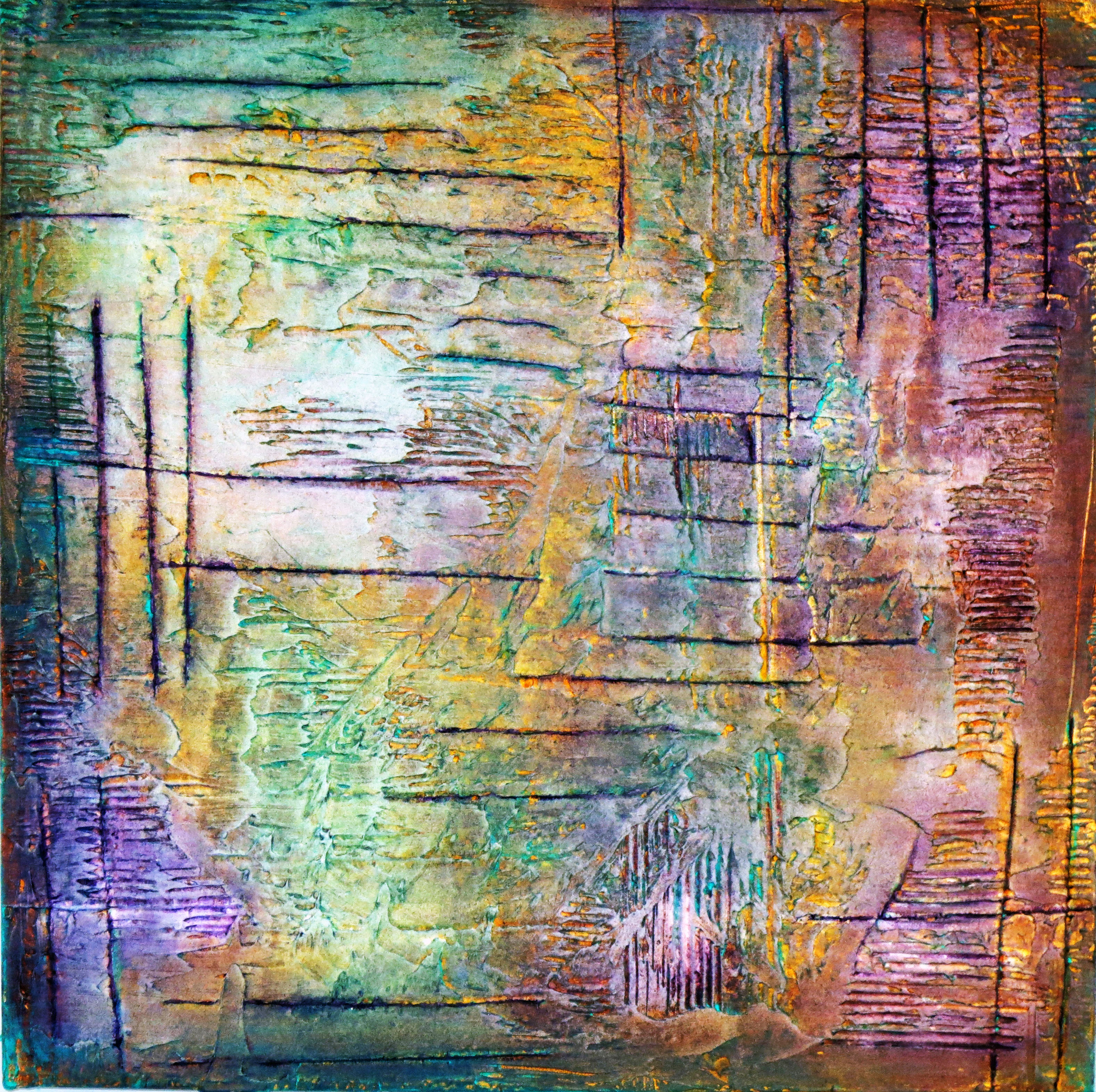
scratched mixed media painting

Artist Statement: It’s much easier for me to express what I feel on canvas. Painting is a huge part of who I am and I’m so thankful I have gotten the opportunity to share my work with others. I put a lot of my heart into each piece and it is a deep form of flattery when someone wants to hang my art in their home. Every experience I’ve ever had in life, inspires me to paint. Thank you to everyone for all your positive feedback. 🙂

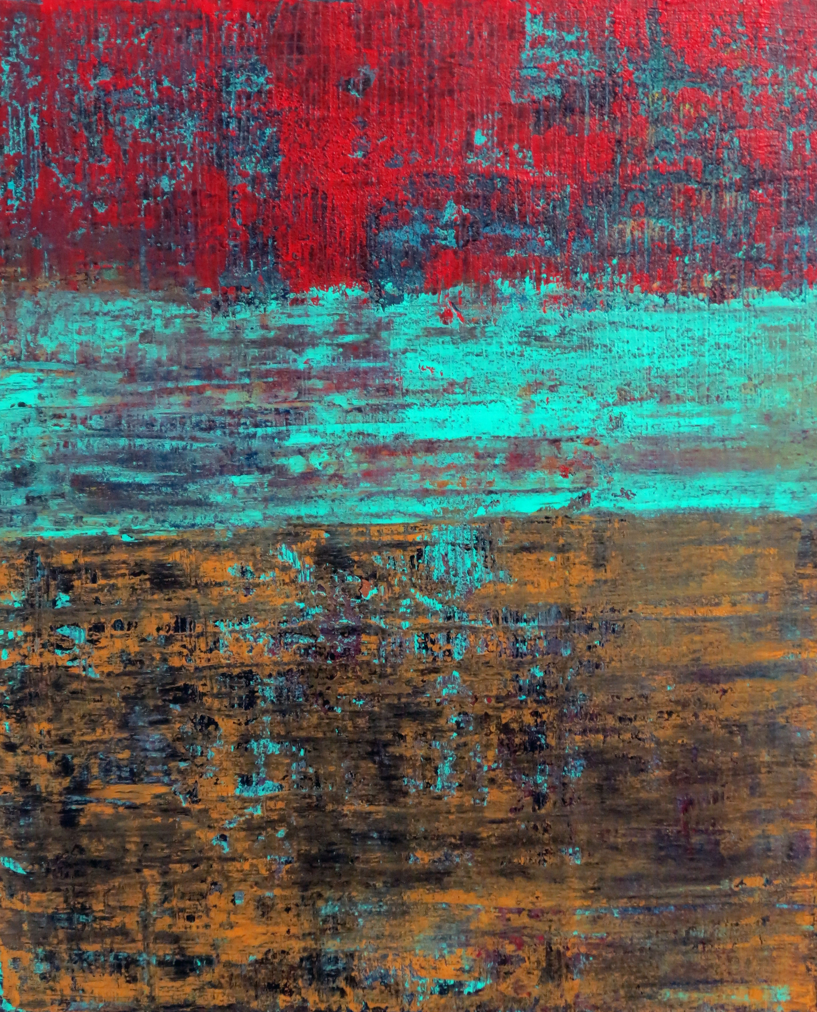
Bright reds and aqua brings our attention to this piece

~*~*~*~*~*~*~*~*~*~*~*~*~*~*~*~*~*~*~*~*~*~*~*~*~

 You can see more of Tara’s work at her website TaraPasher.com or on her Facebook page ~ Art by Tara.

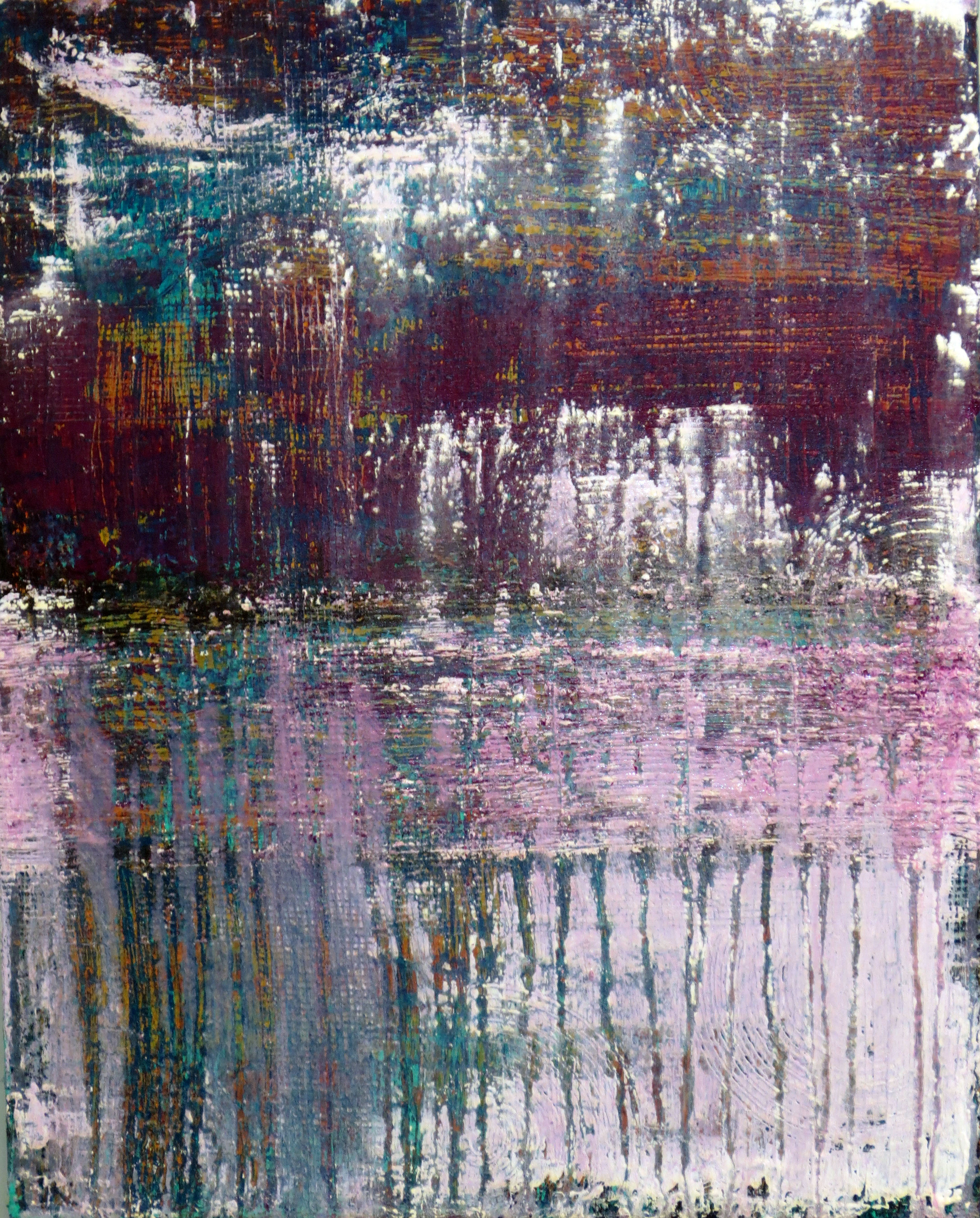
"Underneath" mixed media collage painting

Brilliant purples in this mixed media piece

.

.