Michelle G Brown | Mixed Media Art

Get off line and Make Art: Meditation Cards

~ * ~

This article is written by Melanie Statnick

Get off line and make art. This is my message to you and it is now your new mantra.
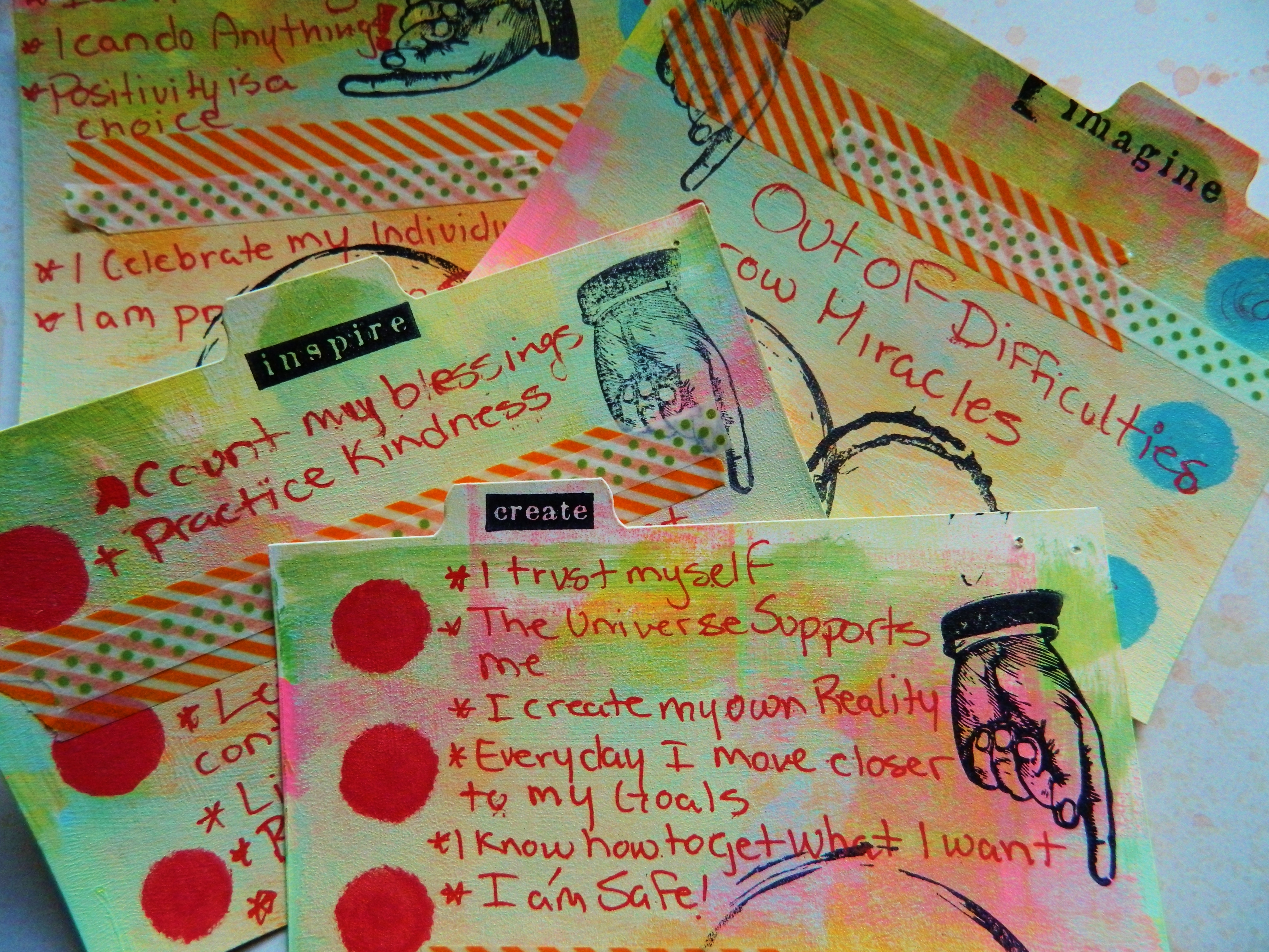
Meditation cards are the perfect focus point to help us get off the internet and create a little art each day!

Have you ever noticed how much time we spend online? Connected to all those virtual friends? Close friends?  How many websites you scroll through, morning, afternoon and evening. News, weather, Facebook, Twitter, Pinterest ,Flicker and blogging?
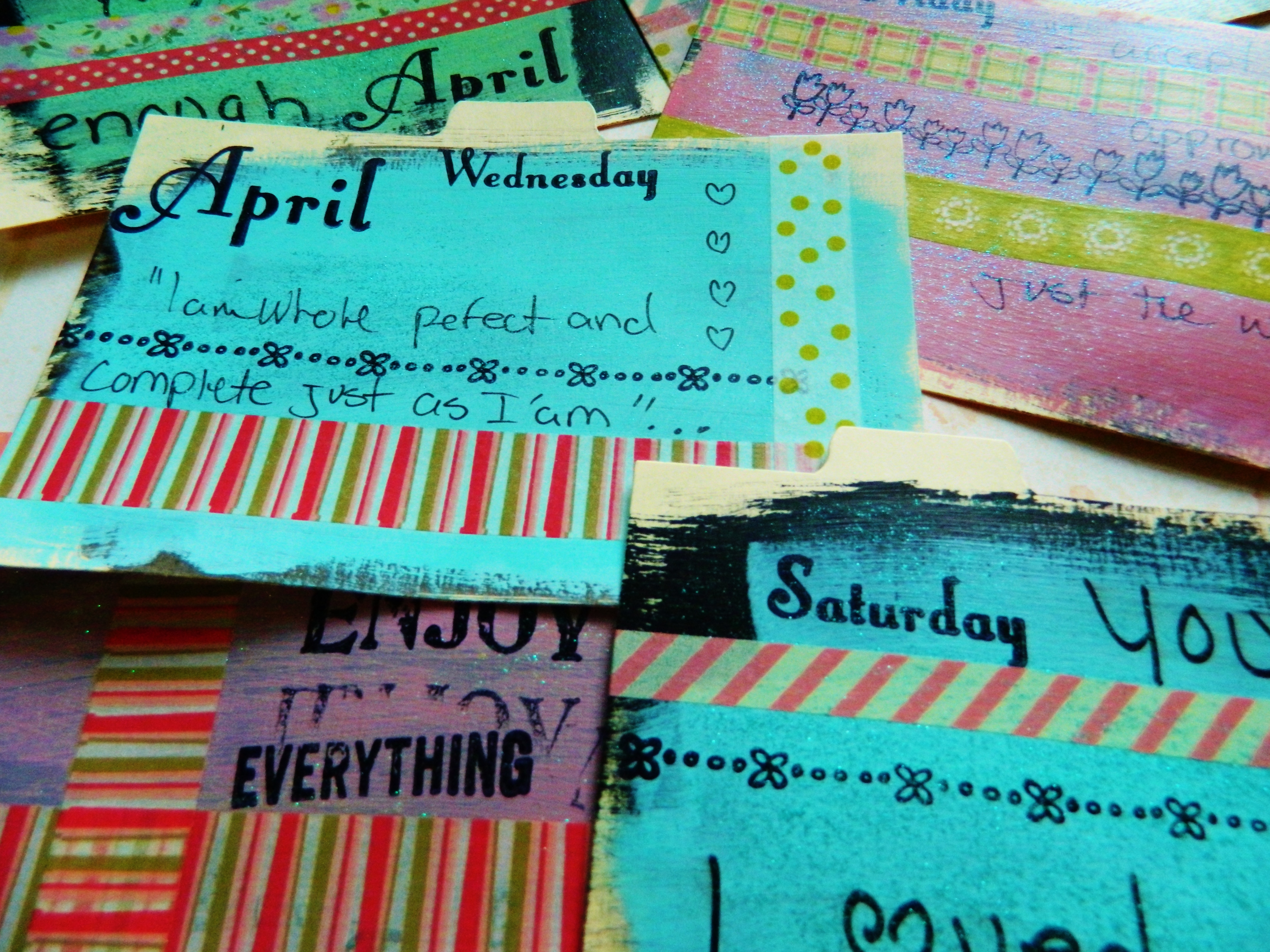
Meditation cards are the perfect focus point to help us get off the internet and create a little art each day!

Working from home can really put you to the test when you sit in front of your computer or check your phone.  We are addicts of social media. How can you create when you’re tuned in to the World Wide Web 24/7?   Get off line and make art. 3 years ago I started practicing yoga and meditating first thing in the morning. Before I even went to the computer or checked my phone.  Being more mindful first thing in the morning can have a powerful effect on how you view the world for the day.  When I finished my routine I was ready to face the day with an open and clear mind.  But I quickly found myself sitting too long in front of the screen afterward. I decided I needed a timer. I set my phone up and I give myself 45 minutes to check e-mail, respond, post, tweet etc… When the bell rings I’m done.  I’m off line and I’m making art.
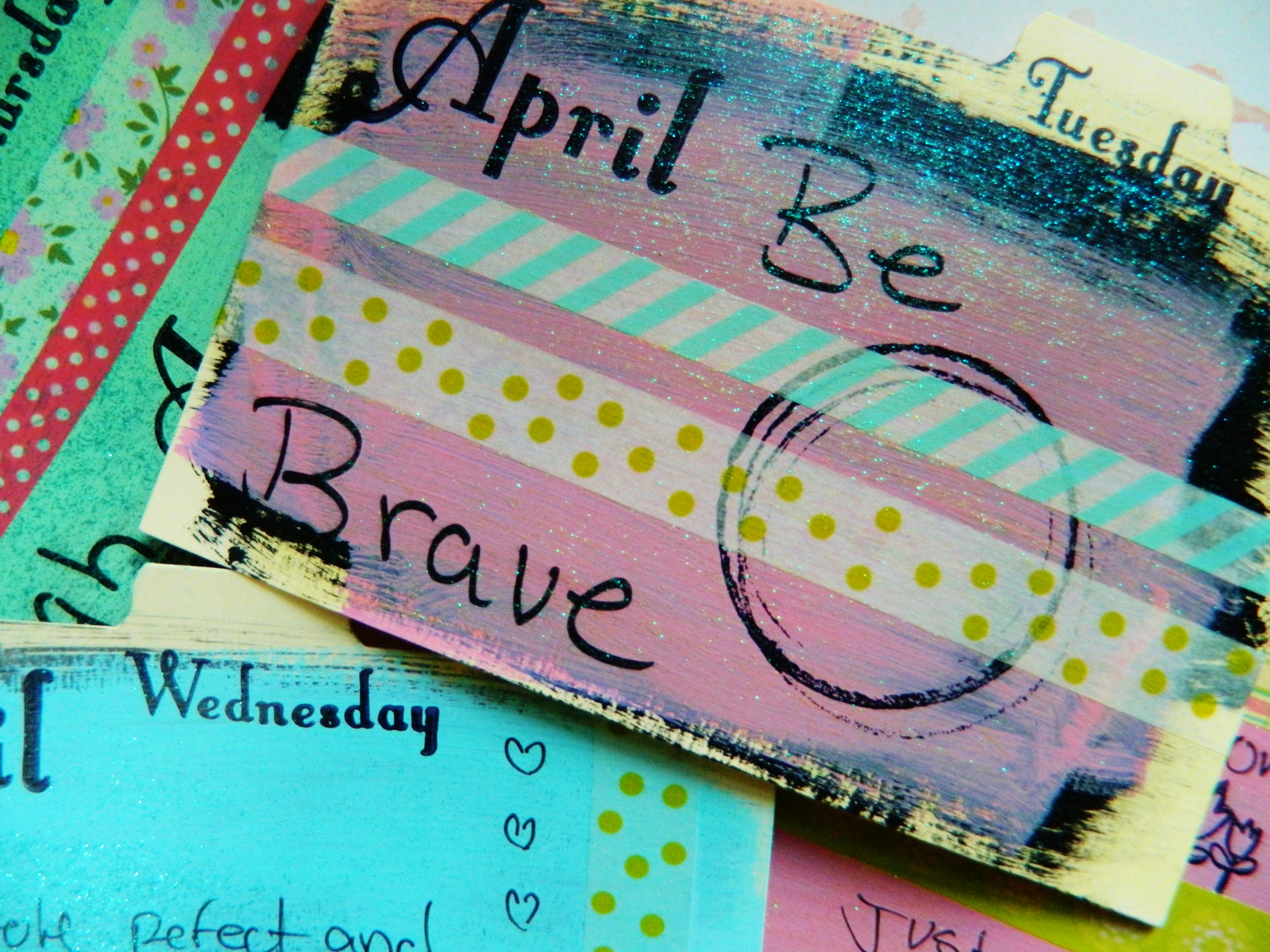
Meditation cards are the perfect focus point to help us get off the internet and create a little art each day!

In that quite reflection I was inspired to create mediation reflection cards. I would make them daily or every other day and began to keep them in a drawer I bought. I used plain index cards, gesso, paint, tape and stamps and I wrote my mantra for the day.   You can use quotes or make your own.  At the end of the year I will have a drawer full of personal motivation and words of self-care and growth.  It is always tempting to check the phone. Turn it off, tune out and get off line.  Give yourself the time and self-care you need to make great works of art. It has been said you can create a habit in 21 days. Challenge yourself of 21 days of cutting your internet time in half and meet your deadlines, personal goals or just tune out and turn in to create art.
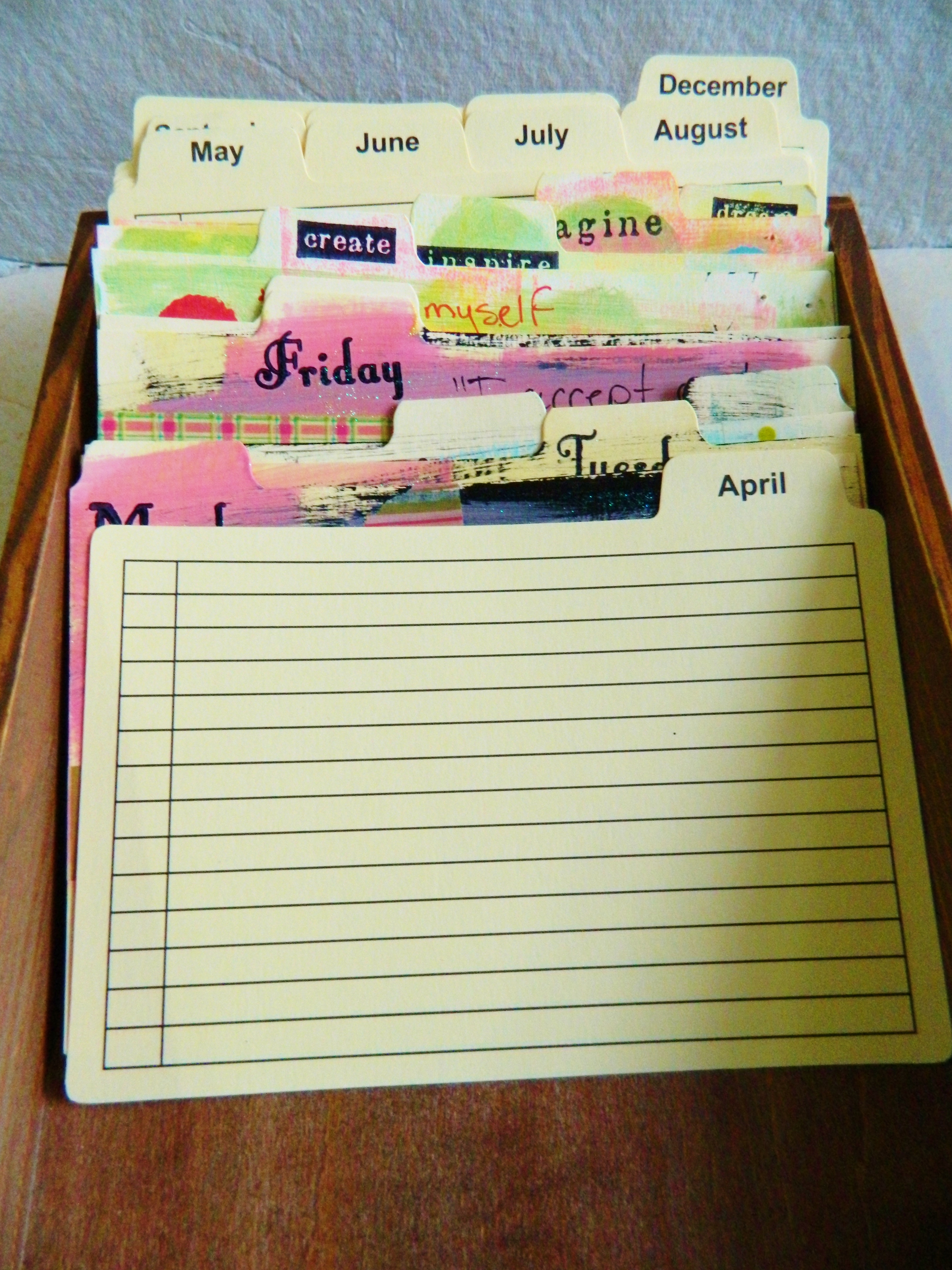
Meditation cards are the perfect focus point to help us get off the internet and create a little art each day!

~*~*~*~*~*~*~*~*~*~*~*~*~*~*~*~*~*~*~*~*~*~*~*~*~

Melanie Statnick is a Canadian Mixed Media & Collage Artist out of North Carolina. Melanie creates art daily from her private studio. Her style is fun, whimsy and eclectic. Melanie is also an Art Instructor for local venues and community colleges for students of all ages.

You can see more of Melanie’s artwork at Rabbit Hole Art
.

.
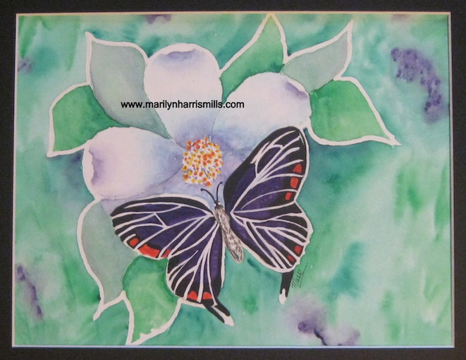
Choosing Paper for a Substrate

~ * ~

This article was written by Marilyn Harris Mills 

Recently, the market has been flooded with all types of surfaces for all types of media.  Whether you’re using watercolour pencil, acrylics, oils or simply gluing and pasting, there’s a substrate for everything.  How does one go about making sense of it all? Remember, even though the various companies market substrates for specific purposes, you are not confined to their suggestions.  Explore and have fun.

I’ll outline here various choices and you can decide what is best for both yourself and the choice of media you will be using.

Let’s first start with watercolour paper with so many choices.

Hot-pressed Watercolour paper (HP)

– the smoothest of all w/c  papers

– requires a great deal of control especially when using more water. It isn’t   porous, which causes pigment to puddle on the surface.

– excellent for detailed paintings with crisp sharp edges

Choose this type of paper if you like working with wash techniques or you want to concentrate on work that requires small amounts of paint applied in a controlled manner.

Marilyn Harris Mills talks about papers

Cold-pressed Watercolour paper (CP or NOT)

-medium tooth

-absorbs more water (more porous) than hot-pressed paper

-produces paintings with a looser style and look

-liquefied pigment can be removed from these papers by “scrubbing” with water and a brush

– will stand up to a fair amount of re-wetting and re-working

Choose this paper if you want a reliable general all-purpose paper that will suit most techniques and subject matter.  This paper is good whether you want to work with lots of control and detail or in a much more spontaneous manner.

Rough Watercolour Paper

-has even more tooth than cold-pressed paper and will hold up to repeated applications of water and pigment removal. This makes correcting mistakes easier than with any other watercolour paper.

Choose this paper for broad expressive work in which texture is important as well as other techniques such as dry brush, broken washes, lifting out and scratching back.

Marilyn Harris Mills talks about papers

Weights of Watercolour Paper

The weight of a watercolour paper describes its thickness. A paper’s weight is determined by how much a ream (500 sheets) of the particular paper weighs. Thickness will vary slightly from paper to paper, because some have different densities and moisture content. The most popular weights for watercolour papers are 140 lb. (300gsm) and 300 lb. (640gsm) it’s safe to use 140 lb. for paintings that require less water. Just be aware that it may buckle under even moderate applications of water. Although more costly, 300 lb. paper is a better choice for more serious watercolour painting projects. As a beginner, 140 lb. paper is a good choice.  Look for paper that is acid free because this means the paper does not contain chemicals that will degrade the sheet and cause yellowing later on.

Paper can be purchased in sheets, blocks or pads.  The choice is yours. Spiral pads are super for travelling.  Sheets of paper need to be cut/torn into the size you want but they are much cheaper to purchase than any other form. I might as well tell you now how to tear a piece of w/c paper.  Yes you can simply cut it…but if you want a torn edge, which is so becoming, then take a good fat round brush filled with water and stroke it along the paper.  Do this several times for the water to absorb.  Then either pulling the paper toward yourself or away from yourself you’ll get a beautiful torn edge.  Try both methods…..tearing toward yourself and tearing away from yourself.  A different effect both times.  Watercolour paper also comes in a block format.  The paper’s edges are glued on three sides, thus forming a block of paper.  One side is usually left unglued for easy removal from the block.  I love working with blocks, more expensive yes but I don’t need to use tape to secure to the placemat (dependent on the size of the block). Should you decide to purchase sheets of paper, cut to the size you wish to use, or a pad of paper in a specific size, then you will always need to use painter’s tape to adhere the paper to your placemat, otherwise the paper will buckle from water absorption.

With most watercolour papers, there is very little difference with the surface texture of one side and the other side. Traditionally, with embossed and watermarked papers, the correct side is the one on which the watermark appears the right way round.  Other papers will have a “mold” side.  If you hold it up to the light, you will notice that it has a more regular surface texture than the other side.  It is a matter of preference as to which side you choose.

Watercolour paper is a good choice for acrylics, charcoal, markers, pen, and especially for mixed media because of its weight.  Great for journals since it’s easy to fold.

Boards

There’s art boards, illustration boards, bristol boards, multi-media boards and speciality boards.  Basically they are boards with different types of surfaces, they are chosen according to the media chosen. Bristol Board provides two working surfaces, front and back. The better quality bristol boards are archival. Illustration Board is only finished on one surface. An illustration board is intended as a surface for creating artwork that will be scanned or reproduced onto other mediums. Art boards are a fine art paper mounted on an acid-free museum board, ready for framing or mounting.

Marker paper

If using markers, pens, ink, paper, then marker paper is a good choice. It’s smooth, non-bleeding and translucent. It responds well with colour with both permanent and watercolour markers.

Mixed Media Paper

This is my favourite when working with lots of different media in one painting. It has the characteristics of watercolour paper but the nice smooth finish of a drawing paper. I also like the weight of the paper thus holding up to many mediums. It is heavily sized for both wet and dry applications. It also erases well and blends easily if that is what you need.  Acrylics, charcoal, watercolours, inks, pastels, markers can all be used on this mixed media paper. Canson has just brought out a spiral bound book of this paper type – look for it – it has a blue cover and has fast become my favourite substrate if I want to work small. I like this paper for journals too since it folds well.

Vellum Paper

This paper is extra smooth and very translucent. It’s resistant to scratching and erasing so it might not be viable for mixed media is those are the techniques you use. It’s a beautiful paper though for tracing, design, penned calligraphy and even drafting.

Paper Terminology

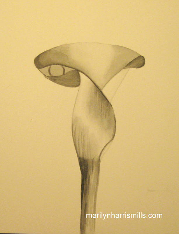
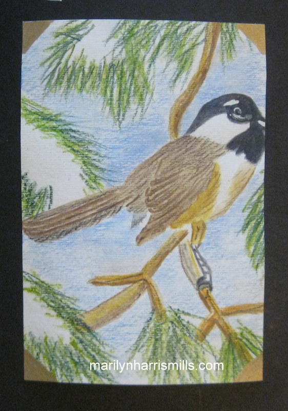
The texture of the surface substrate is a determining factor when working with different media.  Texture is also a personal choice.  When I’m using my watercolour pencils I may use cold  pressed watercolour paper, but when using lots of mediums for my mixed media journals, then I’ll use a heavy hot pressed watercolour paper or the mixed media paper specially made for this. Choice depends on whether you want the substrate to be smooth or rough.

Marilyn Harris Mills talks about papers

Archival

This is a durable acid-free paper that is also PH balanced. Simply put, non-archival means that it will discolour as well as changing the composition of the substrate.  If you want your colours to maintain their richness, choose archival papers.

Sizing

Sizing is the process of adding water-soluble gelatin or starch to the paper when the paper is being made. The amount of sizing used determines how absorbent the paper is. It’s similar to when you purchase a new brush, each brush has sizing in it to protect the brush hairs when travelling.  One must wash out the sizing in the brush before using. Sizing in the paper controls how water, and other media penetrate the surface.

To learn more and to view selections, Dick Blick has some great information here http://tinyurl.com/n9wve96

~*~*~*~*~*~*~*~*~*~*~*~*~*~*~*~*~*~*~*~*~*~*~*~*~

Marilyn Harris Mills, aka Maer, lives in Ottawa, Ontario, Canada and is passionate, creative and eccentric..at least that’s what her girlfriends tell her!. Marilyn a professional and published artist, designer and teacher. She journey through life with her dogs Lucy and Mozart. Practicing yoga, journalling, meditating & walks in the forest nourish and excite her. Some days she tries to knit but that’s not quite working out! One of her favourite quotes is this one because it so her!”I work in whatever medium likes me at the moment!” (Marc Chagall)

You can see more of Marilyn’s work at her website – Marilyn Harris Mills

~*~*~*~*~*~*~*~*~*~*~*~*~*~*~*~*~*~*~*~*~*~*~*~*~

.

.

Vintage Easter Pop-up Card

~ * ~

This article is written by Michelle G. Brown

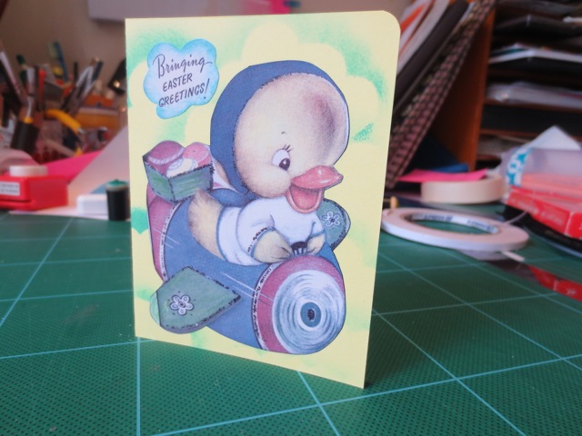
Last year, we had not one but two Easter Ephemera sheets to download – #11 Vintage Easter Wishes and #12 Cute Easter Cards but I hadn’t put them to good use, so for this month’s ephemera sheet, I thought I’d revisit these cute little vintage cards, with their lovely sayings, and turn them into a cad, ready for Easter this year.

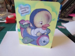
Vintage Easter Card by Michelle G. Brown

Materials

  • Mixed Media Ephemera Sheet #12 Cute Easter Cards (scroll down until you find #12)
  • Yellow and white card
  • Glue stick
  • Double sided tape
  • craft knife and rulers
  • Ink and sponges, to decorate

 Instructions

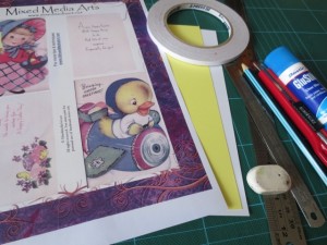
1. Gather materials

EasterCard materials by Michelle G. Brown

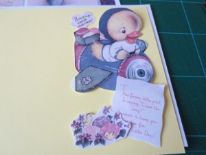
2. Cut out images for card. Here I added a bit to the airplane wing and cut a cloud around the front greeting.

Mixed media vintage Easter Card

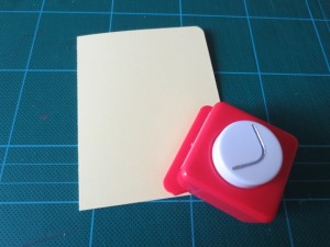
3. Cut the yellow card to 165mm x 110mm [6 1/2” x 4 1/4”] and round top corners

Cute vintage Easter card - round corners

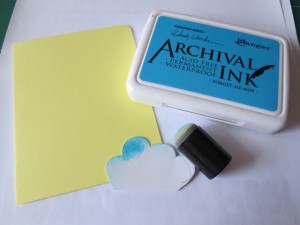
4. Cut out a cloud template from leftover card

EasterCard04

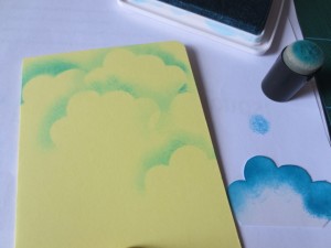
5. Sponge clouds onto card front

Cute vintage Easter card with ink clouds

5. Sponge blue around the greeting. Edge the main image with black marker. Stick onto front of card with glue stick.

Cute vintage Easter card front

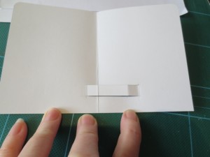
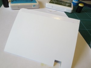
6. Cut inner card to 160mm x 105mm [1/8” smaller than the outer card]. Mark out the tab for the pop-up; 15mm from the bottom, 10mm to the left of the centre fold, then 25mm to the right, then another 10mm. Cut along lines parallel to bottom of card.

[**Note careful measuring is needed for pop-uo cards, so take your time here. it is important to have the lines parallel to the bottom of the card and parallel to the centre fold.]

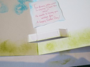
Pop up card tab

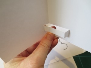
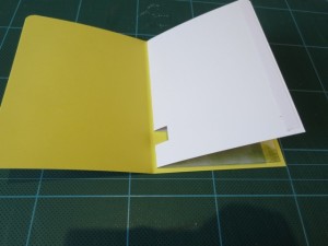
7. Carefully fold tab out and close card to check it will fold flat

Pop up tab folded

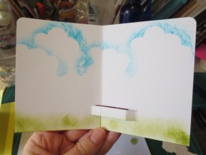
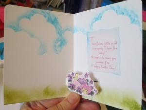
8. Decorate the inside of the card with the same cloud template as on the card front and add some green grass.

Inside of vintage Easter card

9. Add double sided tape to the top of the tab

Add image with double sided tape

10. Add on the pop-up image and sentiment

Inside of card, ready to go

11. Now to add the inside into the card front. Again, care is needed here to make sure the card will open and close properly. Firstly hold the two sections together and check it will work as you expected.

Double sided tape on inner card

Add a line of double sided tape to the outer edges of the inner card.

12. Attach to one side of the card front, leaving  a little room in the spine to allow for the inner section to move a bit. then peel off the backing from the second piece of tape and close the card to stick these two pieces together.

Half stuck in

13. Now your cute little Easter card is finished.

Michelle G. Brown makes a vintage Easter card

~*~*~*~*~*~*~*~*~*~*~*~*~*~*~*~*~*~*~*~*~*~*~*~*~

Michelle G. Brown is passionate about mixed media art and enjoys sharing her knowledge and techniques with you to allow you to express your own creativity. Michelle understands that many of us have an inner need to create. By learning a few basic techniques the amazing world of mixed media art is accessible to everyone!

~*~*~*~*~*~*~*~*~*~*~*~*~*~*~*~*~*~*~*~*~*~*~*~*~

Spring Bouquet Inspired Mixed Media

~ * ~

This article is written by Tamara Dinius Spring Bouquets

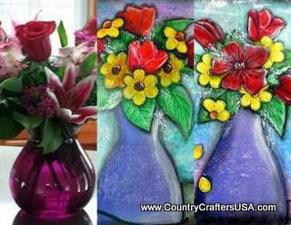
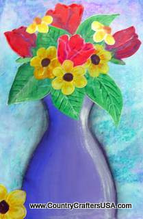
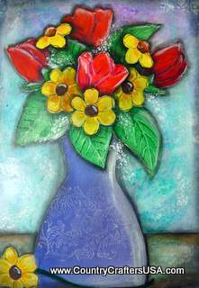
Inspiration comes in many forms, shapes, and sizes. The inspiration for this artwork came from a floral delivery I received. You will notice that the original floral bouquet is quite different from my finished floral still-life piece, but I think that is what art is all about. We take something we like, use it to inspire us, and turn it into our own individual art style. I completed two pieces at the same time, with quite different results. We will be focusing our attention on the vase in the middle of the above photo for this step-by-step process.

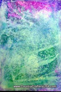
Start with watercolor paper (any brand will work) cut to approximately 8×10 inches. I used Dylusion sprays in Vibrant Turquoise, London Blue, and Crushed Grape. I sprayed the Dylusion sprays randomly on the paper and then rolled my paper towel roll over them. The imprint on the paper is from the design on my paper towels.

Background using Dylusion Sprays by Tamara Dinius

To set the Dylusion sprays I used a Krylon clear satin spray, Next, I applied a thin coat of Liquitex Matte Medium.

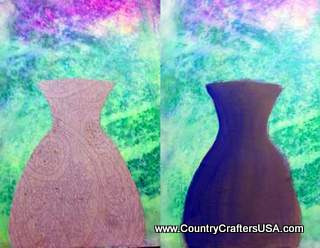
Adding a vase using scrapbook paper and shading with acrylic paint.

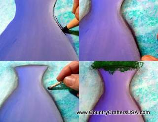
Pick out a piece of paper for the vase. Cut out your shape and adhere it to the paper (I used Golden Heavy Gel Matte Medium). Apply a thin coat of lavender/purple in three different hues. Concentrate the darkest hue on one side moving to the lightest on the opposite side.

Shadow with charcoal

In this step we will be adding some shadows with charcoal pencil. I first lay in the shadow with the pencil. I soften the edges by using my fingers or a blending stump. At this point, we will also add some green foliage to lay our flowers and leaves on. Be loose with this process, as most of the foliage will be covered up.

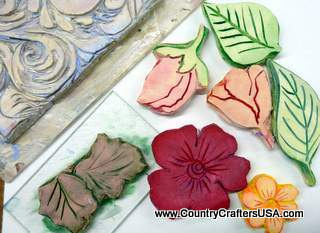
Flowers and leaves in rubber stamps

These are the hand-carved stamps I used for my project. Any leaf or flower stamps you have will work for this project. You can also freehand your designs if you prefer.

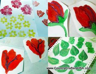
Adding depth to your rubber stamped images

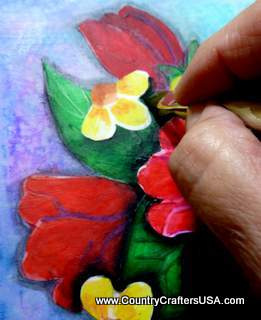
Once stamped (in your desired colors) I used Derwent Inktense Pencils and Derwent Inktense Blocks to color in the leaves and flowers. Use varying hues of your colors to add depth to the flowers and leaves.

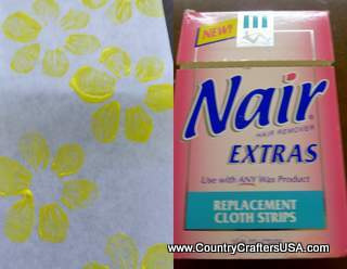
Nair Cloth Strips used in Mixed Media

I recently cleaned out the bathroom cupboard and found Nair Cloth Strips. I thought I would be adventurous and use them in this project. I wanted to see how they would hold up to paint, ink, and various medium. I really like how velvety they were and how they brought out the intensity of the colors.

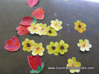
Flowers cut out and ready to adhere to your mixed media background

Cut out the leaves and flowers.

Adding your flowers and leaves to your vase

Adhere your flowers and leaves onto the foliage (I used Golden Heavy Gel Matte Medium).

Shadow adds depth to your mixed media project

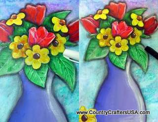
Add a dark shade (I used Delta Black/Green Acrylic) to indicate items that lie in front of another. You will notice that the daisy lies in front of the leaf and the rose. This is indicated by adding a shadow to the outside edge of the daisy.

Black and white Sharpies work well for adding highlights and defining your mixed media

Add highlights using a water-based Sharpie white paint pen or similar pen. Add an outline using a black Sharpie Ultra-fine or similar pen.

Complete your project using stamped images and stencils

Using paper, create a mask for your project so only the vase is visible. Add a design of your choice in a light lavender. You can also add baby’s breath by using a stencil or sponge. I used a piece of ribbon as a stencil. I cut my shape out of the wired ribbon shown in the photo.

End result is ready for framing.

Add a horizontal line with a dark color wash to indicate a table or counter top. I used Derwent Inktense Blocks.

Congratulations! You have created a wonderful mixed media spring bouquet suitable for framing.

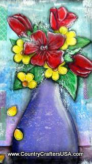
Second mixed media painting depicting spring floral bouquet

This is the second version I created using the same techniques. I added Washi Tape and white paint to the background. Although the two pieces are similar, they are also quite different. I like both of them equally and will be making prints from them to sell on my website.

~*~*~*~*~*~*~*~*~*~*~*~*~*~*~*~*~*~*~*~*~*~*~*~*~

Tamara Dinius lives in the Pacific Northwest with her husband and chocolate lab. She has two grown daughters who make her life meaningful. They support her, ground her, embrace her, and are amazing people in their own right.

Her love for mixed media has taken over most aspects of her creative journey. She believes mixed media allows for a broad range of styles and anyone can find success in this form of artistic expression.

You can find more of Tamara’s work, and on her website www.countrycraftersusa.com or via her Facebook www.facebook.com/countrycraftersUSA

~*~*~*~*~*~*~*~*~*~*~*~*~*~*~*~*~*~*~*~*~*~*~*~*~

.

.