Late Afternoon in Elk Meadows

~ * ~

This article is written by Gloria Malouf-Marsh

Elk Meadows is a region in the Rocky Mountains.  Many parks and trail systems boasts the Evergreen countryside. It is situated on 30 acres, right outside the entrance to Rocky Mountain National Park.

The scenery is vibrant. The atmosphere is fresh and brisk. The mountains are rugged towering to the skies. The pine, fir trees are carpeting the countryside. The animals are soaking the sunshine and this is elk country. Cascading waterfalls, rivers and brooks abound with rock formations in many shapes.

Mixed Media Painting “Late Afternoon in Elk Meadows” by Gloria Malouf-Marsh

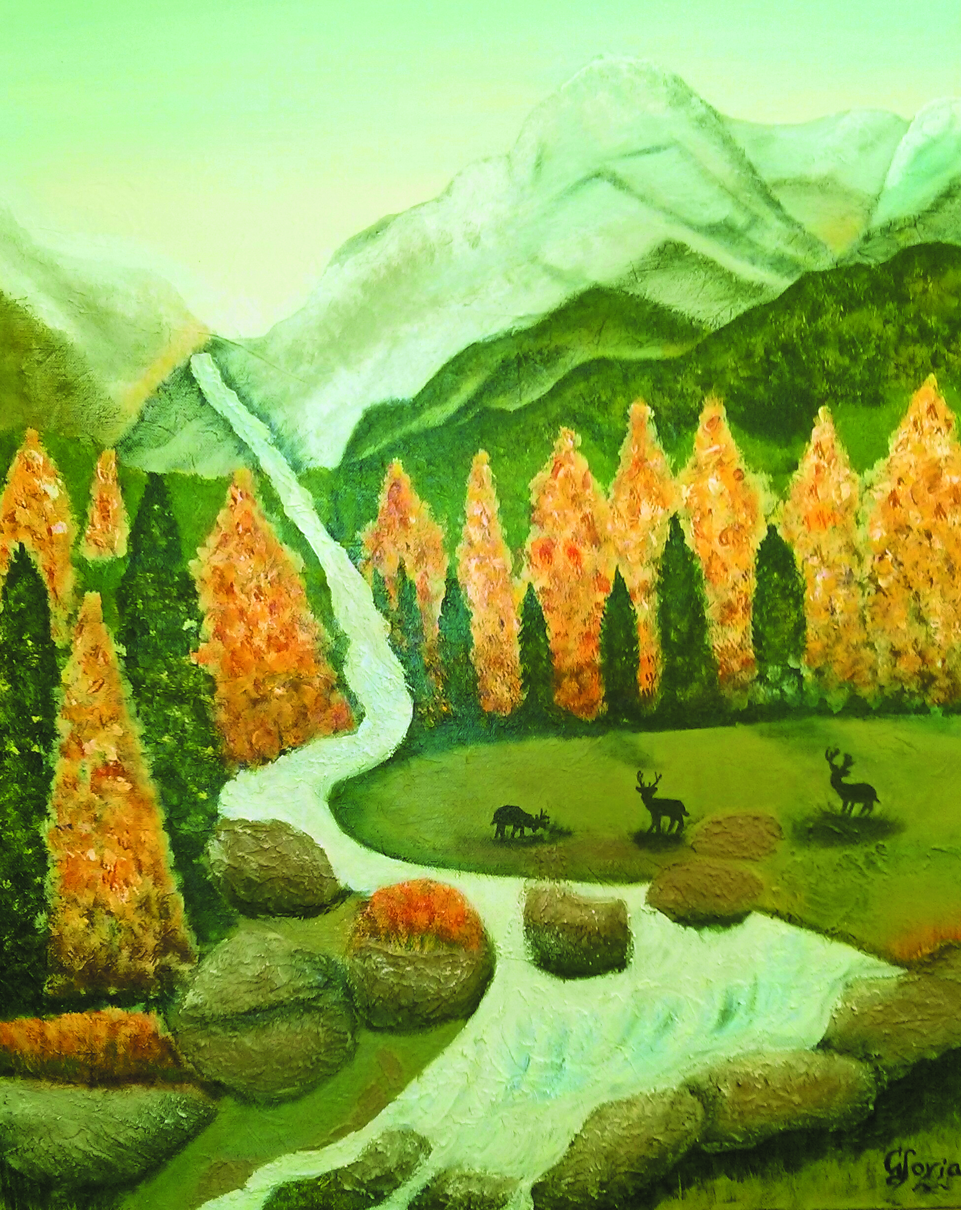
I was excited doing this painting.  I wanted to experiment and discover texture.  I didn’t realize the challenge I was getting myself in for. So I started with gessoing (not sure if this is a word) the canvas with a palette knife.  It was a glorious sunny winter’s morning in Brisbane with some wind.  I had some fun manipulating the swirls, tucks, turns and working with the gesso in creating texture and shapes.   I’m loosening up with my grip on the brush. My canvas included the beckoning snow capped mountains; streams, waterfalls and rocks surrounding the carpet of trees massed with bright complimenting colors of yellow/orange, greens and the smell of nature surrounded me.

I sat at art class (before I started) looked at a blank yellow painted textured canvas.  As I skimmed through books – my imagination had ideas of free flowing curves, and instead of defining scenery, I wanted to listen to my intuition and carry it out without criticism or judgment.  My inner critic wanted me to use bright happy natural colors and I chose an area in the Rockies with snow-capped mountains – I then started with the deer brush, dabbing outlines of the trees, dark bottle green and yellow/orange.   As the canvas started to unfold my free flowing creativity expressed itself in mountains and pine trees.  I came home from my class and my canvas had  set out on its own journey.  I now need to define and build my subject matter. And on I go.

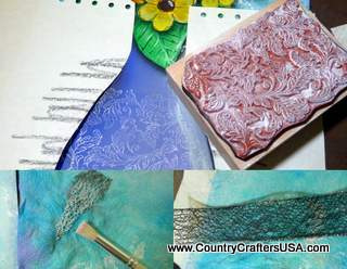
I used texture paste to form the stirring and splashing of the waterfall and this flowing down to the stream below surrounding rock formations.   I applied swirls of water eddying in downward direction to represent the speed of water. I used sand mixed with texture paste to form the rock formations. I then painted the rocks with Provincial Beige. Adding animal life to the scene made it very realistic and welcoming, as they were munching food and looked very happy.

This painting is a busy one, but very vibrant and alive. The finished canvas resembled late afternoon in Elk Meadows. I was quite happy with the end result.

~ * ~ * ~ * ~ * ~ * ~ * ~ * ~ * ~ * ~ * ~ * ~ *  ~

My name is Gloria Malouf-Marsh. I live in Brisbane, Australia, with my husband Greg and my daughter Salwa .  Springtime is glorious in Brisbane. I rise early and go for brisk walks, do my yoga practice and I’m inspired to face the day with inspiration and confidence. I get creative ideas for painting when I’m in nature. I love listening to nature’s sounds and watching and hearing the birds.

I am developing discipline in creating and making time for myself to daily paint. I seem curious to want to further my techniques.  I’m working with the building texture  mediums.  A sense of confidence and enjoyment has developed with me regarding honing my skills and techniques in the art medium, and I do enjoy this website so much.  Hearing peoples’ ideas and seeing their talents, just simply amaze me.  It is a special global family.   If I can create, so can you! Enjoy!

Emails are welcome at Gloria@radiantpathways.com.au

~*~*~*~*~*~*~*~*~*~*~*~*~*~*~*~*~*~*~*~*~*~*~*~*~

.

.

Spring Bouquet Inspired Mixed Media

~ * ~

This article is written by Tamara Dinius Spring Bouquets

Inspiration comes in many forms, shapes, and sizes. The inspiration for this artwork came from a floral delivery I received. You will notice that the original floral bouquet is quite different from my finished floral still-life piece, but I think that is what art is all about. We take something we like, use it to inspire us, and turn it into our own individual art style. I completed two pieces at the same time, with quite different results. We will be focusing our attention on the vase in the middle of the above photo for this step-by-step process.

Start with watercolor paper (any brand will work) cut to approximately 8×10 inches. I used Dylusion sprays in Vibrant Turquoise, London Blue, and Crushed Grape. I sprayed the Dylusion sprays randomly on the paper and then rolled my paper towel roll over them. The imprint on the paper is from the design on my paper towels.

Background using Dylusion Sprays by Tamara Dinius

To set the Dylusion sprays I used a Krylon clear satin spray, Next, I applied a thin coat of Liquitex Matte Medium.

Adding a vase using scrapbook paper and shading with acrylic paint.

Pick out a piece of paper for the vase. Cut out your shape and adhere it to the paper (I used Golden Heavy Gel Matte Medium). Apply a thin coat of lavender/purple in three different hues. Concentrate the darkest hue on one side moving to the lightest on the opposite side.

Shadow with charcoal

In this step we will be adding some shadows with charcoal pencil. I first lay in the shadow with the pencil. I soften the edges by using my fingers or a blending stump. At this point, we will also add some green foliage to lay our flowers and leaves on. Be loose with this process, as most of the foliage will be covered up.

Flowers and leaves in rubber stamps

These are the hand-carved stamps I used for my project. Any leaf or flower stamps you have will work for this project. You can also freehand your designs if you prefer.

Adding depth to your rubber stamped images

Once stamped (in your desired colors) I used Derwent Inktense Pencils and Derwent Inktense Blocks to color in the leaves and flowers. Use varying hues of your colors to add depth to the flowers and leaves.

Nair Cloth Strips used in Mixed Media

I recently cleaned out the bathroom cupboard and found Nair Cloth Strips. I thought I would be adventurous and use them in this project. I wanted to see how they would hold up to paint, ink, and various medium. I really like how velvety they were and how they brought out the intensity of the colors.

Flowers cut out and ready to adhere to your mixed media background

Cut out the leaves and flowers.

Adding your flowers and leaves to your vase

Adhere your flowers and leaves onto the foliage (I used Golden Heavy Gel Matte Medium).

Shadow adds depth to your mixed media project

Add a dark shade (I used Delta Black/Green Acrylic) to indicate items that lie in front of another. You will notice that the daisy lies in front of the leaf and the rose. This is indicated by adding a shadow to the outside edge of the daisy.

Black and white Sharpies work well for adding highlights and defining your mixed media

Add highlights using a water-based Sharpie white paint pen or similar pen. Add an outline using a black Sharpie Ultra-fine or similar pen.

Complete your project using stamped images and stencils

Using paper, create a mask for your project so only the vase is visible. Add a design of your choice in a light lavender. You can also add baby’s breath by using a stencil or sponge. I used a piece of ribbon as a stencil. I cut my shape out of the wired ribbon shown in the photo.

End result is ready for framing.

Add a horizontal line with a dark color wash to indicate a table or counter top. I used Derwent Inktense Blocks.

Congratulations! You have created a wonderful mixed media spring bouquet suitable for framing.

Second mixed media painting depicting spring floral bouquet

This is the second version I created using the same techniques. I added Washi Tape and white paint to the background. Although the two pieces are similar, they are also quite different. I like both of them equally and will be making prints from them to sell on my website.

~*~*~*~*~*~*~*~*~*~*~*~*~*~*~*~*~*~*~*~*~*~*~*~*~

Tamara Dinius lives in the Pacific Northwest with her husband and chocolate lab. She has two grown daughters who make her life meaningful. They support her, ground her, embrace her, and are amazing people in their own right.

Her love for mixed media has taken over most aspects of her creative journey. She believes mixed media allows for a broad range of styles and anyone can find success in this form of artistic expression.

You can find more of Tamara’s work, and on her website www.countrycraftersusa.com or via her Facebook www.facebook.com/countrycraftersUSA

~*~*~*~*~*~*~*~*~*~*~*~*~*~*~*~*~*~*~*~*~*~*~*~*~

.

.

The Return of the Prodigal Son

This article is written by Gloria Malouf-Marsh

For this painting, I would like to introduce you to two artists, though years apart, have found, that this painting has made an indelible impression on them both.

The Return of the Prodigal Son is an oil painting by Rembrandt Harmenszoon van Rijn (1606-1669). It is among one of the Dutch master’s final works.  The highlight of this story describes the impact the moment the Prodigal Son returns to his father and the consequences that unfold. The story is about two sons of a rich man. The youngest one asks his father for his inheritance. He leaves home and squanders all his money and returns home penniless and asks for his father’s forgiveness. His father welcomes him home with open arms.

canvas mixed media textures

This painting evokes mood, human compassion and shades of light and dark were used often in his style of painting. The symbolism used here is of a homecoming and this ignites the compassionate heart to offer those who have experienced brokenness and darkness in their lives to be  loved and accepted.

Henri Jozef Machiel Nouwen (1932 –1996) was a Dutch-born Catholic priest and writer who authored 40 books about spirituality. Among his subjects he studied were theology, and psychology. He discovered the connection were related and this took him on a personal journey. This lead to his becoming a lecturer in pastoral theology, and an academic. During these times they were fruitful for him. He had a strong relationship with his mother.

The above two artists drew parallels and similarities of their personal lives and brought it to life in painting and writing about the story. The most poignant point I  see is that the father is forgiving, loving and welcoming his son with open arms and  compassionate love.  Looking at the picture one notices the father’s large hands embracing his long lost son – this symbolises the maternal instinct. The father’s hands were welcoming the son. The left hand was larger that the right one

The first impression I get when I see this artwork evokes a sense of darkness, complexity and symbolism.  But this didn’t deter me from attempting one of Rembrandt’s most cherished art pieces.

I used gesso to seal the canvas followed by a coat of burned umber. I sketched the top arch and faintly sketched the outlines of the figures. The father’s cloak and the cloak of the older son where painted with a mix of cadmium orange and ultramarine blue. It was difficult to paint the two figures faintly. I didn’t want them to stand out but still wanted their outlines seen. There were shades of gold, yellow, orange and brown scumbling and I used the deer brush to daub the mottled brown/opal/grey, giving the motley effect around the top right side of the canvas.

The Prodigal son was difficult to paint with a mournful side face and kneeling facing his father.

The painting was a mammoth challenge and took me on a personal journey of a deeper understanding of the characters in “The Return of the Prodigal Son”. The characters being the father, the older brother, the Prodigal son, the mother figure, and the maid servant in the distant background, (these two characters are thought to be) and the tax Collector (The Pharisee) sitting down garbed in his rich garments. I only knew of an overview of the story, but until I tackled this painting did I discover the true meaning of this painting.  In writing this book, Nouwen reflected what homecoming, and reconciliation was all about in his life.  There was a similarity of parallels used with both Rembrandt and Nouwen in painting and writing the story, using their life experiences of loneliness, dejection, jealousy and anger which assisted to complete the real story. The book is thought provoking and if you want to go on a deeper search and personal journey in your own life – Rembrandt and Nouwen make it easier to understand the parable of ‘The Return of the Prodigal Son”.

This work has been a challenge for me in drawing the characters and some barely visible. I agonized over the finished work, whether I could do more and better. This painting took me over 6 months to finish.

Keep creating; you never know what your capabilities present.

Thanks to Michelle from Mixed Media Art for giving me the opportunity for sharing my creation of artwork.

Keep Creating! Enjoy!

Emails are welcome

~ * ~ * ~ * ~ * ~ * ~ * ~ * ~ * ~ * ~ * ~ * ~ *  ~

My name is Gloria Malouf-Marsh. I live in Brisbane, Australia, with my husband Greg and my daughter Salwa .  I rise early and go for brisk walks, do my yoga practice and I’m inspired to face the day with inspiration and confidence. I get creative ideas for painting when I’m in nature. I love listening to nature’s sounds and watching and hearing the birds.

I am developing discipline in creating and making time for myself to daily paint. I seem curious to want to further my techniques.  I’m working with the building texture  mediums.  A sense of confidence and enjoyment has developed with me regarding honing my skills and techniques in the art medium, and I do enjoy this website so much.  Hearing peoples’ ideas and seeing their talents, just simply amaze me.  It is a special global family.   If I can create, so can you! Enjoy!

Emails are welcome at Gloria@radiantpathways.com.au

.

.

A Desert at Sunset

This article is written by Gloria Malouf-Marsh

I started this painting from scratch.  I imagined a desert scene, I introduced working with sand textures, texture paste, warm colors sprang to my mind. The gold/yellows/oranges, different shades of hues, spindly plants that thrive in the desert climate, rock techniques, cactuses and the like. I also worked with dark and light – shadow and brightness.

canvas mixed media textures

I started at first to gesso the canvas. From 2/3 of the canvas up, I applied a paste and sand composition and let dry. This raised the texture and added an atmosphere to the base of the picture, which I would like to call a desert composition.   I had no idea where I was going; I just allowed my creativity to lead me.  I knew there was a road leading me somewhere. This road, I could see far in the distance. So I sketched mountains, rocks, cactuses, and started to build the tones and the painting started to come alive.  The rock face at the bottom and foreground was built up with texture paste composition.  I used a palette knife to apply knife shapes and irregular shapes to create the jagged rocks.   I wanted to maintain the warm shades and not to introduce any cool shades.

The different shades of the sunset were very effective.  I painted the area from the mountains upwards with vermilion red and used graduated shades of yellow/gold/ orange to create the sunset-scape.

As the painting was taking shape, I was transported into an earthy desert and the connection to the earth was of paramount importance to me. It’s also a form of meditation for me.  The warmth of the earth beckoned me deeper to the roots of the soil. I felt very close to the earth and very grounded. The symbolic meaning evoked a sense of humility and a deep sense of  gratitude. This desert time  brings on a change of heart, a transformation and a time to reflect.

The desert represents the hardships and challenges one has to overcome in one’s life. And through this challenge, one comes out so much better for it.

Keep creating! Enjoy!

~ * ~ * ~ * ~ * ~ * ~ * ~ * ~ * ~ * ~ * ~ * ~ *  ~

My name is Gloria Malouf-Marsh. I live in Brisbane, Australia, with my husband Greg and my daughter Salwa .  Springtime is glorious in Brisbane. I rise early and go for brisk walks, do my yoga practice and I’m inspired to face the day with inspiration and confidence. I get creative ideas for painting when I’m in nature. I love listening to nature’s sounds and watching and hearing the birds.

I am developing discipline in creating and making time for myself to daily paint. I seem curious to want to further my techniques.  I’m working with the building texture  mediums.  A sense of confidence and enjoyment has developed with me regarding honing my skills and techniques in the art medium, and I do enjoy this website so much.  Hearing peoples’ ideas and seeing their talents, just simply amaze me.  It is a special global family.   If I can create, so can you! Enjoy!

Emails are welcome at Gloria@radiantpathways.com.au

.

.