Funky Calligraphy: Adventures in Hand Lettering

This article was written by Martice Smith II

Funky Calligraphy: Adventures in Hand-Lettering


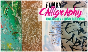
Funky Calligraphy: Adventures in Hand Lettering, Tutorial by artist Martice Smith II

My graffiti-style lettering is a fun mixture of bold, expressive calligraphy with a whimsical, urban vibe. It’s what makes my handwriting so recognizable and unique.

Sometimes, I prefer my letters to look imperfect and scribbly. It’s important to me that my spirit, at the moment, transcends into my artistry.

Today, I’ll be your guide for a quick adventure on finding your “voice” within your hand-writing.

So, where do I find inspiration? Literally, everywhere!

Look around you…the world is your oyster. Take an adventure!

I challenge you to look at your surroundings differently. Here are a few places of inspiration I like to start with:

  • graffiti murals / graffiti on trains
  • billboards
  • food packaging
  • tribal symbols and jewelry
  • kids’ writing
  • Expand your powers of observation. Photograph interesting walls and surfaces, print them out and add to a visual journal. Doors, facades, an vintage signage are my favorite things to look for!
  • Flip through architecture catalogs and fashion magazines for contemporary design inspiration.
  • Look at brand packaging. Notice how the typefaces exude various emotions for you.

Now that you’ve been inspired, let’s play!

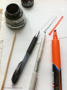
Here are some basic supplies to get started with lettering: 


Funky Calligraphy; supplies to gather

  • Speedball’s Super Black India Ink (waterproof, free flowing, and contains a deep opaque pigment. It’s one of my favorites!)
  • skewer or toothpick
  • assortment of markers and fine point pens (include a chisel-tip marker / calligraphy pen)
  • paper

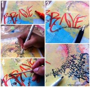
Funky Calligraphy and graffiti; step-by-step process by Martice Smith II

  1. First, grab your biggest chisel-tip marker or calligraphy pen. Write large letterforms and work randomly across the page.
  2. Next, use a pen with a smaller point. Try writing a phrase in a circular shape. Rotate the page for smoother writing. Allow the words to look like a series of marks. It’s OK to leave some words illegible. By layering letters and strokes you create interesting effects and backgrounds.
  3. Exaggerate letterforms and lines – make them your own! Vary their size by alternating your thicker, chisel-tip markers with fine point pens.
  4. Finally, draw scribbly flourishes with a toothpick or skewer dipped in India ink. (Do this part last to allow the ink to dry without being disturbed.) Set aside to dry for a few minutes. Spray varnish to seal the surface.

Your creative design potential is limitless if you think beyond traditional calligraphy methods. Take a playful approach, forget about the “rules” and allow your imagination to soar!

Think about this:

What kinds of fonts make you feel happy? Do they happen to be skinny, thick, bold or a mixture of all three?

What about fonts that help a product look timeless and fresh?

Analyze the differences of vintage style vs. a more kid-friendly look. What would they look like combined? Try it!

Remember, the key to developing your own style is to allow yourself to play and experiment.

JOIN the fun!

If you want to learn more about expressive, free-style hand lettering, be sure to sign up for Martice’s newsletter. Be the first to know about her upcoming mini-workshops, featuring in-depth handwriting techniques.

~*~*~*~*~*~*~*~*~*~*~*~*~*~*~*~*~*~*~*~*~*~*~*~*~

Mixed-Media artist, designer, and instructor Martice Smith II

Martice Smith II is creative director of Martice Smith II – Illustration & Design Studio, based in Missouri and owner of Uneek Art Boutique. She established herself as a freelance Illustrator and graphic designer after receiving her Bachelor of Arts Degree. Specializing in mixed-media illustrations, Martice’s love for fashion, typography and wildlife are infused with a combination of traditional and digital art techniques.

~*~*~*~*~*~*~*~*~*~*~*~*~*~*~*~*~*~*~*~*~*~*~*~*~

.

.
Calligraphy for Mixed Media Artists

~ * ~

This article was written by Katja Blum

One common description of the art of calligraphy is “the art of giving a pleasing, harmonious form to the written word”. This rather terse definition includes masterpieces of calligraphy from the Book of Kells to the scribes of ancient Persia to William Morris and contemporary art.

Many works of mixed media art include text – individual words or text blocks – as a focal point and added layer of texture, color and meaning. One would think that calligraphy and mixed media should be a natural combination. However, as a big admirer of the work of calligraphy artists, I often find myself developing a special form of writer’s block – calligrapher’s block, if you will.

The surface of a piece of mixed media art is often textured and varied, with layers of different materials that make it hard to control the nib or brush, the classic calligraphy tools. And forget aids such as ruled lines and light boxes. So there is just freehand writing. What if I mess it up? My solution for this (as for many other mixed media issues) is to move towards serendipity and relaxed design. I embrace my handwriting, although I can tell you that it has suffered as much as the penmanship of any computer user – and I play with tools. Take a good look at your art tools, kitchen utensils or other implements, dip them in ink or diluted acrylic paint and start writing.

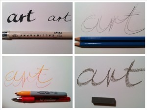
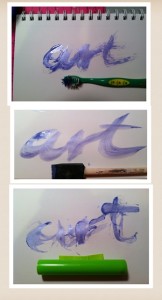
Samples done with classic writing tools

First, let’s look at “simple” writing tools. A calligraphy pen with a broad and fine tip is a good choice for a block of text, perhaps on a journal page. Holding two pencils or colored pens together creates an interesting effect. Try writing with five or six colored pens held together. The result is a fascinating blur. Pastels and crayons look substantial, but still relaxed – lovely in white on a dark background.

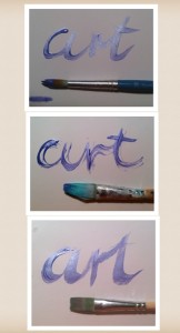
Samples done with different brushes

Play with brushes. The top and bottom ones are classic shapes for Asian and Western calligraphy. The middle brush is one I used to apply PVA glue once and forgot to wash. It is one of my favorites for applying color effects and for writing.

Samples done with uncommon writing tools

For the third round of writing experiments, I used some unusual writing tool. At the top I wrote with a children’s toothbrush and found I like the feathered effect. This could be very interesting on heavily textured backgrounds with very diluted acrylic paint. The center word was written with a sponge brush. The broad strokes can accommodate all kinds of color effects and decorations. My favorite is the bottom picture. Here, the tool is a hollow polymer clay roller. I love the completely random, unrepeatable strokes. Working with unusual tools is the calligraphy version of a monoprint – you can’t plan every move and you’ll never do two the same.

Choose your tool, take a deep breath and just start writing on your artwork. Lay the foundation with your favorite writing implement – mine turned out to be the roller – and then add color, highlights, texture – or take your inspiration from ancient palimpsest manuscripts and layer more writing on top.

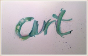
“Art” written with a polymer clay roller

~*~*~*~*~*~*~*~*~*~*~*~*~*~*~*~*~*~*~*~*~*~*~*~*~

Katja Blum is a writer and translator from Tulsa, OK. As an artist, she started with yarn, fabric and papier mache (rarely together), branching out into collage and other paper arts about ten years ago. Her latest obsession is making soft stuffies and art dolls – to the delight of her toddler. She also likes to find creative solutions for ugly or broken things around the house – to the delight of her husband.

You can see more of her work with fiber, paper and words at thewaywardsheep.com

~*~*~*~*~*~*~*~*~*~*~*~*~*~*~*~*~*~*~*~*~*~*~*~*~

.

.
Illuminated Letters for Mixed Media Artists

~ * ~

This article is written by Katja Blum

Illumination is the art of embellishing individual letters or symbols on a page of written text. The letter, usually the first letter of a page or particularly important passage is decorated with patterns and may contain intricate symbolic drawings or a miniature. The word “illuminate” means “to fill with light”, and the art derived its name from the technique of filling parts of the letter or background with gesso – not the acrylic primer, this stuff involves boiling rabbit carcasses – and covering the raised area with gold leaf.

Illumination has been around since 1500 BCE, when scribes began to illuminate Egyptian Books of the Dead. In the Middle Ages, artists created incredibly beautiful illuminations of sacred texts all over Europe and Asia. Famous examples are the Lindisfarne Gospel and the Book of Kells. As the printing industry progressed, illuminations became too labor-intensive and fell out of style. In the late 19th century, the illumination work of English artist William Morris led to a brief revival of the art form. Today, many calligraphers create commissioned illuminations, often as monograms for special occasions.

As a mixed media artist, focusing on the shape, form and symbolic value of a single letter can bring an extra dimension to your artwork. While it is very rewarding to create within the rules of traditional illumination (maybe minus the rabbit sizing), you can create fascinating effects if the letter is the centerpiece of the work, not just enhancing but completing or even replacing text – either carrying the whole piece or adding a layer of meaning to the work.

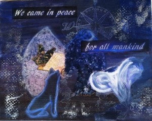
Illuminated letter collage “We Came In Peace” focusing on the letter M

For “We Came In Peace”, I started with free association about the moon. This is the part where the illuminated letter concept gets to be big fun. Do a brainstorm and run with your ideas. You definitely don’t have to be literal; perhaps you have personal associations with the letter or concept that will surprise both you and the beholder.

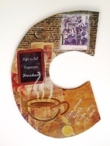
Illuminated letter shape “Coffee”

Two- and three-dimensional letter shapes are trending right now, and I’m a fan! Exploring different letter shapes as the basis of your work lets you play with space and contours and takes you far away from the ever-present rectangular boundaries of paper and canvas. “Coffee” is about my love for old-fashioned coffeehouses and pretty much any caffeinated concoction. The color palette in this piece sort of designed itself – and also goes great with our kitchen wallpaper.

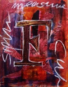
Illuminated letter collage “Fates”

With “Fates”, I moved away from concrete images, concentrating on lines and textures instead. Again, the letter is not the first of any word I used, but refers to the overall idea instead. There is actual illumination, even though I replaced the raised gold leaf with mica powder.

Explore the possibilities of illuminated and embellished letters in mixed media artwork, combined with text, imagery or standing alone. Following your imagination ‘to the letter’, you will discover more creative potential of mankind’s most powerful invention – the alphabet.

~*~*~*~*~*~*~*~*~*~*~*~*~*~*~*~*~*~*~*~*~*~*~*~*~

Katja Blum is a writer and translator from Tulsa, OK. As an artist, she started with yarn, fabric and paper mache (rarely together), branching out into collage and other paper arts about ten years ago. Her latest obsession is making soft stuffies and art dolls – to the delight of her toddler. She also likes to find creative solutions for ugly or broken things around the house – to the delight of her husband.

You can see more of her work with fiber, paper and words at www.thewaywardsheep.com

~*~*~*~*~*~*~*~*~*~*~*~*~*~*~*~*~*~*~*~*~*~*~*~*~

.

.